
(World Wide Fund of Nature)
Born from the opened mind and perception of a people who acknowledged the destructive remnants of humanity’s rapid progression in the growth of civilization, the WWF (World Wide Fund of Nature), was originally founded by a series of event beginning with distressing articles by Julian Huxley, regarding the eradication of wildlife habitats occurring in East Africa. By catching the attention of Victor Stolan, the dire severity of the circumstance that was unearth, was brought to surface, which allowed the necessity for an international organization to be created for financing the proper protection efforts. Along with the addition of the Director General British Gov. agency of Nature Conservancy, Max Nickolson who was dedicated to this new opportunity, a new force on the side of nature was on the horizon to safeguard the natural wildness of life.
WWF First Logo in 1961 (1000LOGO)
Around the same year the organization was being established in Switzerland in 1961, the inspiration of the logo was arriving at a London Zoo in the form of a giant panda going by the name of Chi-Chi. Being a global organization came with the realization of a required logo to identify and represent the ideals of their goals. By using a recognizable animal with simplified colors, the understanding of the organization was made transparent for everyone regardless of ethnicity. Although it appeared as a rough sketch, the first original logo was hand drawn by Gerald Watterson. Depicting the hatching shade sketching of the furry Chi-Chi in an enclosed yet irregular circle with an open top. The organization’s goal of preservation, conservation, and overall support to nature and wildlife was easily grasp as clearly as black and white.
WWF Logo in from 1960 – 1970 (1000LOGO)

After gaining a new image of representation it was time to refine and stabilize the concept. Following Gerald Watterson’s sketch as a proper templet of example, Sir Peter Scott took the task to smoothen the logo image and as a painter and naturalist, he made sure to do work on the design with diligence. During the development process Peter Scott originally stated that, “We wanted an animal that is beautiful, is endangered, and one loved by many people in the world for its appealing qualities. We also wanted an animal that had an impact in black and white to save money on printing costs.” By following this form of building blocks, Peter Scott aimed to make his design simple, cheap, and more importantly, understandable to anyone. The very creation of the logo spoke for itself and managed to capture the meaning of the WWF’s intentions. Using these necessities as guidelines allowed Peter to narrow down the very essence of what was trying to be produced. The dark hatching parts were bolden and soften to bring out a more visible image of a panda and the circle was removed. More details of the animal’s features such as claws, and texture was incorporated into the refinement. With the origin of the logo already being effective from the start, all that was left was a size increase with little to no change to the main structure of the image.
WWF Logo in 1986 (1000LOGO)

Heading into 1980, the logo was entering further development to embed itself in the mind of many. Further details regarding the clear description of an animal began to be properly applied. At this stage, a distinction could be made from the eyes and the black eye patch patterns on the panda’s face and the blended bold of the mouth and nose were now made sharper. This allowed the logo to gain easier recognition and relevance. However, the previous addition of the claws was removed for a gentler padded approach. By making the face more defined, the familiarity of the organization was significantly increased. This allowed the progression of the design to pick up a new pace in acceleration towards a much relatable depiction. Although the appearance of the logo was more detailed it caused the design to be a bit more jagged and rough. This may have been one of the flaws that led to a possible change years later.
WWF Logo from 1986 – 2000 (1000LOGO)
Towards the end of 1986 and entering the beginning of 2000 the addition of typography was incorporated and placed underneath the logo. Using a serif typeface equivalent to that of Times New Roman in bold print, gave the logo a sense of legibility and sophistication which advanced the model of the logo a step further towards its ideal image. The previous details of the eyes were removed for a more simplified appearance while the lower jaw was made to be its own shape. The white background was enough to complete the idea without any further inclusions to the design being required. As a result, borders that outlined the panda and enclosed the image, was removed to allow the logo to breathe in negative space.
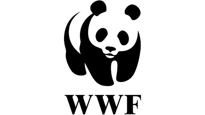
WWF Logo Current Logo (1000LOGO)
The unity between image and font solidified the logos course towards its final stage of development in the early years of 2000. Aiming to modernize the design one step further than its current abstract form, Peter Scott gave the font a reproach and settled with a bold sans serif font similar to that of Zar Brush Gothic Regular. This now cause the font and emblem to compliment each other. Without a single edit applied to the image, the logo was now complete to be viewed as it is today.
WWF Merchandise
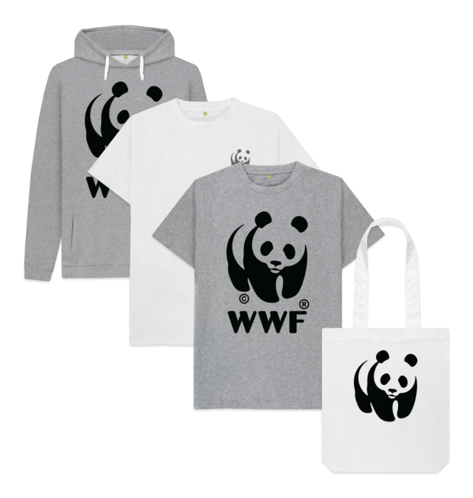
It wasn’t long before the design was placed on merchandise and accessories. The transparent white areas of the panda easily allowed the logo to be displayed on just about anything that could be sold, regardless of color. This may have been one of the leading causes to help satisfy the decision of whether the logo was sustainable or not. By being able to be placed on any background, the logo was now flexible for further usage beyond a simple company representation. The WWF now had ways to gain donations investments and support from those with the same appreciation for the organization’s goals. A brand would now become a part of the organizations new way to expand their recognition and create awareness for what they are trying to achieve.
Sources:
- World Wildlife Fund. (n.d.). History. WWF. Retrieved September 14, 2021, from https://www.worldwildlife.org/about/history.
- Chris GilesChris Giles is the owner of CGain Web Design & SEO and has been involved in the internet industry since the early 1990’s. He has been the marketing manager of several multi-million turnover companies. He is a Fellow of The Chartered Institute o. (2020, June 3). WWF logo history and insights and inspirations. CGain Web Design & SEO Blackpool | Development, SEO, Ecommerce. Retrieved September 14, 2021, from https://cgain.co.uk/wwf-logo-history-and-insights/.
- WWF logo. 1000 Logos The Famous Brands and Company Logos in the World WWF logo Comments. (n.d.). Retrieved September 14, 2021, from https://1000logos.net/wwf-logo/.
- Angus Hyland writes about the WWF logo for Computer Arts. Pentagram. (n.d.). Retrieved September 14, 2021, from https://www.pentagram.com/news/angus-hyland-writes-about-the-wwf-logo-for-computer-arts.
- (2021). YouTube. Retrieved September 14, 2021, from https://youtu.be/IUtHRQjnC6g.
- World Wildlife Fund. (n.d.). Giant panda. WWF. Retrieved September 14, 2021, from https://www.worldwildlife.org/species/giant-panda.
Word Doc. My logo History Report


