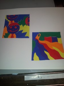
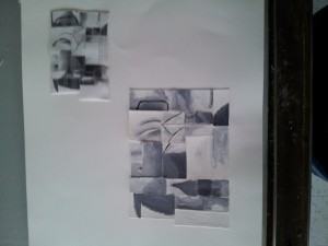
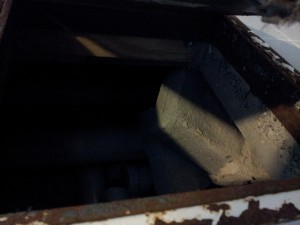
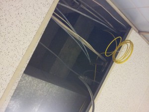
This free study was interesting, not entirely challenging though. Going from chromatic, to muted to prismatic colors made it more enjoyable to work with. If all 3 compositions were chromatic grey this would’ve immediately become boring. The idea of changing the colors and being able to make my own chopped up pictures made it a lot more fun. I feel like all of my compostions are visible and the pictures make sense. The addition of the colors trying to paint the right parts to have it work well together was challenging at first, but became easier as it carried over to the other compositions.
Author Archives: Dillon
Assignment #3 Painting
This project I found really tedious and frustrating, not because of the actual difficulty, but because of the focus on high/low key and focal point. When it came to actually painting this it became a whole new level of frustration because these paints, after you mix them, decide to change colors after they dry on the page. That drives me insane. I still think it came out pretty well, I just learned to deal with the color change. In this uploaded picture for some reason it decided to rotate, so it SHOULD be seen rotated 90degrees clockwise, so the small collage should be in the top right corner.
Assignment #3
This is my cut-up picture of Ming. In comparison to the original vs. the one done in photoshop, this one has more of a low-key look to it in my opinion and in comparison to the hand made one. After my painting was pretty broad, I had to make the attempt to make this either high or low-key. Understandably this has some light spots, but without them there would be not differential in shades and everything would’ve just looked dark and confusing.
High-Key Low-Key
ADV1100- A View From My Window
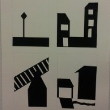
Starting this project I really had a set image in my head of what I wanted to draw, and by the end I had completely changed what I wanted to accomplish. At first I wanted to show just one angle, but adapt it and add new details in each time. But I ended up just doing four different angles with only a few similarities between them. I think my work came out pretty good, and for the time I spent just cutting the paper to shapes I needed I hope it came out well. All together this project showed me to look at this deeper, take in all the shapes and make each one of them their own character. From top left to bottom right, the cut-outs represent a street sign, the sides of 2 separate houses, a garage and a fence, and the last one is part of a house, a garage/driveway and a walkway. Yeah.

