Podcast

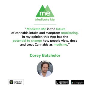
After about a month of being at my company I was also teamed up with the Operations manager of our Social Media as well as the host of my company’s podcast Justin Michuad. Meg, my senior designer, decided that we would work best together at keeping the social media platforms up to date with what the company was doing as well as testimonials from people Justin has interviewed on his podcast. Above and below are two examples of Instagram posts i have created using direct quotes from users of our app. Corey Batchelor (above) was able to get a picture to us. Initially my design included a larger picture of Corey with text laid over it however Meg pointed out that with a quote we want to make the words the most important element in the post not necessarily what the person looks like.
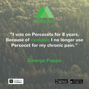
In my second post I was forced to use a different approach for George Pappa’s quote (above) because I was not able to acquire a picture of him. After going through the library I created when I began my internship I stumbled across this picture of a forest from above. Due to the overwhelming amount of elements in some of the other nature photos I have, this was the easiest to read text on top of. I learned that although there is a branding guideline for a company, each post or advertisement needs to be tweaked slightly due to the resources I have available to me.
Social Media

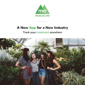
After completing the infographic and attending the expo with my boss I returned back to work and began to design social media content for all platforms including twitter, Instagram, and Facebook. One of the first posts I created for Medicate Me (above) took many revisions to get the initial template that we all agreed would work the best on Instagram. We decided that very little copy and a kind of softer image would work best on Instagram due to the fact that many people tend to flick very fast while using that app. After deciding on a look and feel of our posts I began to make a library of images taken from free sites like Unsplash in order to make our imagery cohesive.

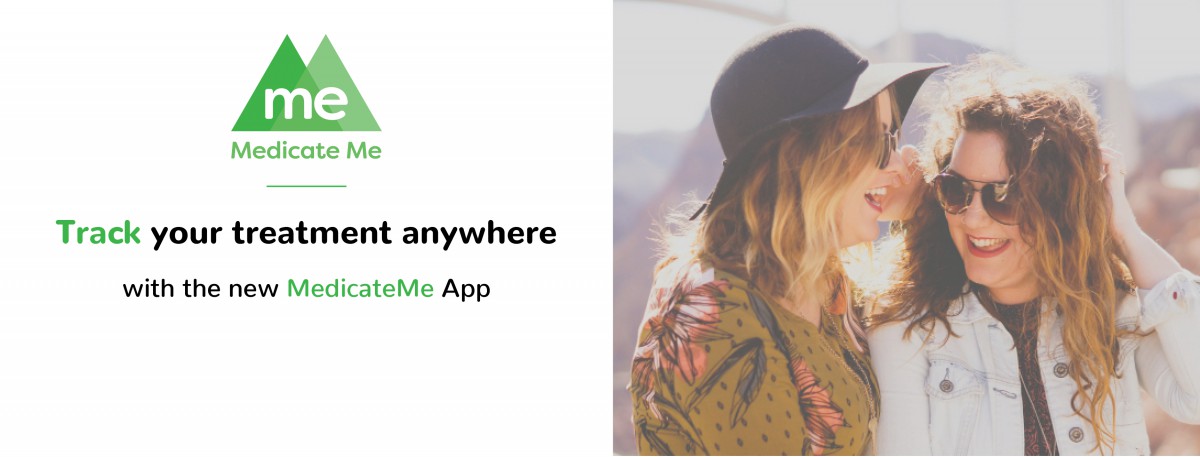
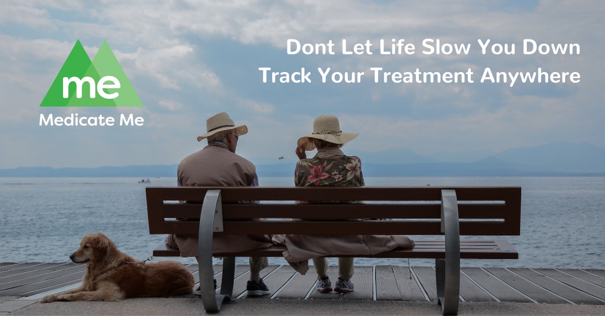
Now that I had created a library of images and established a feel to the brand I began to work on other social media platforms like Facebook (above). Because of the different sizing of a Facebook banner I felt as if the design wasn’t as impactful in this format. After realizing this I contacted my senior designer and we went through a few different reformats of the design until we both decided that a full format picture would work best.I also needed the show that this app was diverse and easy for people of all ages to use so I was able to come up with this banner (below).


Networking

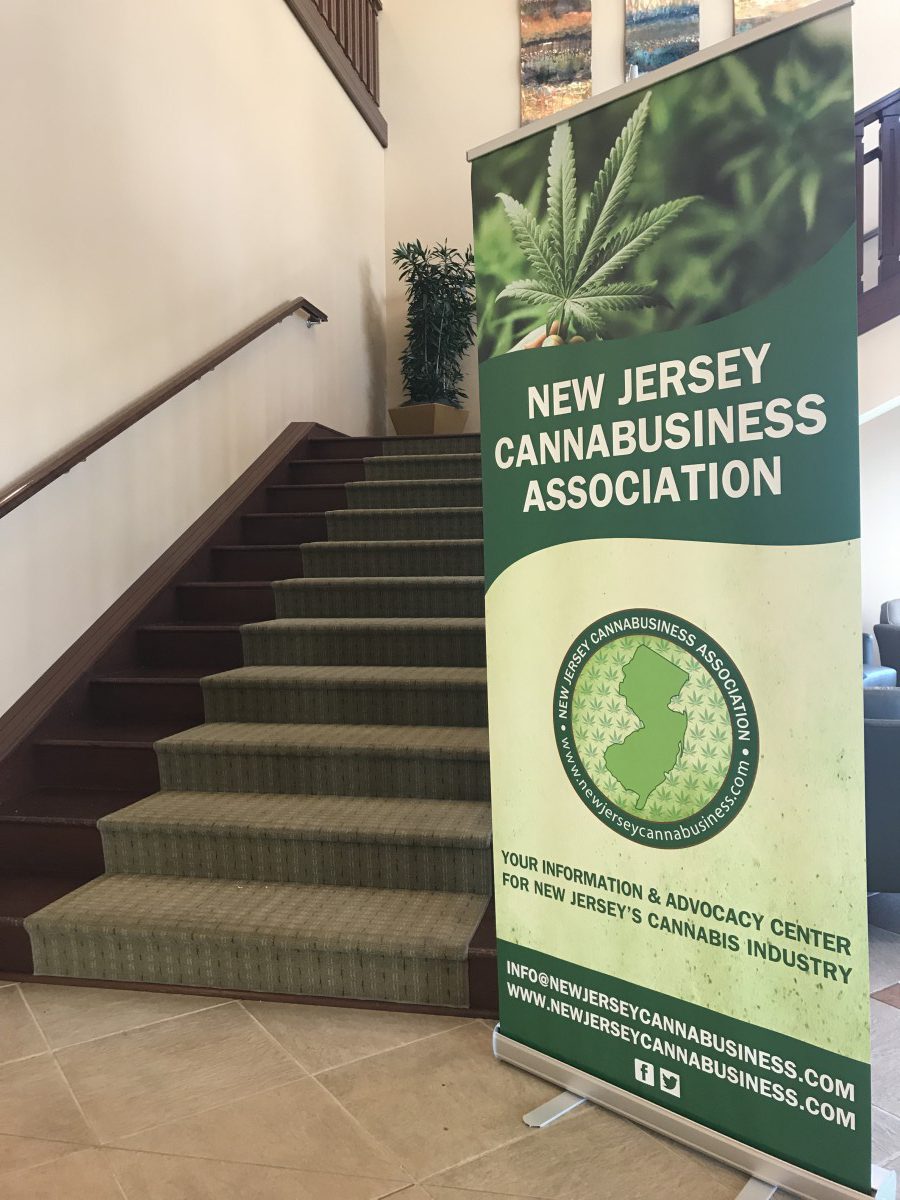
On September 27th I attended the New Jersey CannaBusiness Expo in Kenilsworth, NJ. This was the first networking event I have attended not as a student but as part of a company. At first I was a little intimated because it was on me to document this event as well as make sure I kept track of all the potential investors that we met. Throughout the event my boss Josh and I were able to interview many people including former DEA agents and retired NHL and NFL players. Not only did I learn about PR during this expo but I also learned a lot about the current state and future of cannabis as a business. After interviewing players like Eugene Monroe and Riley Cote we were able to that information and quotes and apply them to our companies testimonies and ads.

While at the event I was able to do some networking of my own as well. A few times throughout the day Josh and i separated because he wanted me to go and interact and connect with other potential clients. I thought this was a great opportunity to get rid of the crutch of my boss to lean on and go out on my own. I was able to make connections with a magazine company called Sensi magazine and hope to send them some of my work soon.