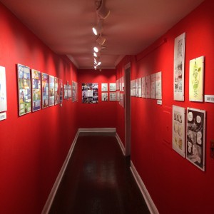
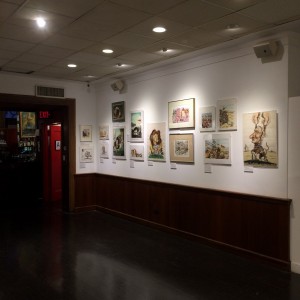
After taking a field trip to the Society of Illustrators (Located at 128 E 63rd St, New York, NY 10065), we were tasked with answering several questions that required critical thinking based on the many illustrations we saw from various artists within the 3 floor gallery.
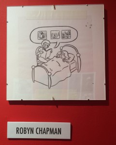
1) COMD: Write about an exhibit, artist, or specific work of art that exemplifies illustration as communications design
It’s trying to communicate a parent and child’s bedtime story session. Robyn uses a very relatable scene of an adult sitting over a child in bed reading them a story as they fall asleep. The tranquil look on the child’s face shows her quietly go off to bed. Illustration can communicate visually in half the time what words may not while being pleasing to the eye. Without saying anything, the artist illustrates 3 key scenes in the Little Red Riding Hood story that makes it easy to identify what is being talked about by the adult in the illustration to her audience. There was no typography in the image, nor was it necessary. I believe the artist got her point across without needing to say a word.
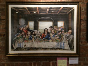
2) Storytelling: Write about an exhibit, artist, or specific work of art that serves as a good example of illustration as a storytelling
Rick Meyerowitz and Tony Hendra’s illustration addresses a common cultural issue (Dealing with the restaurant bill after going out with a large group of people.) but using “The Last Supper” in a form of satire. The scene itself is taken directly out of the bible, so while it addresses a common issue that transcends time, it’s shown during the biblical period. Their illustration does happen to feature text in an additional art piece that serves to further push along the narrative. You are allowed to see the bill that Jesus sees in the main illustration, thus explaining the extreme dismay on his face.
3) Review: After visiting the whole museum, list 3 overarching themes that appear to tie together the works featured here today (for example, satire, absurdity, perspective). Describe each theme by citing specific visual examples across collections (insert pictures/captions here) or analyzing the exhibition choices, or even the layout of the museum.
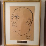
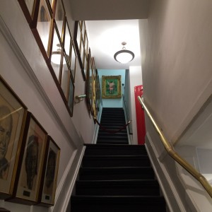
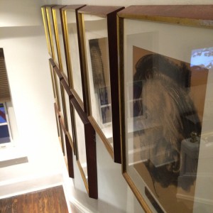
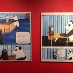 3 Major themes that seem to be illustrated across the majority of pieces found at the exhibit are 1) Storytelling 2) Cynicism & 3) Satire. To take things a bit further, they also seem to be organized by floor. Towards the 2nd floor, most of the pieces are done with charcoal of past presidents of the Society of Illustrators, symbolizing a theme of “storytelling” and “time periods” dating back to the 1940s.
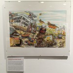 Once you reach the 2nd floor, the illustrations found here are done mainly with pencil / pen and are more so cartoon strips with a lot of self depreciating humor. Finally, the 3rd floor, is where the majority of paintings and heavily colored illustrations featuring satire / political issues, and cultural references are found.
- 1st Floor
- 1st Floor
- 2nd Floor
- 3rd Floor

