After finishing the original branding assignment, I decided to revisit the logo and make some much needed corrections. During an in class discussion, it was brought to my attention that while the overall logo was well executed, there were minor kerning and spacing issues that could be fixed. I’ve displayed a short list of changes I’ve made below:
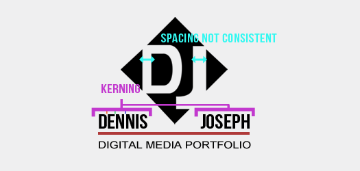
1) As you can see the spaces in between the letters in both my first and last name weren’t consistent. I took note of that and corrected it.
2) The ‘D’ and ‘J’ were meant to be similar but the spacing inside of each letter was noticeably different. I felt a skinnier J made to match the spacing in the D would weaken the overall logo and decided to make the D as bold as the J. This, in my opinion, gives it and the entire logo a bolder presence.
Original Logo Banner

Updated Logo Banner