
This assignment required us to create a logo based on our names/initial. I’ve provided a detailed look into my process in creating the logo used above for this very portfolio.

After sketching out several ideas and carefully analyzing the final choices, I was about to eventually break it down to 4 possible choices which are outlined below.
Design #1
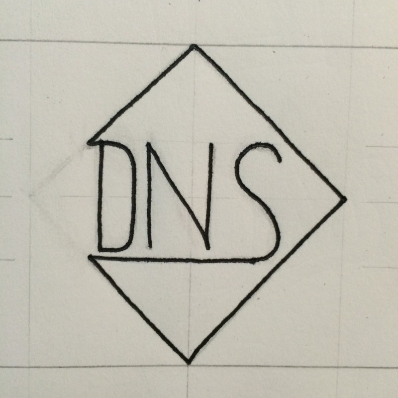
– Originally, I wanted to go with a Diamond Style for my logo because of the shape. I personally feel a brand identity that is equal on all sides makes it easier to implement on all sorts of designs. However, while the shape is appealing, I felt it would be difficult to color in if I wanted to go with a more “bold” alternative since the DNS and Diamond didn’t fully connect allowing the inside to be colored. The font was based off a Sans Serif style using the Build Bridges example as a platform. The X-Height throughout the design is proportional to the uppercase letters using 50% the Height as a base.
Design #2
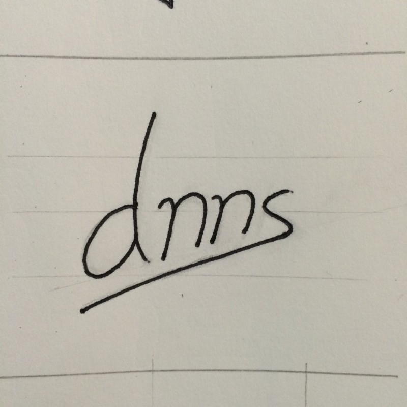
– I decided to attempt the ‘crossbar’ theme. Sticking to the idea of removing the vowels, unlike design #1, I chose to keep both N’s because I noticed people always seemed to spell my name with just one. However, I wasn’t confident that it would hold up if I scaled it down really small. It was based on a Sans Serif style, but due to the thin lettering and kerning space, I thought it would be difficult to view, especially on “busier” designs. The X-Height wasn’t consistent due to the ‘sheared’ look, which was another reason why I didn’t choose it as my final design.
Design #3
– Based on the Overly style, there was a ‘motion’ about this design that I liked after making a few small alterations with pencil. Like I mentioned in Design #1, I kept to the idea of keeping the X-Height at a 50% base compared to the uppercase lettering. My issue with it is, once I colored in the shape, it would be hard for people to distinguish what it was since it used not only the overlay theme, but part of the stroke was removed and took elements from the “Follow the White Line” theme as well.
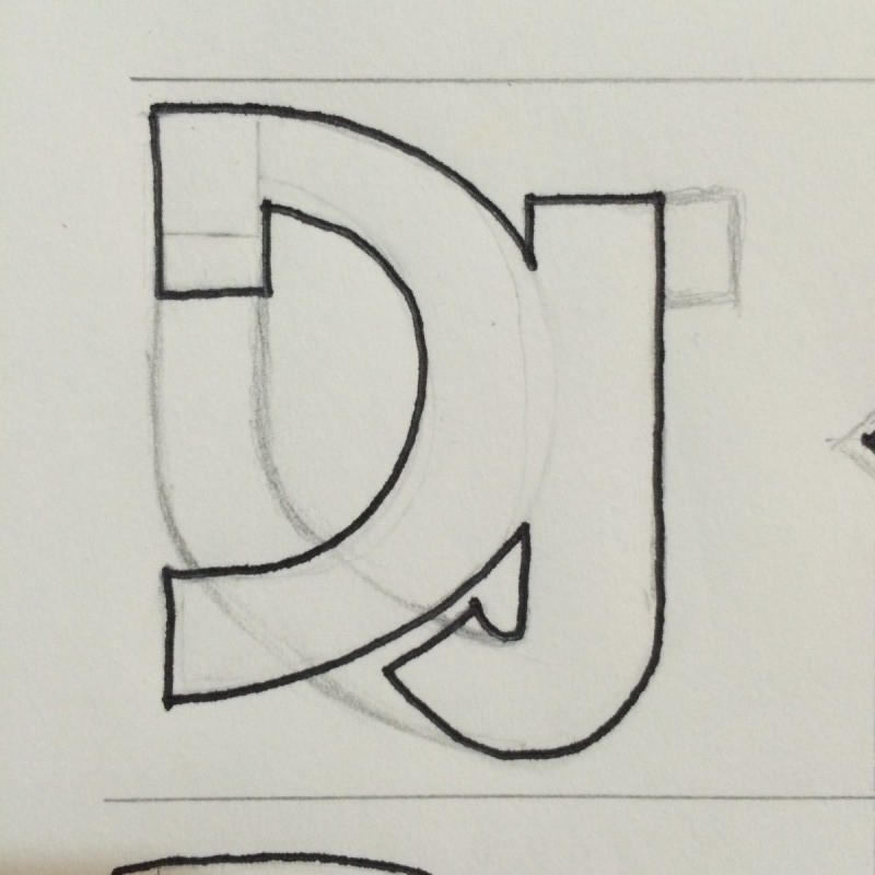
Design #4
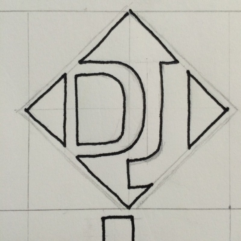
– Keeping consistent with the Sans Serif style, this was no different. I started with a diamond design (see Design #1) and just so happened to finish with one. I decided to simplify the “DNS” from design #1 and go with my initials instead. The X-Height maintained the same 50% base across the board for all of my designs, including this one. I also wanted to take up more space within the Diamond. Since I was using less letters, scaling the D and J up to the point where they broke out of the box seemed to be a good idea. Also, mixing white space and Gestalts theory on closure gave the idea more appeal. With four solid shapes instead of letters, I could apply the coloring I felt the other designs lacked and the human eye would use the white space to form the letters. The final design followed the Crop theme with a reverse field.
Final Design:

I was looking to create a logo that was easy to view no matter the size and allowed for possible color customization. After playing around with letters in my name, I felt my initials were best suited since it’s very straight forward and the less people have to “guess” what it is, the better.
What I like best is that it’s very flexible and can be altered slightly based on the background it’s used on to still stand out. Having the design fit a perfect square makes it easy to implement on things as small as icons or as big as a banner. Also due to its simplicity, I feel as if it reflects a strong feel of professionalism that best represents my work but leaves room to be ‘fun’ based on the project. This sums up my personality perfectly.

