
“Let’s put a smile on that face.” — The Joker, The Dark Knight (2008)
For my quote, I chose “Let’s Put A Smile On That Face.” by the Joker (played by Heath Ledger). As a fan of Director Christopher Nolan’s Gritty Dark Knight Series, Heath Ledger’s Joker was a brilliant take on the iconic character. I also feel like the quote itself, aside from being very recognizable, leaves room to be interpreted visually with either a “light” or “dark” theme. In my opinion, that would give me room to play around with concepts until I decided the direction I truly wanted to go.
Sketches (WIP)
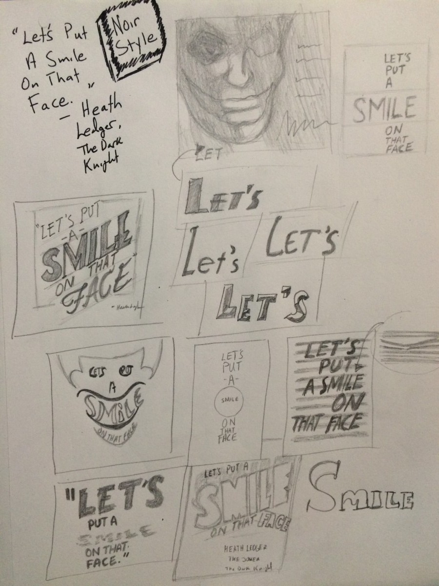
The initial sketches are my take on a “Noir” type style to represent the quote. I felt for the typography part of the assignment, this would be best suited for The Joker as he is usually known to wear suits and that’s what usually comes to mind for me when I think Noir.
What is Noir?
Noir is a cinematic term used primarily to describe stylish Hollywood crime dramas, particularly such that emphasize cynical attitudes and sexual motivations. Hollywood’s classical film noir period is generally regarded as extending from the early “1940s” to the late “1950s”. Film noir of this era is associated with a low-key black-and-white visual style that has roots in German Expressionist cinematography.
Reference Material
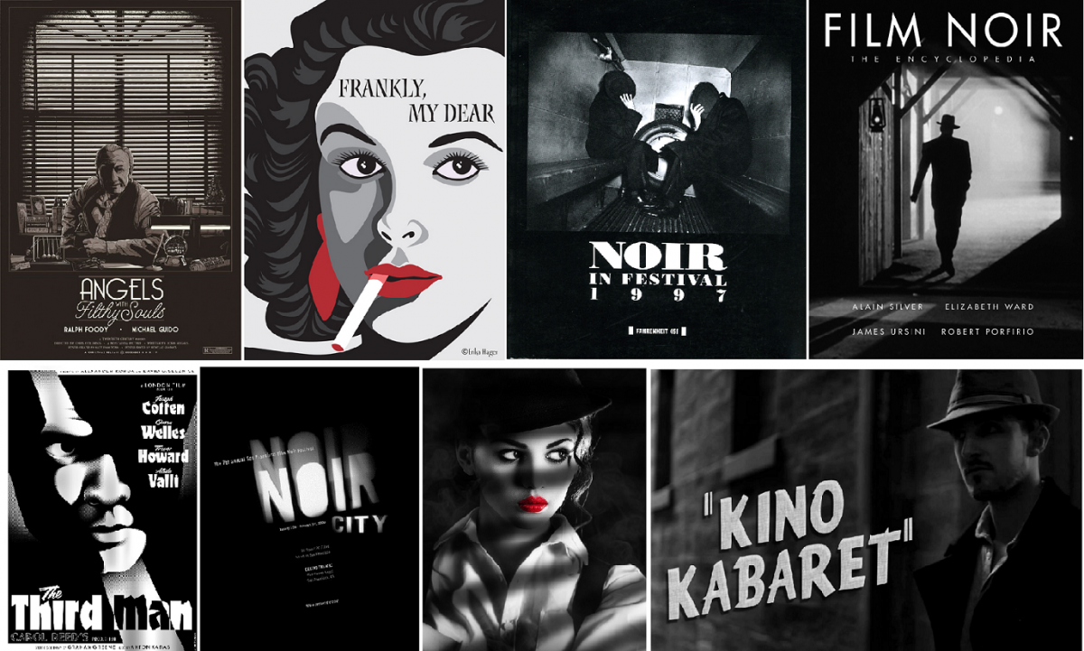
To start, I Googled for some reference material (Posters, movies, etc.) to help stylize the images in order to properly portray the Noir theme.
Photographic Image
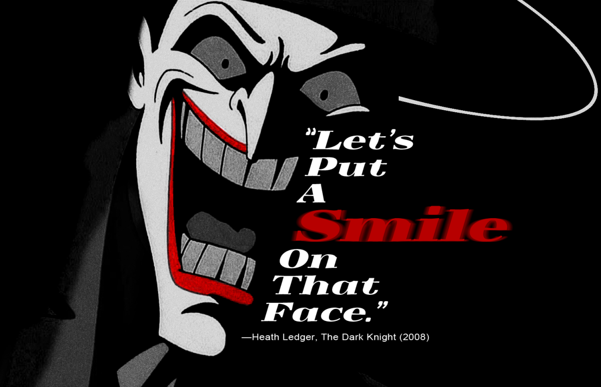
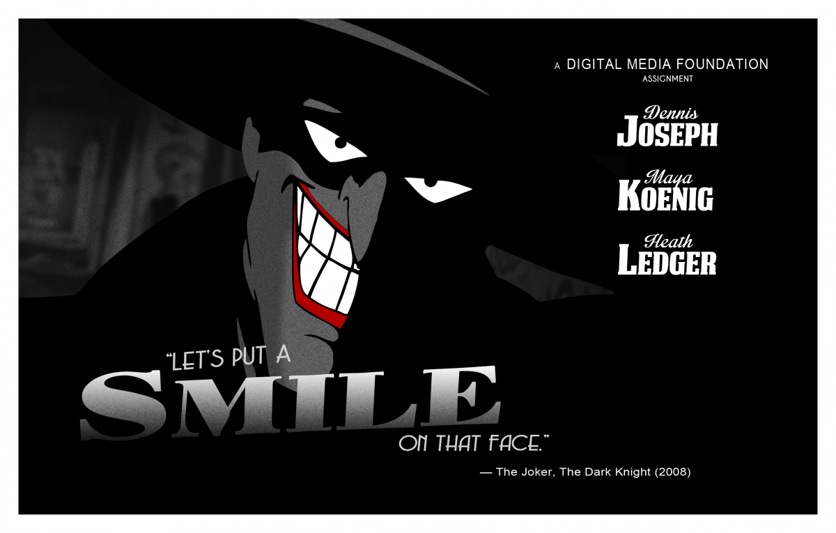
This was a variation attempt of my first sketch. Although Joker is much more colorful, I wanted to go with a black, white and grey color scheme to fit my “Noir” theme. Stylistically, highlighting part of his face felt like something you’d expect to see from a film or poster using that type of art. However, to adhere to Joker’s trademark style, I added the color back to the lips. I feel as if it also adds a bit of “madness” back into the image, something The Joker certainly is known for.
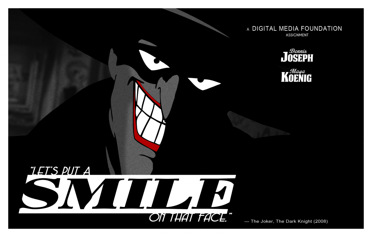
Final Photographic Image | PDF Link
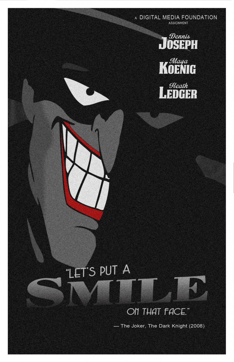
Final Photographic Image
From there, the image went through a few changes. For one, I decided to use a “smiling” Joker photo instead of laughing since it more accurately fits the quote. There was also the issue of font placement. I wanted to place an emphasis on smiling and went through a few variations. I concluded that a portrait design seemed to work better than landscape. I could “squeeze” all the information into the image without an abundance of negative space. Also for accuracy, I increased the amount of grain/noise to make it “feel” like an old poster.
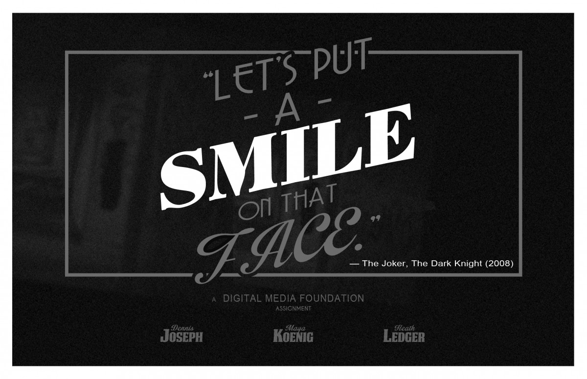
Typographic Image
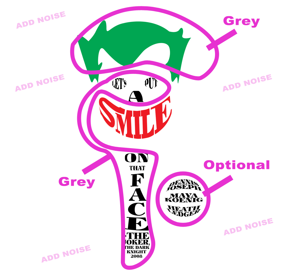
Earlier in my sketches, I made a rough design of the one above. However, after cleaning it up in Illustrator, I realized the one mistake I made was the fact that the type didn’t match the Noir theme I was going for. Eventually, I redid the type using the “Smile” Serif font (Yokawerad) from my earlier Photographic Image. Finally, in Photoshop, I removed all saturation, aside from the smile, to create the image below.
Final Typographic Image | PDF Link
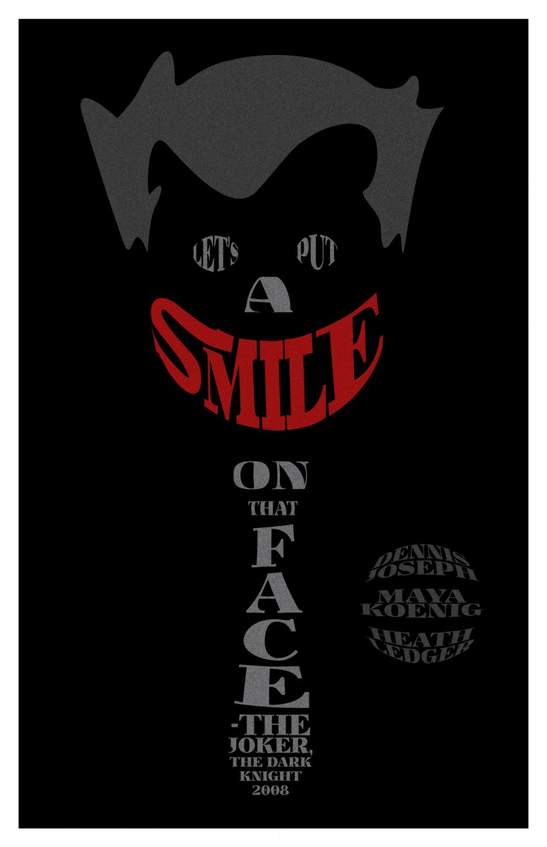
Final Typography Image
Typography Image
This also came from one of my rough sketches. To keep all of the images within the same ‘family’, I used the same fonts for the entire assignment. As mentioned before, the noise effect was used to give the images an “old” vibe. I also really liked the size proportion used in the reference material (Big x Small / Script) and implemented that as well.
Final Typography Image | PDF Link
Final Typography Image

