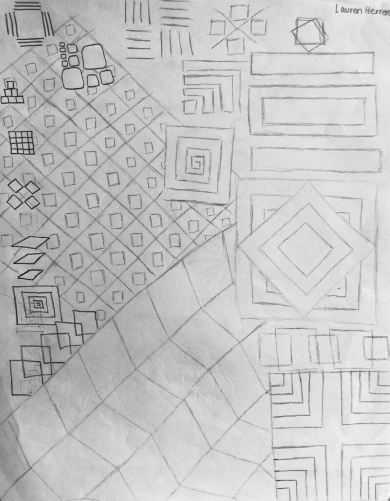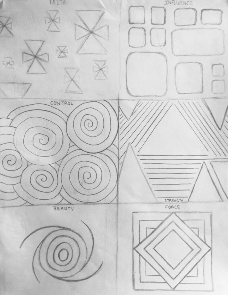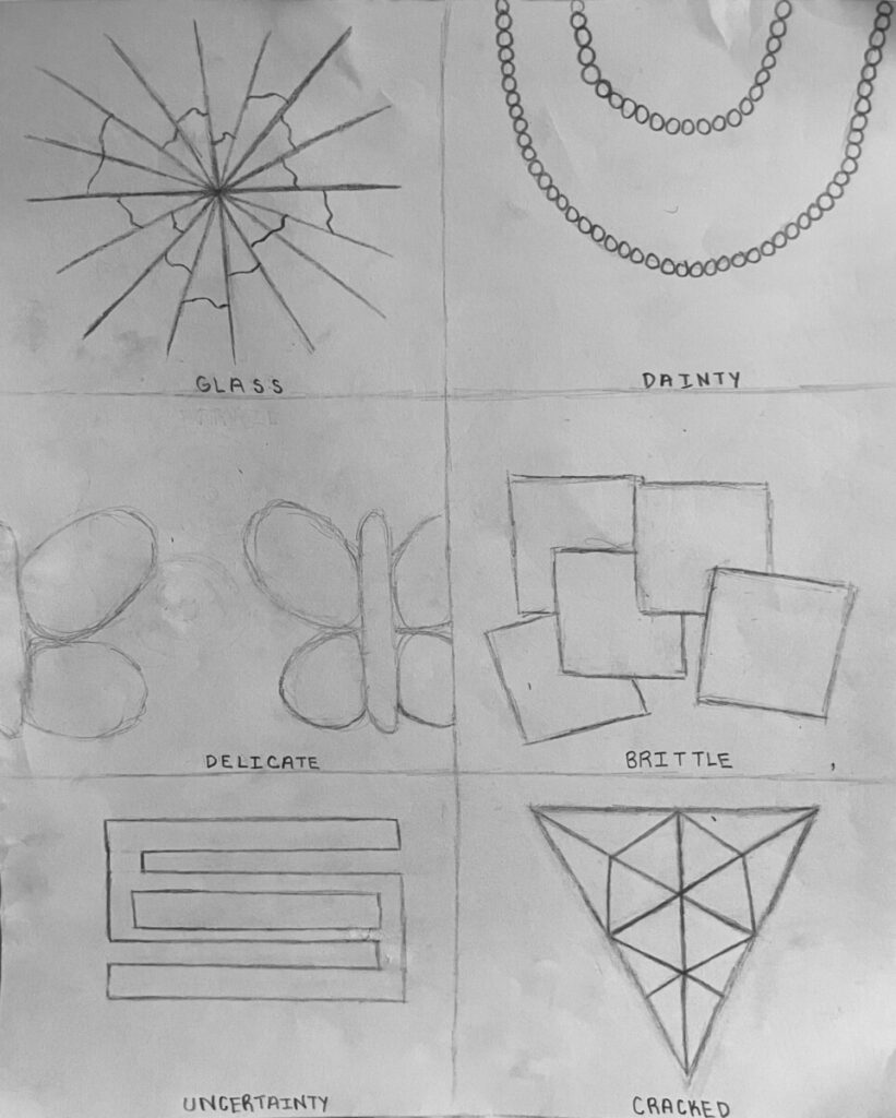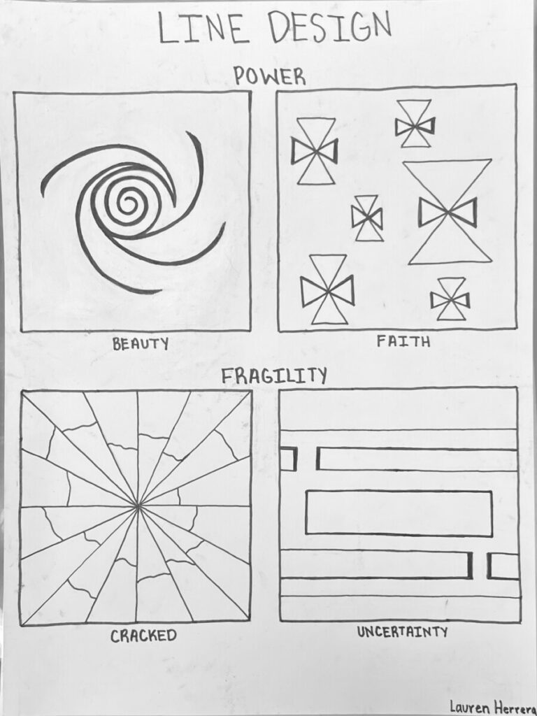


For our first project, we used elements of circles, squares, and triangles to create images that convey messages related to the themes power and fragility. Through the use of lines and curves of different sizes and density, we all had our own personal approach to the project using two words related to each theme, with a total of 4 refined designs.
The process of this project was a bit tedious but necessary to completely finalize my work. The variations especially, which I’ve never done for an art class before, helped me to make small changes before my final project. It was fun to come up with ways to make my designs appear more interesting and to better relate to the words I chose.


Leave a Reply