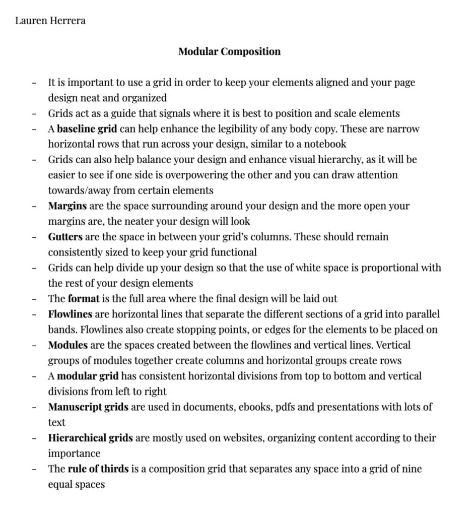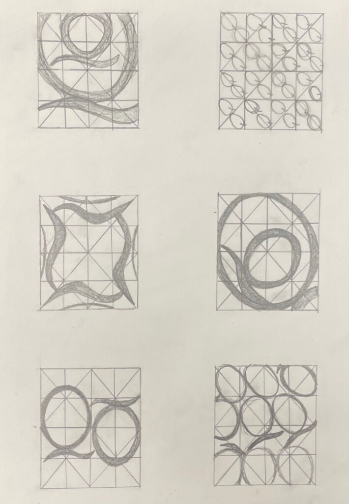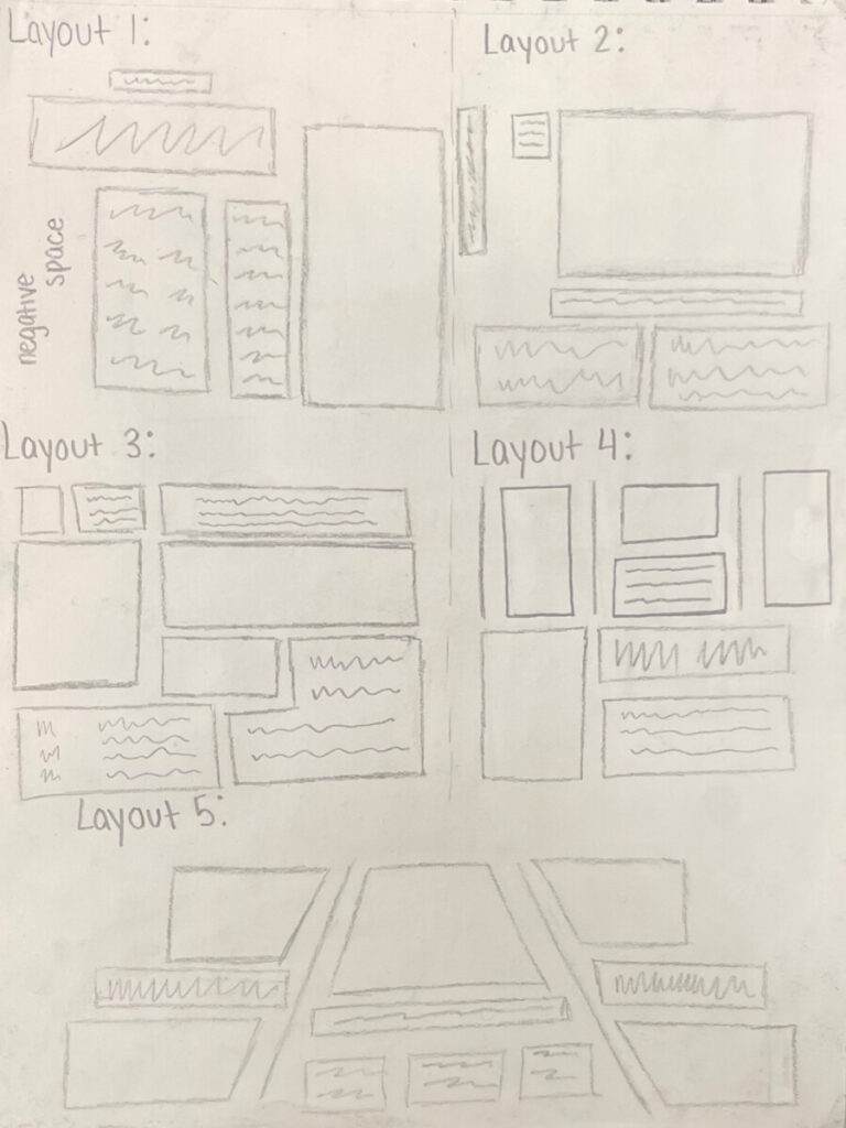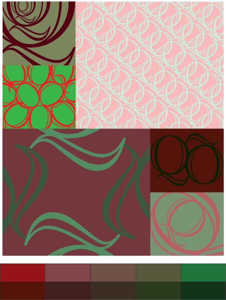


The main focus of this project is to use our knowledge of hierarchical principals to create a digital piece of a letter formatted in different ways to create unique mini pieces, which would combine into one overall large piece. To start, we took notes about the different forms of grids, layouts, and vocabulary about digital formatting that we could potentially use for our own project. Next, we created some manual sketches of our letters to give us ideas for the mini pieces as well as concepts such as enlarging, rotating, cropping, etc. After that, we found examples of different layouts used in media such as magazines or websites to bring us inspiration on the several ways we could organize our pieces to create the final overall project. Using all of these resources, we then created our digital pieces, which was the longest part of this project.
To be honest, I don’t have many thoughts on this project. It wasn’t particularly fun or boring and kind of felt like something I would do in Type and Media class. The best/most interesting part was actually working on the digital collage and finding the right color combinations for each individual piece.


Leave a Reply