Table of Contents

Discover:
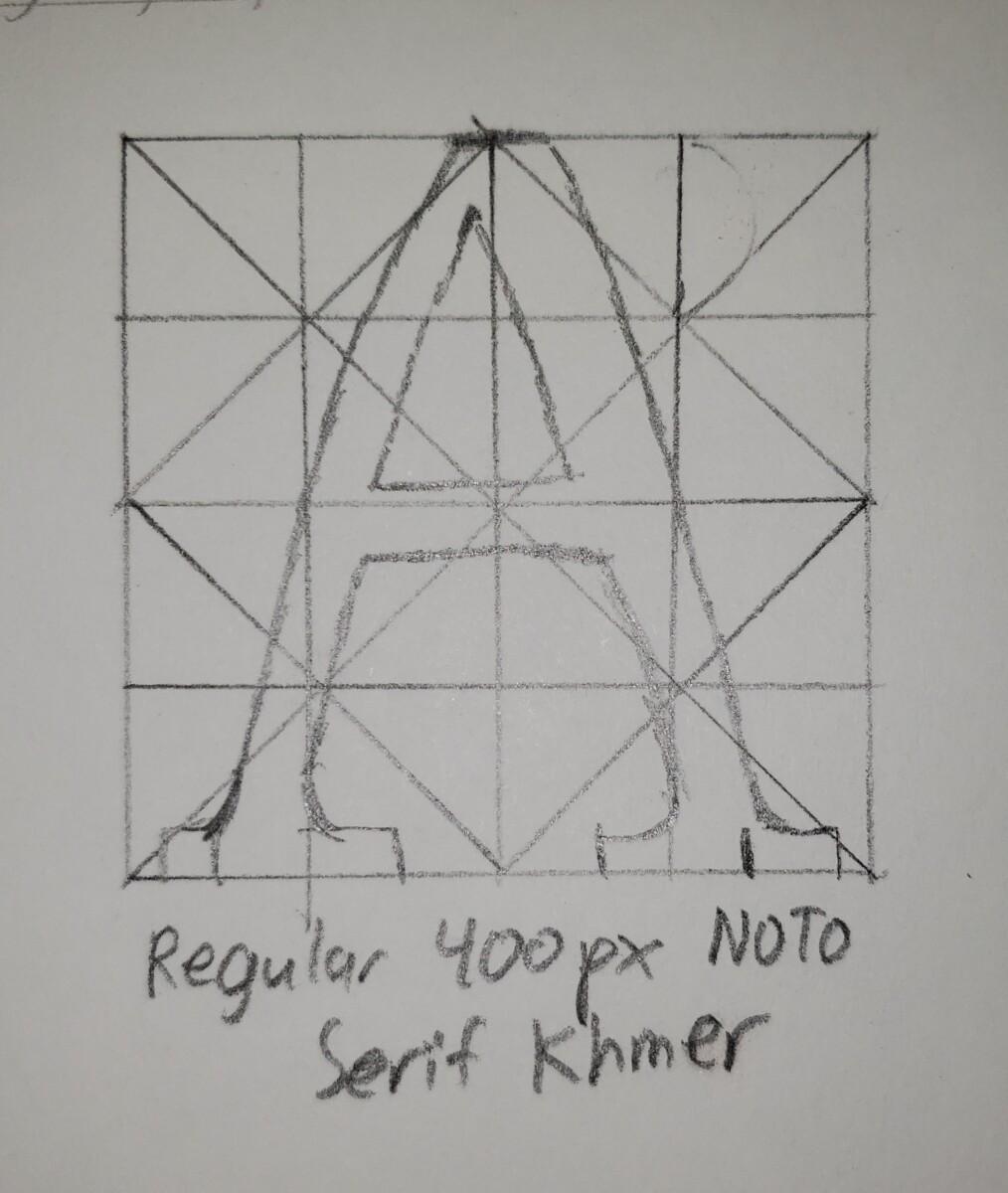
I Sketch this letter “A” using a letter grid. I think it’s close enough to the font I wanted to emulate.
In the illustrator play page, I made one the letters cut off by using the divide tool on a box smaller than the letter. With everything divided, I used the direct select tool to remove the shapes that are outside the box. To make the “J’s” look like that, I used the reflect tool and copy and paste.
Define:
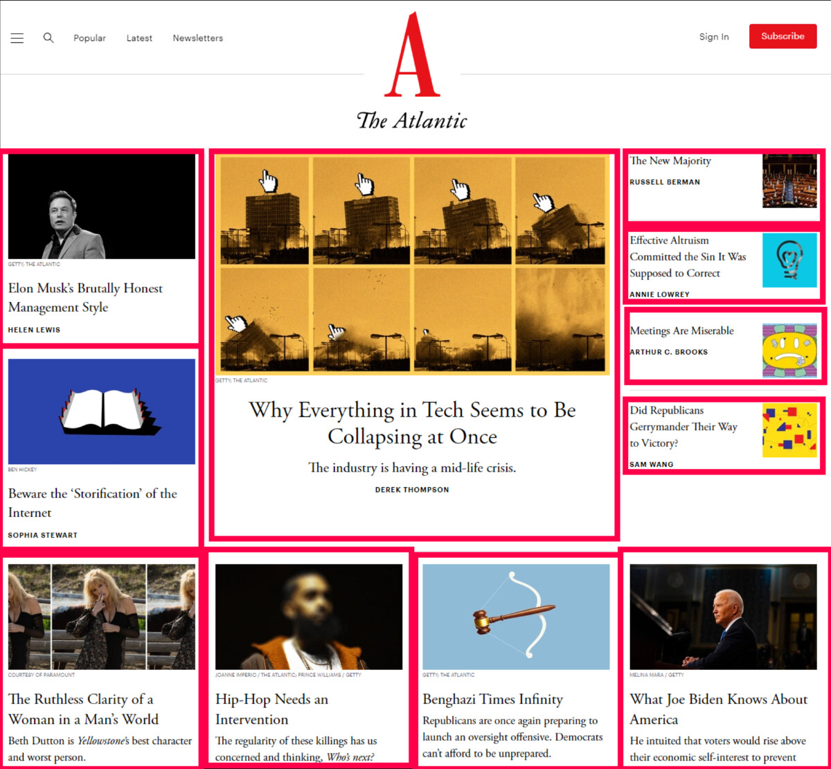
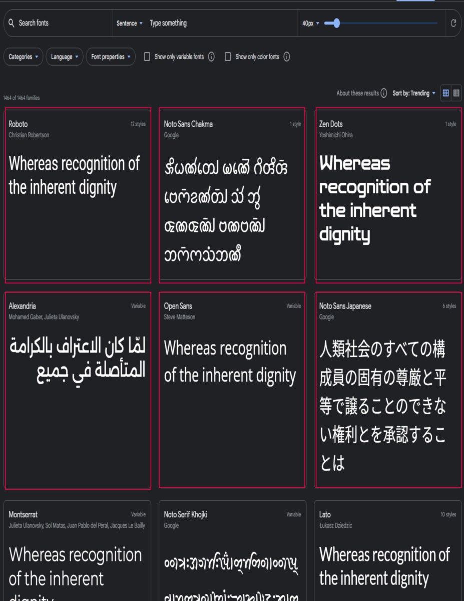
I research about grid through the websites we were given and took some notes. I tried by best to see what type of grid some websites are using. It was a little difficult to see which elements are boxes.
Discover:
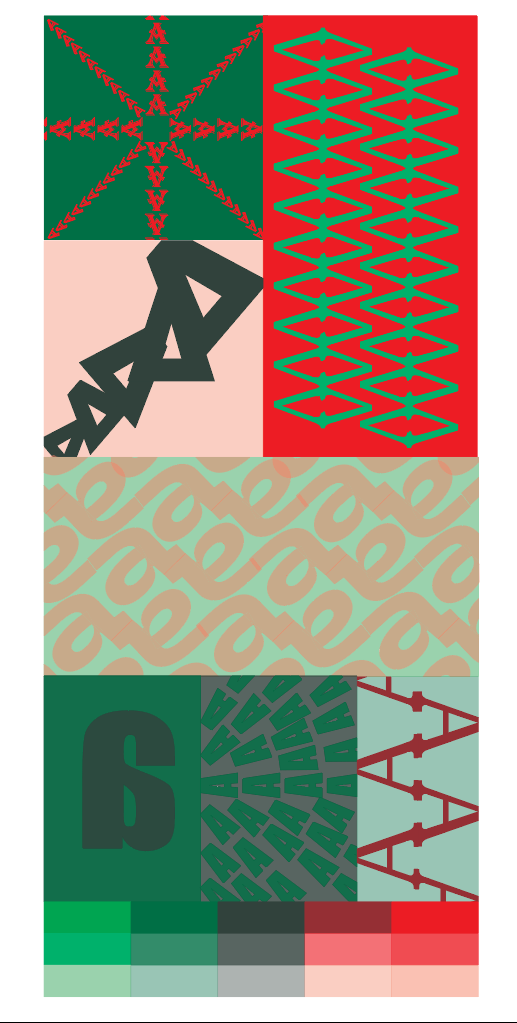
We now have to make a gird we like with a complementary color and a single letter with upper/lower case and only 2 font styles. I choose red and green. I tried my best to use stable/ambiguous and design principles. I used a hierarchical grid.
The first one on the top right is a harmony and ambiguous design. The bright red “plus” and “x” design have 2 different typefaces in a dark green background.
Coming after the first one, the bottom one is a hierarchy and ambiguous design. I used a tinted red and a dark green. To make the triangles, I cut the legs off the “A”. You see these triangles getting bigger and bigger from the bottom left.
The rectangle one is a repetition and stable design. I used a light green and bright red. I removed the crossbar from the “A” and attached the legs to each end. I then put it sideways and repeated the pattern using the control + d command so I don’t have to manually drag and repeat. I then duplicated and dragged those set of “A’s” to fit into the opening of the other “A’s” (kind of like a puzzle). Those connected “A’s” give the illusion of greens squares.
Coming after the bright red rectangle, the bottom one is repeating patterns and ambiguous. I used a tinted green and red. I connected the lowercase “a’s” and put them in a tilted position. I made the square smaller than the repeating letters and use the divide tool to cut out the shapes outside the box.
The one on the bottom left is contrast. I use a green color on the left and a middle value on the right. I had a big middle value uppercase “a” that is facing against a lot of smaller green color uppercase “A’s”.
The last one next to the contrast one is an ambiguous repeating pattern with one the uppercase “A’s” ends connected going down. I used a tinted green and dark red. This box almost looks like stairs.
Reflection and Final Thoughts
I like most of the results of this project. I don’t think I should have spent too much time looking at which type of grid websites are using. I thought some of the headlines/titles were squares and part of the grid. I think maybe the stair design one should be something different because I think its technique is a little similar to the square ones.


Leave a Reply