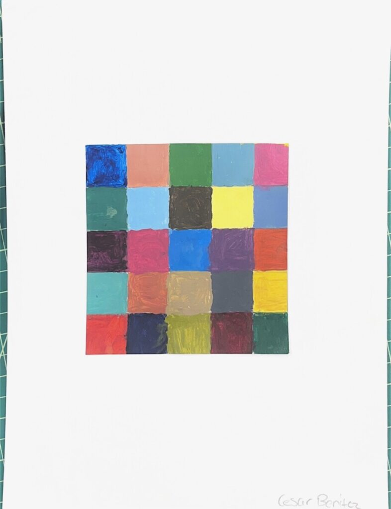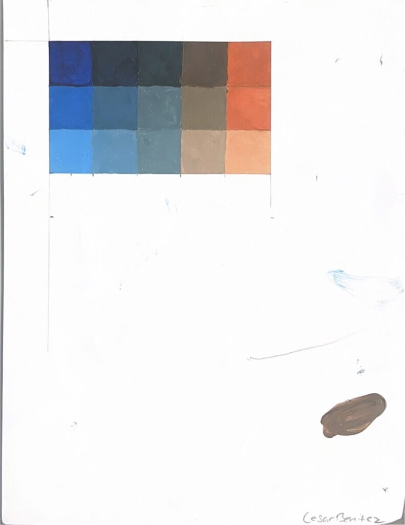


In project 4, we explored the way of colors and understood the vast knowledge behind colors, using techniques to achieve certain color palettes, and learning the elements such as hue, intensity, CMYK, etc. Learning the elements helped me understand Color, as I never looked at it passed just the name of colors, like yellow, blue, red, orange, etc. It is fun to see what colors can be created when blending them and then find ways to give them different values, such as tinting. I have partial color blindness and thought It would put me at a disadvantage with this project, but I feel like I did well, and doing assignments such as the saturation scale made me feel at ease and kept me distracted. My least favorite was the colored pencil grids, as I felt like I was running out of ways to make each box look unique, as I was only limited to three colors, yellow, red, and blue.
What I thought I could’ve done better was when painting, to completely fill areas with complete strokes, and sometimes I left some parts of my work painted duller, compared to heavily painted spots. I will apply what I learned in class to my next project is how colors work with each other. For example, if I am creating something orange, I will use the complementary color of blue to make the design look good.


nice job, good reflection.