


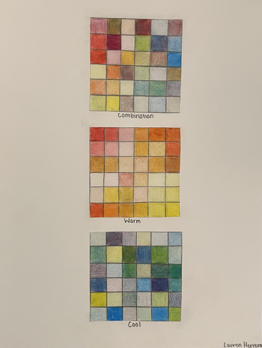
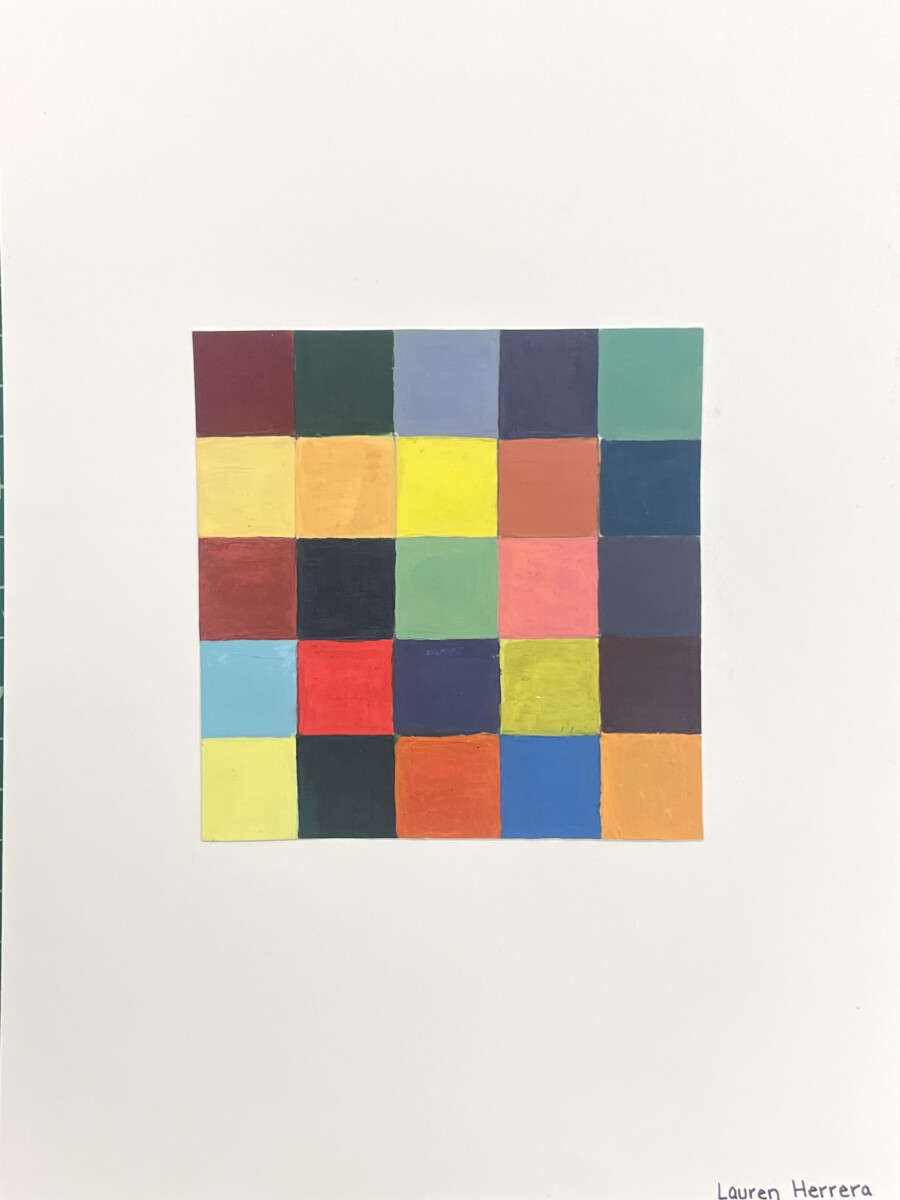
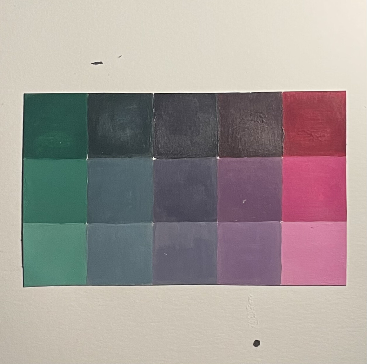
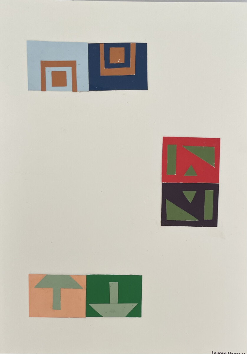
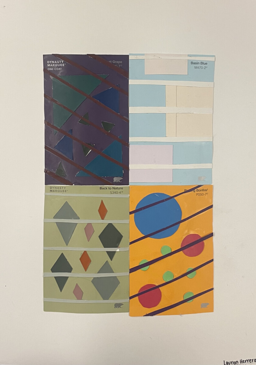
The main focus of this project is to understand how a variety of colors can be used in design to convey a message as well as vocabulary and elements that can help us identify them. To start, we used images of warm and cool tones to create a pixelated version, which displayed a range of hues although still falling in the same tone category. Next, we created our own tone grids using colored pencil, only using primary colors. Using what we know about color mixing, we created a grid using paint, creating different tones and intensities of primary and secondary colors. Also using paint, we created a saturation scale between two complimentary colors–I used red and green. Using paint samples, we displayed how colors may look different based on other colors they are placed with (simultaneous contrast). We also used paint samples to display both low and high intensity and tones in a collage form.
This was our longest project yet and I felt differently about each process. My favorite steps were painting the grid and saturation scale – it was therapeutic to work on in class but it was a bit tedious trying to stay within the lines/cleaning up edges. My least favorite was probably the colored pencil grids – after a while, it felt really limited since we could only use 3 colors, but it was also a good beginning step before painting. Overall, this project really helped me to completely understand the different elements of color and how it can be altered to create hues within a singular color.


Leave a Reply