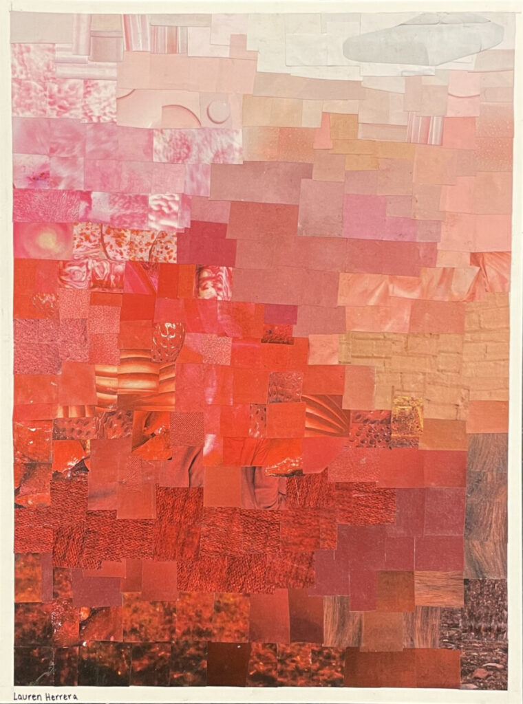


For this project, we needed to pick a primary or secondary color along with a range of shades from dark to light and organize them into a collage in whatever way we’d like as long as there is a visible gradient. I chose the color red and looked for pictures that varied from brown/deep maroon to light pink/white. I decided to order my collage from darker colors at the bottom to lighter colors at the top, with the more strictly red shades on the left and more of a neutral variation on the right with browns and whites.
Personally, I enjoyed this project the most out of all our projects so far. It was really fun going through magazines and looking out for different textures in different colors. This process helped me to not only identify several shades of a singular color but it also made me acknowledge and appreciate how much time and effort is put into visual design when it comes to magazines and other forms of photography. One thing I wish I would have done is keep the full shape of the objects I found with interesting textures, such as strawberries and ornaments, to preserve its singular uniqueness.


Leave a Reply