KFC
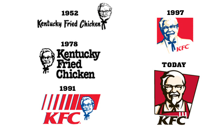
Kentucky Fried Chicken, or KFC is a famous fast food restaurant worldwide. The company was founded by Colonel Harland Sanders in 1952. At the time Colonel Sanders worked in a restaurant in Corbin, Kentucky where he became known for his seasoned chicken. Pete Harman a man who frequently came to the restaurant offered a business proposal to create their own chicken business together. They founded Kentucky Fried Chicken and soon became very popular eventually leading the company to expand worldwide.(Feloni) In 1991 the company name “Kentucky Fried Chicken” was changed to the abbreviation “KFC” to avoid negative reminder of the word “fried” because it applied fatty foods. The KFC logo is well designed and portrays the company’s heritage and what it’s about which is fried chicken made by Colonel Sanders.
In April 2007, San Francisco-based Tesser designed the new and current logo for KFC.(Tesser) It shows Colonel Sanders in a red cook’s apron instead his regular white suit jacket and features brighter colors and a friendlier view of the founder of KFC while still keeping the consistency with his black bow tie, glasses and goatee. The KFC logo uses a slightly modified version of the Friz Quadrata typeface. The use of color allows for good use of depth and dimension, and shading. Most companies don’t use a person as their logo and since KFC does it allows for more people to be interested in the product.
The new KFC logo has been designed to have a powerful effect on packaging, television, signage, and other marketing materials. It allows to leave a stronger visual impression across all mediums in which the previous logo failed. Although KFC’s logo has gone through a many changes in the past 65 years, one thing that hasn’t changed about the logo is the use of Colonel Sanders face. They have maintained the consistent visual identity of the logo. Because Colonel Sanders is the founder, KFC has kept his picture on their logo. The design of Colonel Sanders face has been evolved over time to appear friendlier over time.(Pena) When you look at the 1952 logo you can see the smile on Sanders face is more of a smirk. The most recent logo shows Sanders teeth are being shown when he smiles. A bigger smile makes Sanders appear more friendly and welcoming, inviting every customer to stop by and try out KFC. The sharp contrasts and simplified line work in the new logo make the Colonel more youthful, energetic and contemporary.
In the new logo Sanders is appeared to be wearing an apron, which reminds customers that he was more than just the face of KFC but he was a proud and passionate chef as well. The new logo also appears to have a richer colour palette. Black, white, rich reds and subtle flesh tones give the logo a warmer appearance. These colours also allow greater flexibility for use in both streetscape and consumer touchpoint applications. The color red in their logos is used by many companies because it stimulates hunger.(Associated Press) This is a great reason as to why the KFC logo is mostly red dominant. The red color in the logo has given KFC identity a more bold and energetic look and works well across different media from web to TV or print. All these new improvements to the logo allow for a better representation of the company and allow for better advertising. The KFC logo is definitely a well designed logo.
https://www.famouslogos.us/images/kfc-logo.jpg
SOURCES
- Feloni, Richard. “KFC Founder Colonel Sanders Didn’t Achieve His Remarkable Rise to Success until His 60s.” Business Insider. Business Insider, 25 June 2015. Web.
- “Tesser | Portfolio | Kentucky Fried Chicken.” Tesser | Portfolio | Kentucky Fried Chicken. N.p., n.d. Web.
- Pena, Anthony. “KFC Logo Design and Evolution.” KFC Logo Design and Evolution Comments. N.p., 12 Nov. 2016. Web.
- Associated Press. “KFC Unveils New Logo With Giant Image in Nevada Desert.” Fox News. FOX News Network, n.d. Web.
- “KFC: Finger Lickin’ Good.” KFC®: Finger Lickin’ Good®. N.p., n.d. Web.


