Ethics in Advertising and Marketing: 1A/B

1A. Ethics in design, advertising, and marketing provide guidelines for the creative community to adhere to. Design ethics both protect designers’ work from plagiarism & copyright violation but also encourage financially safe collaborations on original projects. When designers ignore ethics, they create opportunities for lawsuits, fines, and fees. 

In my internship, 100 Roses from Concrete’s Growth Initiative, we are already being introduced into the world of “free [and] fair use”.To prepare for client presentations and briefings, our creative team is tasked with creating slide decks to demonstrate our strategy, campaigns, & eventually our final presentation. In the creation of these slide decks, we are all conscientious of where we source our imagery from, whether directly from the client’s visual library or from stock image sites like Pexels and Pixabay, we ensure that the media we use are all non-licensable. Furthermore, in our ideation phase of the internship, we take caution to avoid ideas that are identical to those that have already been done by large non-profits or corporations in the past. We do this for a few reasons: to ensure that our marketing campaign is as interesting as possible, to carve out a new marketing strategy in our client’s niche that deeply resonates with our target audience, and to avoid accidental theft of intellectual property from our competitors. Another way design ethics is being implemented is in our final video we have the option to use National Geographic shooters that are partnered with our client organization. However, we have yet to clarify if these shots that we storyboard and they shoot would only be allowed to be used for the 30 seconds PSA it was intended for or on any and every other social media platform our client uses.

1b. For my internship we did not have to sign and NDA, however, we did have to consent to the use of our media for both promotional and educational materials that the organization would use or share in the future.

Resources:

Copyright AIGA
Use of Photography AIGA

https://learn-us-east-1-prod-fleet02-xythos.content.blackboardcdn.com/61aab133e7df2/24571489?X-Blackboard-S3-Bucket=learn-us-east-1-prod-fleet01-xythos&X-Blackboard-Expiration=1686970800000&X-Blackboard-Signature=t3yR1mMy4XSfqgL5C11RBPNnpep92PuUEbxD%2FOBMB2A%3D&X-Blackboard-Client-Id=100211&X-Blackboard-S3-Region=us-east-1&response-cache-control=private%2C%20max-age%3D21600&response-content-disposition=inline%3B%20filename%2A%3DUTF-8%27%27AIGA%2520Busines_Ethics%252047556733-Use-of-illustrations-1-MB.pdf&response-content-type=application%2Fpdf&X-Amz-Security-Token=IQoJb3JpZ2luX2VjEPb%2F%2F%2F%2F%2F%2F%2F%2F%2F%2FwEaCXVzLWVhc3QtMSJGMEQCIEZW1v0%2F%2BkUQRmkO7ekp2SMG5kCvp5%2Fe95Spg7mJnf28AiAOLG4kd3dRmS%2BPhv4ygfJtS18IB5UtMW3%2BIQH3acbchSqzBQhPEAMaDDYzNTU2NzkyNDE4MyIMZZGvVz4BMijI3yNkKpAF7Crwb0zoky3OqDj7l3BX58v2PiEfvwKOOeB%2FQgmd6FxZvnJcLVgnJGq9ImyrWXE2d174Ys32YcSFXeQzE7denikEe13Z5FR6%2FRdcHRaBEo%2BzXKS8yvQBamaXZ8pea3XvAC8Xc9uAvQBTMCOx7MFAjMSWkqMZbmbdmz7rqoShCxU0qZ6KorAx6%2Ffz1Y6Kp3gkohNMwIGwbkIg4%2FphNhU7juz3kj%2B6Rnfnplc7JhHHyfYwp5WdJ06zoihl3qwg3pr74OOc0x64n1LbUiGx9b1RaWi52eMNG2Cpl1puJplqMFwO3gXc4xCzmwwD2c4qHegXAeMsVBLyUMjveII%2Fg3kKv9vQ6dPgbabiDMfH8ycZASqqYDgeNrk2aCSyvSypyV%2BkFQTFeXQgzXqTKJri1B4SzwrLEq5yLdDyzKdLy%2BYS21835LZikSgzf%2F81tZE49i%2BYVAIhX%2BoBk%2F%2BBEMpG1BsU5Tttaa9Y4D%2F%2Bt570ZONJCTElsXkYxMX8An%2FpLLCORXEfFdahLHOuzhrnGh%2FrRqoyJRotAd4cLq8Gj82jOb8kfWvShh9xRTh0Zo0STHtYI4VMjmq9ucU8UsQ3kAXtvjkjSRbpYSVYLBwB4gBZwOF35UO%2BTaMORbAglRkX2C47w6hzCOPAMdkN%2BvVjEV8vlxs%2FN0Ch4nzj9vQ36lBzMchzY52HEvfoc7Ja8in%2FF9t%2FWWK%2FVsqejD12JfBxGsqyYHJO6oNtSmBl3Vj0wYGinWipb2zfE2IsoPL6SD1WbRZrMTjP3cxLWvxsjpUpZHZHbWcLpl097CljLuPtrdPT1uNNSK0VLyhOqaMSb8IeRjM4LC0lY9sfMkrGQ8wweoypNcvCFivDvt0vYcIp98qcPplwN7Iws7ezpAY6sgGowgAaUH7fEBLcKW972HcQkdOYkKc0LadddH%2F%2FeWRJ21OZFpF9AYefGX%2BW5sO2kcZzJ1SOrykSlfEnEC9Qherx1d%2Bz0m96GI6bWL7XLldDm%2B0Db58yuOU9P6dEIY1Kht%2B39IF4tUnA%2FX%2Bot2ySpQDmIdH%2F08YXzYKG%2BnW2qd6mr7ZyPxOvTA8e0DNMqU2SuzvNEzNxMRRyCC6HbFJpd3jm%2FFiXrsYSc45VnbM2v8THJwWj&X-Amz-Algorithm=AWS4-HMAC-SHA256&X-Amz-Date=20230616T210000Z&X-Amz-SignedHeaders=host&X-Amz-Expires=21600&X-Amz-Credential=ASIAZH6WM4PL77FGYNXV%2F20230616%2Fus-east-1%2Fs3%2Faws4_request&X-Amz-Signature=4af15ed9f12aae5cd656e393aac0f7eb47818dae2346288ab6ca8c02900b1e41

My Video “Artist Bio” Short Film

For my video project, I showcased my landscape and street photography alongside an ethereal track from YouTube. My greatest challenges were deciding what pictures to use while storyboarding and choosing which footage to use and which footage to cut out. I had a lot of trouble choosing which pictures to showcase. I decided to make the viewing experience more interactive by going out and taking new pictures and showing a video and me with the camera at the scene, then the final product directly after. I recorded around 20 minutes of B roll to ensure I’d have a transition into my slideshow. I color graded the videos I used and edited the photographs in Adobe Lightroom. I also had difficulty creating my title typography reveal effect. I enjoyed syncing the change of my photos with the music and am confident in the flow of my short film.

Visual Quote Project

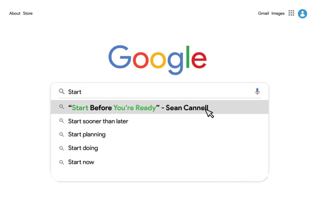
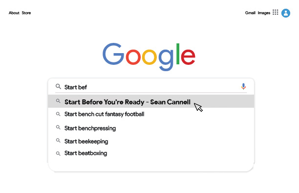
This postcard idea started out as one sketch of many. I knew I wanted to design something based on the UI of an internet browser, whether that be the google website or the windows interface, I wasn’t sure yet. This design is a collage of many images to make the Google homepage. I used a bold typeface and a slightly larger font along with the mouse icon and selection effect to create a focal point. I also ensured that the quote would come up first in search results to further. After further review, I concluded that the other search items took away from the postcard as a whole. I had initially used real google search terms to maintain accuracy. I implemented more related messages in my revised version to ensure that if the quote doesn’t hit home, one of the other statements will.
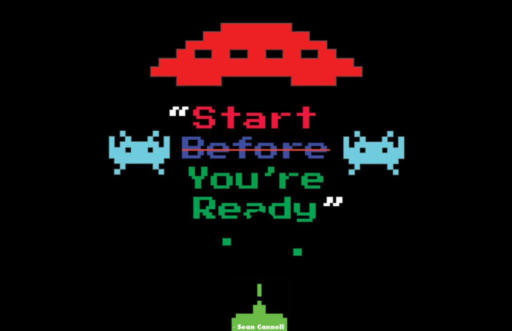
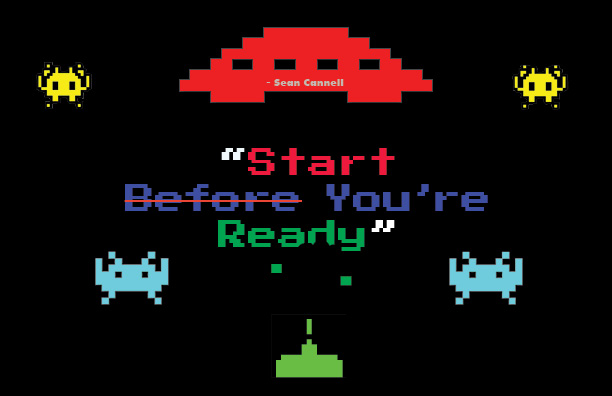
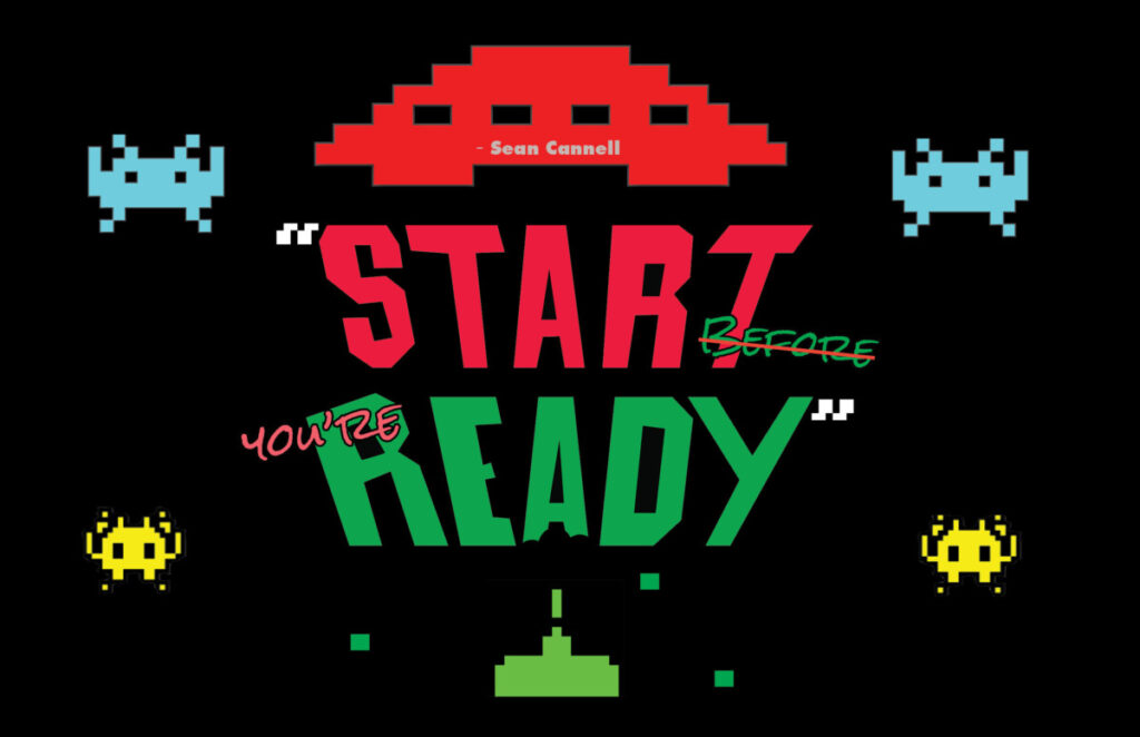
I created this postcard with the idea of creating a videogame theme. I used color to group sections of text together and center-aligned it to increase readability. I initially struggled with the alignment but after showing my drafts to my friends and getting their feedback I made a switch from “before you’re” being on the same line to stacking them. I made “Start” red to command action. “Before you’re” is blue to help the power words “Start [and] Ready” to stand out. “Ready” is green because green has a positive connotation in the gaming world. I used a strikethrough on “Before” so that it can also be read “Start, You’re Ready”, further calling my viewers to action. I used the iconic “Space Invaders” sprites to help portray that you’re in a videogame world while changing the background to black to match the game. I used an 8-bit typeface and added destruction effects on the bottom of “Ready” to add to the “Space Invaders” theme.
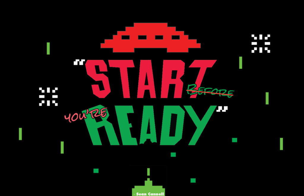
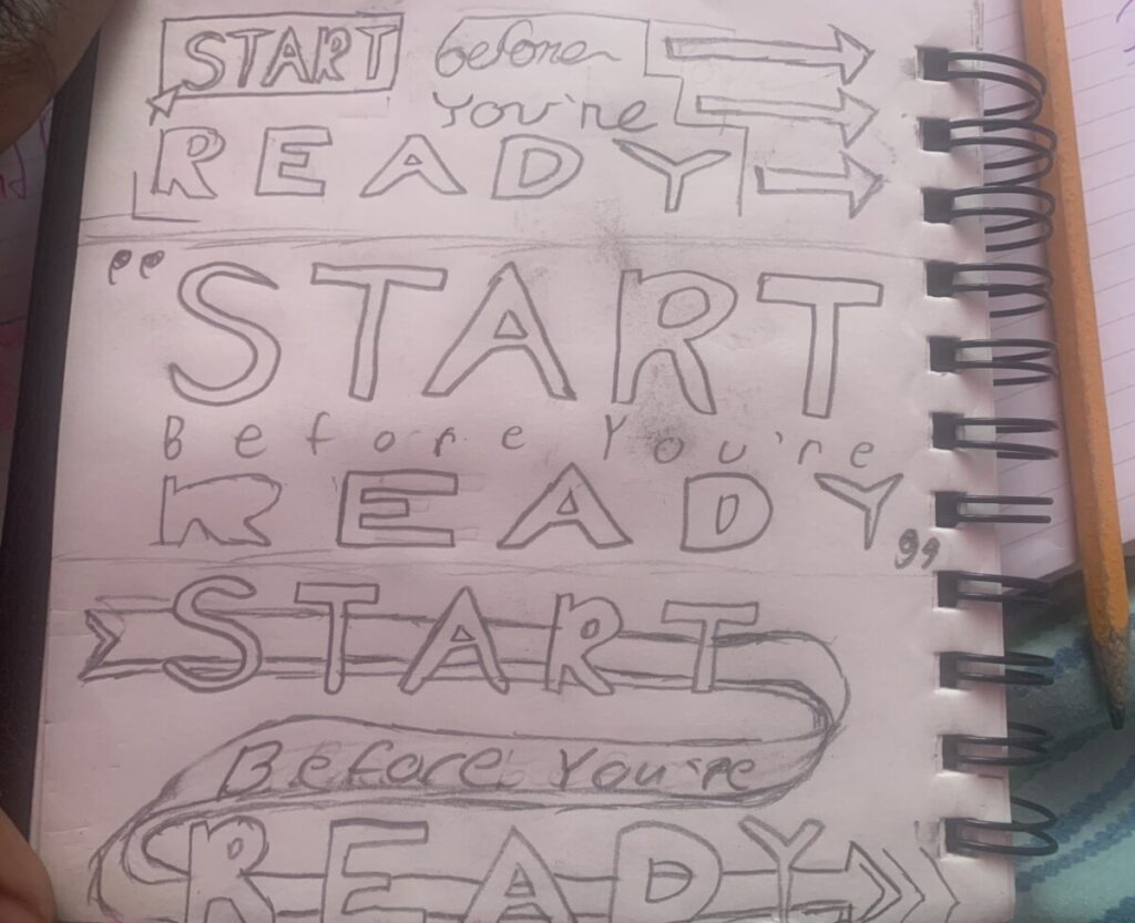
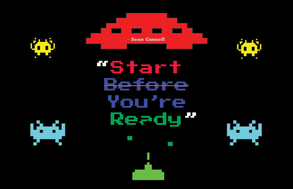
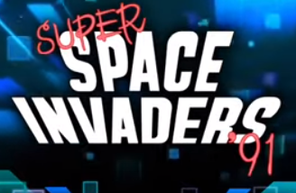
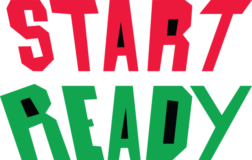
After a peer review of my previous postcard, I got the suggestions to make it more “Space Invaders” Esque, therefore I decided to try and implement the “Space Invaders” typeface to give a better impression of a title screen of a game. After some digging, I found out that the “Space Invaders” typeface is hand-drawn. I traced the style into my sketchbook and made reiterations using “Start [and] Ready” as substitutes for “Space [and] Invaders”. I struggled thinking of where to put “before you’re” in the design, but after seeing the 1991’ “Space Invaders” title I had a better idea of how to implement them. I also changed the placement of the quote attribution from the top center of the design to the bottom center.
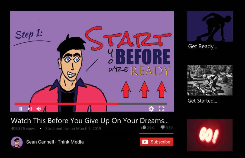
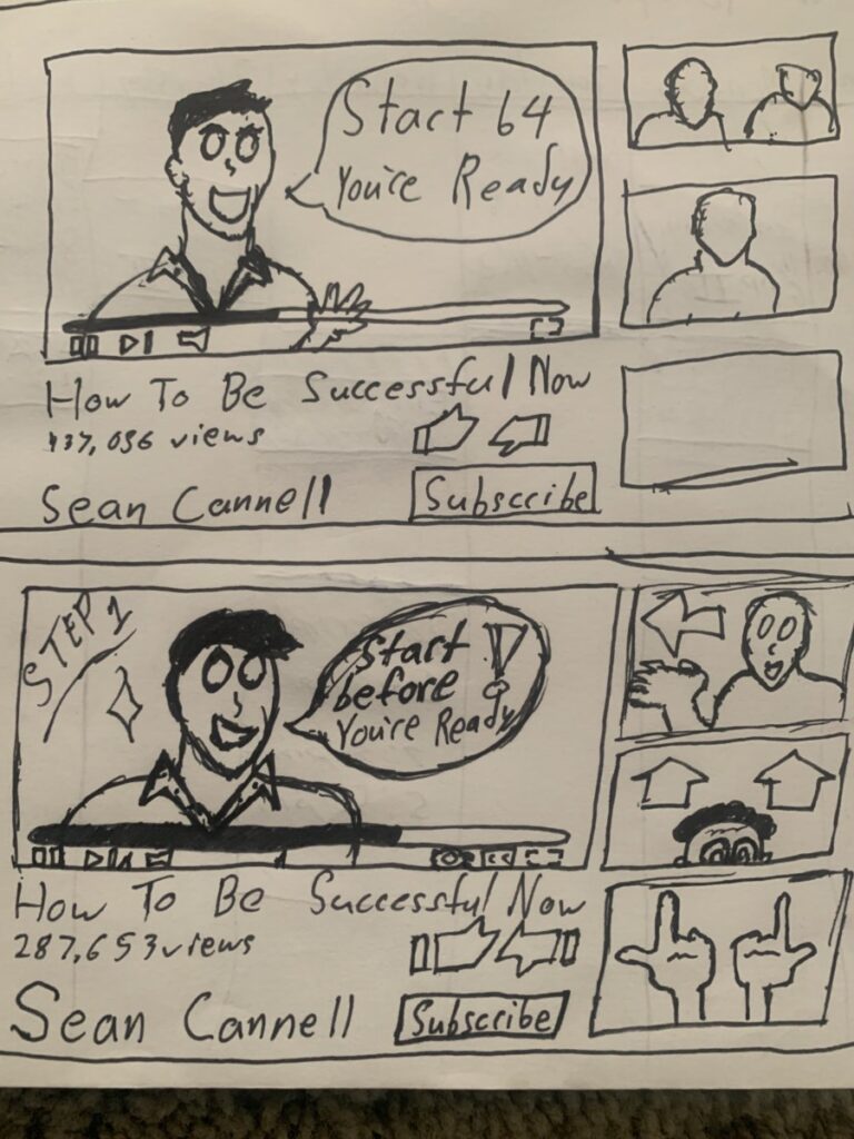
This postcard was my third concept inspired by my Google webpage postcard concept. I wanted to continue to embrace technology in my visual quote representations by emulating well-known websites. I had first encountered this quote “Start Before You’re Ready” in a YouTube video about how to start a YouTube channel. Using that as a base I created an iteration of the YouTube screen that is seen while watching a video. In the scene, I include the YouTube channel name instead of a conventional reference to the person who says the quote, as well as “subscribe, like [and] dislike” buttons to reinforce the YouTube theme. I also illustrated the subject in the video frame to force myself to become more comfortable incorporating illustrations into my designs. I changed the title of the video from “How To Start A YouTube Channel from 0” to “Watch This Before You Give On Your Dreams” to embody the inspiration I felt my first time hearing the quote. By changing the title I make the message of the quote applicable to anyone with aspirations and even those who have put their aspirations to the side. I intentionally made the quote visually entrancing and complex in comparison to the other text on the page to establish visual hierarchy (seeing the quote first, then the title of the video, then the channel name). I used uncopyrighted images for the thumbnails of the featured videos on the right side of the postcard.

The Process

The Exhibit “blue.” Art Analysis

The exhibit “blue.” at Nassau County Museum of Art is a showcase of the different forms that the primary color, blue, has taken in modern art.

This piece titled, “Air”, from Verve Editions by surrealist Joan Miró is one of the showcased works in the exhibit. It is a 14 x 10-inch lithograph created in 1930. I was drawn to this artistic print for its organic shapes and unique shading styles. This print is divided into thirds vertically, with a cream-colored, mountainous structure at the bottom third of the page, and a deep royal blue fill for the background in the remaining two-thirds of the page. The foreground of this print is tattered with peculiar shapes and figures created by curves and colors. The colors used for these figures are red, green, black, and cream. The large red and black circle reminds me of the setting sun descending behind a mountainous landscape. However, assuming that the black gradients on the shapes are shading, the red circle being a light source becomes an inconsistent part of the lithograph’s narrative. There are small faces in some of the figures, suggesting that there is life in the landscape. Even so, the almost random design of the shapes makes it difficult to tether their form to specific animals. The captivating curvature of the figures creates very interesting shapes with the negative blue space of the lithograph.


This piece titled, “ Moonscape” by pop artist Roy Lichtenstein is another work showcased in the “blue.” This work is a 50.6 x 60.8 cm screenprint on plastic created in 1965. I initially thought this was a painting because of the textured water-like background. The background has a shifting wave-like appearance created from the use of light blue and royal blue together. The use of lighter hues of blues creates a ripple effect and the illusion that there is moonlight hitting the surface of the tides. My specific referral to moonlight is not random; there is a small light gray circle in the top middle portion of the page. The circle is small and slightly positioned to the right of the center, which seems to be divided by the ripple found in the first “wave” depicted in the background. The foreground is an overlay of pop art photographs, the top third of the page uses a red and white dotted pattern, reminding me of a comic book. The bottom quadrant of the foreground is the same form as the above dotted visual element, without color or the pattern. The blues appear differently next to the black compared to the red and white pattern.

This painting featured by “blue.” is titled “Poetic Water” from Hymns To Nature by Cao Jan. This work appears to be formless, created without a grid, as a depiction of the push and pull of the washy textures and colors of the ocean. Even so, some form can be spotted by the diagonal line in the center of the piece created by a convergence of two tides. This painting uses a beautiful range of deep and light blues to depict the solitude of the still ocean and the movement of washy white waves. 

Raster and Vector Graphics Project

Project Description

Nulla quis lorem ut libero malesuada feugiat. Curabitur non nulla sit amet nisl tempus convallis quis ac lectus. Quisque velit nisi, pretium ut lacinia in, elementum id enim. Nulla porttitor accumsan tincidunt.

Reflection

Donec rutrum congue leo eget malesuada. Curabitur non nulla sit amet nisl tempus convallis quis ac lectus. Curabitur aliquet quam id dui posuere blandit. Quisque velit nisi, pretium ut lacinia in, elementum id enim. Quisque velit nisi, pretium ut lacinia in, elementum id enim. Nulla porttitor accumsan tincidunt. Vivamus magna justo, lacinia eget consectetur sed, convallis at tellus. Vivamus suscipit tortor eget felis porttitor volutpat. Mauris blandit aliquet elit, eget tincidunt nibh pulvinar a. Vestibulum ac diam sit amet quam vehicula elementum sed sit amet dui.

Additional Images

Foundation Drawing Project

Project Description

Nulla quis lorem ut libero malesuada feugiat. Curabitur non nulla sit amet nisl tempus convallis quis ac lectus. Quisque velit nisi, pretium ut lacinia in, elementum id enim. Nulla porttitor accumsan tincidunt.

Reflection

Donec rutrum congue leo eget malesuada. Curabitur non nulla sit amet nisl tempus convallis quis ac lectus. Curabitur aliquet quam id dui posuere blandit. Quisque velit nisi, pretium ut lacinia in, elementum id enim. Quisque velit nisi, pretium ut lacinia in, elementum id enim. Nulla porttitor accumsan tincidunt. Vivamus magna justo, lacinia eget consectetur sed, convallis at tellus. Vivamus suscipit tortor eget felis porttitor volutpat. Mauris blandit aliquet elit, eget tincidunt nibh pulvinar a. Vestibulum ac diam sit amet quam vehicula elementum sed sit amet dui.

Additional Images

Type and Media Project

Project Description

Nulla quis lorem ut libero malesuada feugiat. Curabitur non nulla sit amet nisl tempus convallis quis ac lectus. Quisque velit nisi, pretium ut lacinia in, elementum id enim. Nulla porttitor accumsan tincidunt.

Reflection

Donec rutrum congue leo eget malesuada. Curabitur non nulla sit amet nisl tempus convallis quis ac lectus. Curabitur aliquet quam id dui posuere blandit. Quisque velit nisi, pretium ut lacinia in, elementum id enim. Quisque velit nisi, pretium ut lacinia in, elementum id enim. Nulla porttitor accumsan tincidunt. Vivamus magna justo, lacinia eget consectetur sed, convallis at tellus. Vivamus suscipit tortor eget felis porttitor volutpat. Mauris blandit aliquet elit, eget tincidunt nibh pulvinar a. Vestibulum ac diam sit amet quam vehicula elementum sed sit amet dui.

Additional Images

Graphic Design Principles 1 Project

Project Description

Nulla quis lorem ut libero malesuada feugiat. Curabitur non nulla sit amet nisl tempus convallis quis ac lectus. Quisque velit nisi, pretium ut lacinia in, elementum id enim. Nulla porttitor accumsan tincidunt.

Reflection

Donec rutrum congue leo eget malesuada. Curabitur non nulla sit amet nisl tempus convallis quis ac lectus. Curabitur aliquet quam id dui posuere blandit. Quisque velit nisi, pretium ut lacinia in, elementum id enim. Quisque velit nisi, pretium ut lacinia in, elementum id enim. Nulla porttitor accumsan tincidunt. Vivamus magna justo, lacinia eget consectetur sed, convallis at tellus. Vivamus suscipit tortor eget felis porttitor volutpat. Mauris blandit aliquet elit, eget tincidunt nibh pulvinar a. Vestibulum ac diam sit amet quam vehicula elementum sed sit amet dui.

Additional Images