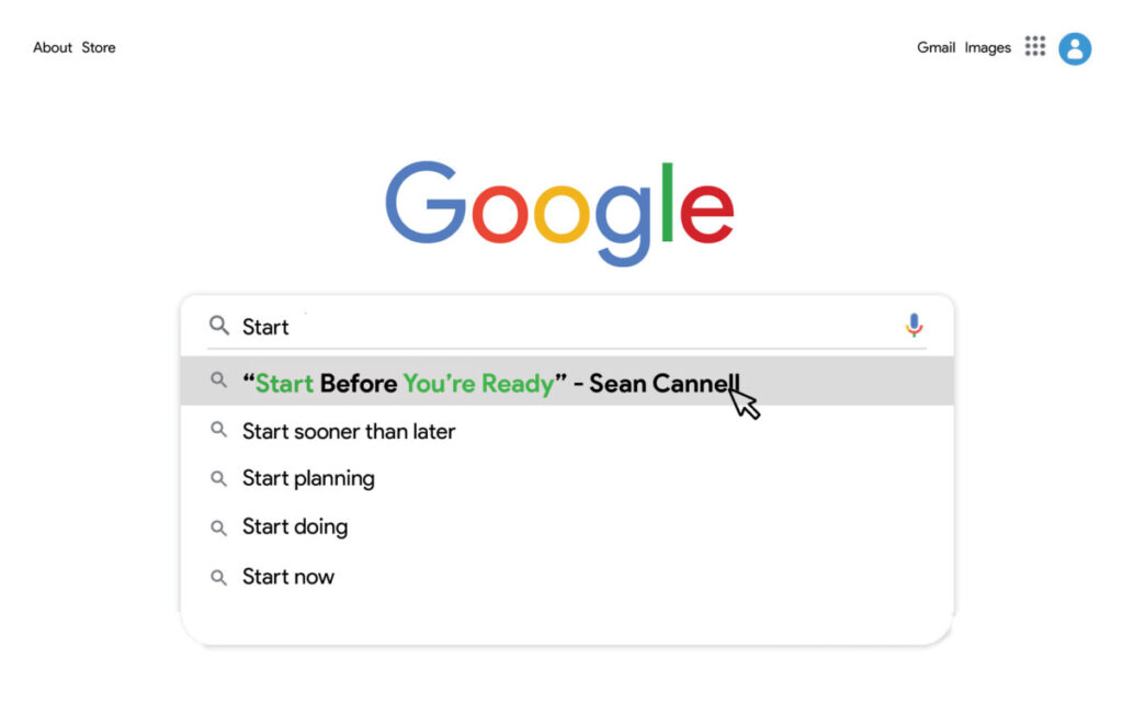
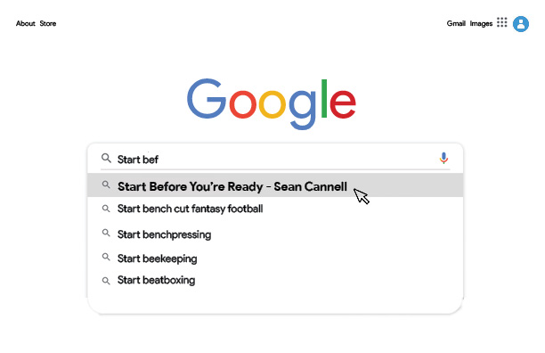
This postcard idea started out as one sketch of many. I knew I wanted to design something based on the UI of an internet browser, whether that be the google website or the windows interface, I wasn’t sure yet. This design is a collage of many images to make the Google homepage. I used a bold typeface and a slightly larger font along with the mouse icon and selection effect to create a focal point. I also ensured that the quote would come up first in search results to further. After further review, I concluded that the other search items took away from the postcard as a whole. I had initially used real google search terms to maintain accuracy. I implemented more related messages in my revised version to ensure that if the quote doesn’t hit home, one of the other statements will.I created this postcard with the idea of creating a videogame theme. I used color to group sections of text together and center-aligned it to increase readability. I initially struggled with the alignment but after showing my drafts to my friends and getting their feedback I made a switch from “before you’re” being on the same line to stacking them. I made “Start” red to command action. “Before you’re” is blue to help the power words “Start [and] Ready” to stand out. “Ready” is green because green has a positive connotation in the gaming world. I used a strikethrough on “Before” so that it can also be read “Start, You’re Ready”, further calling my viewers to action. I used the iconic “Space Invaders” sprites to help portray that you’re in a videogame world while changing the background to black to match the game. I used an 8-bit typeface and added destruction effects on the bottom of “Ready” to add to the “Space Invaders” theme.After a peer review of my previous postcard, I got the suggestions to make it more “Space Invaders” Esque, therefore I decided to try and implement the “Space Invaders” typeface to give a better impression of a title screen of a game. After some digging, I found out that the “Space Invaders” typeface is hand-drawn. I traced the style into my sketchbook and made reiterations using “Start [and] Ready” as substitutes for “Space [and] Invaders”. I struggled thinking of where to put “before you’re” in the design, but after seeing the 1991’ “Space Invaders” title I had a better idea of how to implement them. I also changed the placement of the quote attribution from the top center of the design to the bottom center.This postcard was my third concept inspired by my Google webpage postcard concept. I wanted to continue to embrace technology in my visual quote representations by emulating well-known websites. I had first encountered this quote “Start Before You’re Ready” in a YouTube video about how to start a YouTube channel. Using that as a base I created an iteration of the YouTube screen that is seen while watching a video. In the scene, I include the YouTube channel name instead of a conventional reference to the person who says the quote, as well as “subscribe, like [and] dislike” buttons to reinforce the YouTube theme. I also illustrated the subject in the video frame to force myself to become more comfortable incorporating illustrations into my designs. I changed the title of the video from “How To Start A YouTube Channel from 0” to “Watch This Before You Give On Your Dreams” to embody the inspiration I felt my first time hearing the quote. By changing the title I make the message of the quote applicable to anyone with aspirations and even those who have put their aspirations to the side. I intentionally made the quote visually entrancing and complex in comparison to the other text on the page to establish visual hierarchy (seeing the quote first, then the title of the video, then the channel name). I used uncopyrighted images for the thumbnails of the featured videos on the right side of the postcard.