The exhibit “blue.” at Nassau County Museum of Art is a showcase of the different forms that the primary color, blue, has taken in modern art.

This piece titled, “Air”, from Verve Editions by surrealist Joan Miró is one of the showcased works in the exhibit. It is a 14 x 10-inch lithograph created in 1930. I was drawn to this artistic print for its organic shapes and unique shading styles. This print is divided into thirds vertically, with a cream-colored, mountainous structure at the bottom third of the page, and a deep royal blue fill for the background in the remaining two-thirds of the page. The foreground of this print is tattered with peculiar shapes and figures created by curves and colors. The colors used for these figures are red, green, black, and cream. The large red and black circle reminds me of the setting sun descending behind a mountainous landscape. However, assuming that the black gradients on the shapes are shading, the red circle being a light source becomes an inconsistent part of the lithograph’s narrative. There are small faces in some of the figures, suggesting that there is life in the landscape. Even so, the almost random design of the shapes makes it difficult to tether their form to specific animals. The captivating curvature of the figures creates very interesting shapes with the negative blue space of the lithograph.
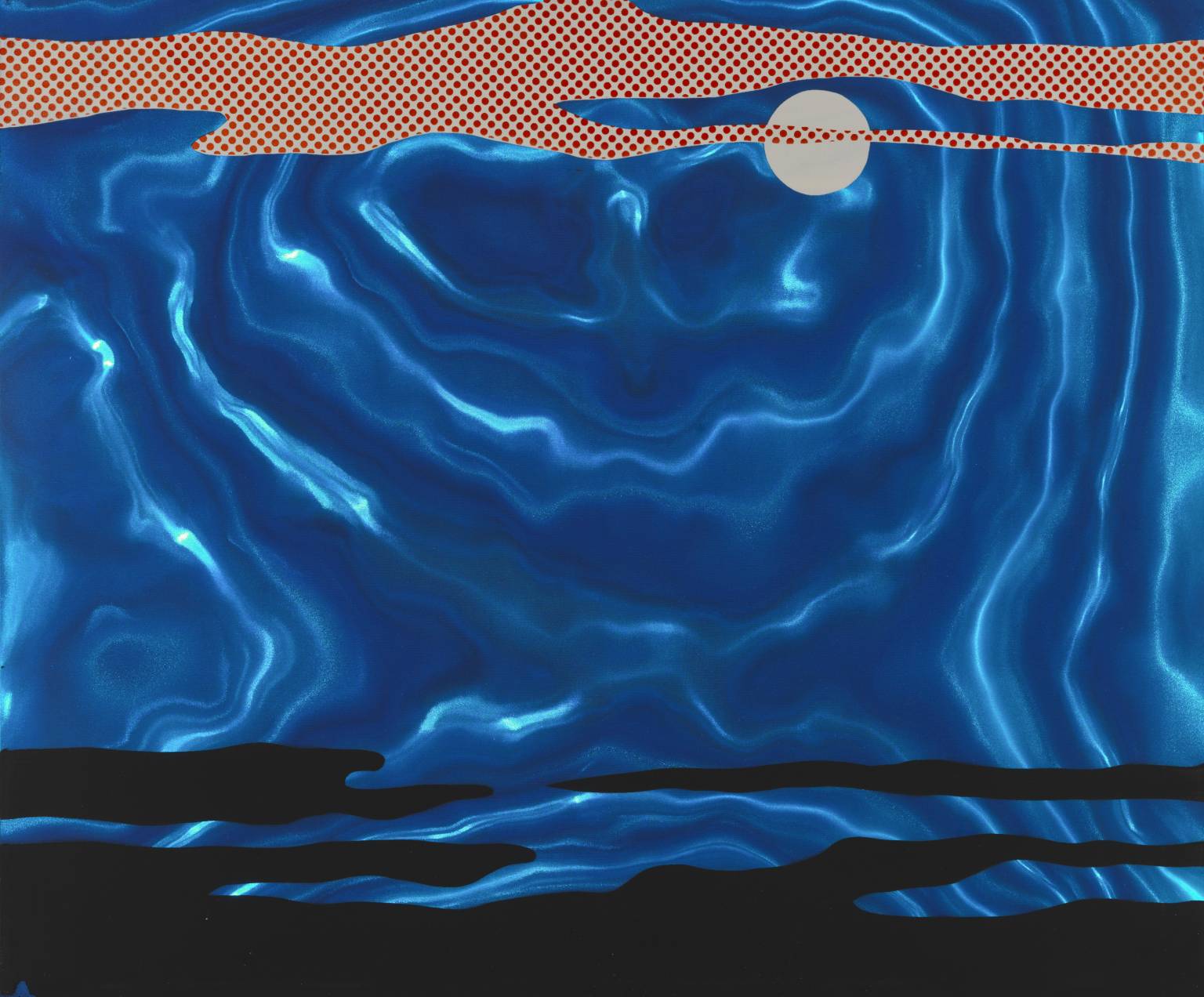
This piece titled, “ Moonscape” by pop artist Roy Lichtenstein is another work showcased in the “blue.” This work is a 50.6 x 60.8 cm screenprint on plastic created in 1965. I initially thought this was a painting because of the textured water-like background. The background has a shifting wave-like appearance created from the use of light blue and royal blue together. The use of lighter hues of blues creates a ripple effect and the illusion that there is moonlight hitting the surface of the tides. My specific referral to moonlight is not random; there is a small light gray circle in the top middle portion of the page. The circle is small and slightly positioned to the right of the center, which seems to be divided by the ripple found in the first “wave” depicted in the background. The foreground is an overlay of pop art photographs, the top third of the page uses a red and white dotted pattern, reminding me of a comic book. The bottom quadrant of the foreground is the same form as the above dotted visual element, without color or the pattern. The blues appear differently next to the black compared to the red and white pattern.

This painting featured by “blue.” is titled “Poetic Water” from Hymns To Nature by Cao Jan. This work appears to be formless, created without a grid, as a depiction of the push and pull of the washy textures and colors of the ocean. Even so, some form can be spotted by the diagonal line in the center of the piece created by a convergence of two tides. This painting uses a beautiful range of deep and light blues to depict the solitude of the still ocean and the movement of washy white waves.

