What is Accessibility?
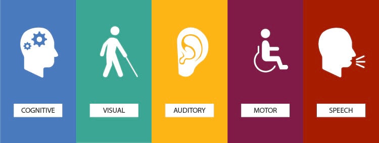
Accessibility to me means creating visual content that is not only aesthetically pleasing but also user-friendly for people with diverse abilities. It means thinking beyond the visual attraction and considering how color, font styles, and layout impact the overall accessibility of the design. For example, ensuring sufficient color contrast makes the content readable for people with visual impairments, and using clear and legible fonts benefits people with reading difficulties. As a graphic designer, incorporating accessibility features into designs enhances the user’s functionality with your product and experience. In addition, accessibility is not just a technical consideration but also an ethical one. It’s acknowledging the diversity of your audience and recognizing that good design should be accessible to all. As a graphic designer, accessibility principles demonstrate a commitment to creating designs that are not only visually appealing but also considerate of the needs pertaining to the audience.
How am I applying it to my internship?
So far in my internship, I’ve been designing with accessibility applying its principles and disciplines as a designer. In one of my many assignments, I designed Cover slides, including elements such as logos, colors, and fonts to maintain consistency with the college institution’s visual identity. I also ensured the contrast between text and background did not clash to enhance readability while keeping a clean minimalist approach.


