Author: Jia Ling Lin Huang (Page 1 of 2)

Choi, Kyoungho, et al. “Evaluating Olympic Pictograms Using Fuzzy TOPSIS-Focus on Judo, Taekwondo, Boxing, and Wrestling.” International Journal of Environmental Research and Public Health, vol. 19, no. 7, Mar. 2022. EBSCOhost, https://doi-org.citytech.ezproxy.cuny.edu/10.3390/ijerph19073934.
Garcia, Beatriz. “One Hundred Years of Cultural Programming within the Olympic Games (1912-2012): Origins, Evolution and Projections.” International Journal of Cultural Policy, vol. 14, no. 4, Nov. 2008, pp. 361–76. EBSCOhost, https://doi-org.citytech.ezproxy.cuny.edu/10.1080/10286630802445849.
Kim, Sojung. Trends in Olympic Pictograph Design: A Comparative Study Using Olympic Games’ Sports Symbols, PJIM Parson Journal for Information Mapping, 2012, http://www.piim.newschool.edu/journal/issues/2012/04/pdfs/ParsonsJournalForInformationMapping_Kim_SoJung.pdf.
Ya-Chieh Lee, and Ming-Chyuan Ho. “The Cultural Identity of Image Design, with Olympic Games as Example.” International Journal of the Humanities, vol. 7, no. 4, July 2009, pp. 167–74. EBSCOhost, https://doi-org.citytech.ezproxy.cuny.edu/10.18848/1447-9508/CGP/v07i04/42660.
According to “The Underground Mainstream” by Steven Heller said “Commercial culture depends on the theft of intellectual property for its livelihood. Mass marketers steal ideas from visionaries, alter them slightly if at all, then reissue them to the public as new products”. In a certain way, it is true. I think that most the trendings or cultural movements have like a cycle, a person or a small group of people create or form the movement, and then they started to gain followers until in some way explote as a boom that became popular or commercial. It must be said that not every underground movement experiments with the boom however in the last years we experienced how the underground culture explote and started to be mainstream. For example, electronic music in the early ’90s and 2000s was considered an experimental music genre and was very underground. Listening to electronic music at this time was considered a friki or weird kid. I remember listening to Daft Punk, Deadmau5, Claptone, Carl Cox, and others not popular DJs at this period until David Guetta appears and breaks the music scene. I considered David Guetta as the most important mainstream DJ that popularize this genre around the world. I don’t go to say that his songs are bad but, in my personal opinion when an underground culture became commercial and mainstream the own movement lost its identity. In 2011 with the song “Titanium” with Sia, he mixed the pop and the electronic sounds and create something spectacular. However, since this song has been released the electronic music begins to lose that grace, that rhythm that makes them unique from other music genres. After that song, many DJs released more hits but the identity of the electronic genres start to be lost and then became a mixture of modern pop with monotonous and boring rhythms. And these happened with others music genres and artist like the rock (that some bands evolved to a kind of pop also), indie or hip-hop. And also, is not happening only in music, it is happend in almost everything. The sneakerheads, bloggers, YouTubers, streamers, design movements, ideas, internet subculture, etc.
KEY WORDS
- Imitary
- Image
- Sign
- Symbol
- Linguistic
- Message
- Code
- Italianicity
- Cultural message
- Literal message
- Symbolic message
- Rhetoric
- Anchorage and relay
UNKNOWN WORDS
- Ontology
- Tautological
- Polysemous
- Denotational
- Connotational
- Syntagm
- Metalanguage
NOTES
- “Thus we find ourselves immediately at the heart of the most important problem facing the semiology of images: can analogical representation (the”copy”) (produce true systems of signs and not merely simple agglutinations of symbols?” – What is the difference between sign and symbol? I don’t quite understand.
- “image is an extremely rudimentary system in comparison with language and those who think that signification cannot exhaust the image’s ineffable richness”
- “The linguistic message is this twofold (at least in this particular image): denotational and connotational” – What does the author want to mean by denotational and connotational?
- “message without a code” – I don’t understand what this means.
- “Does the image duplicate certain of the information given in the text by a phenomenon of redundancy or does the text add fresh information to the image?”
- What are anchorage and relay according to the author?
- “the anchorage may be ideological and indeed this is its principal function; the text directs the reader through the signifieds of the image, causing him to avoid some and receive others; by means of often subtle dispatching,t remote-controls him towards a meaning chosen in advance.” – ????
- “the words, in the same way as the images, are fragments of a more general syntagm and the unity of the message is realized at a higher level, that of the story, the anecdote, the diegesis…” – What syntagm means?
- “This evictive state naturally corresponds to a plenitude of virtualities: it is an absence of meaning full of all the meanings… but this intelligibility remains virtual by reason of its very poverty, for everyone from a real society always disposes of knowledge superior to the merely anthropological and perceives more just than the letter.” – ?????????
- Photography and drawing
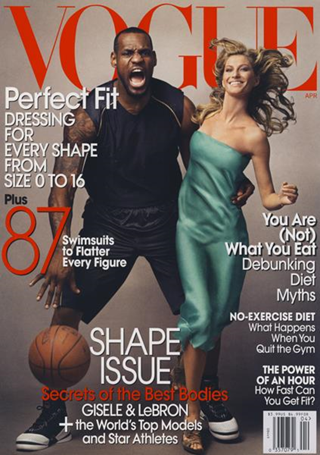
Lebron James and Gisele Bündchen. Lebron was the first African American man that appears on the cover of this magazine. However, this was a very controversial photo because “For many, the Vogue cover, which was shot by renowned photographer Annie Leibovitz, resembled images of “King Kong, casting James as the dangerous (black) gorilla and Bündchen as the helpless (white) damsel.” In other words, it shows how racism is rooted in the subconscious of our society.
Ott, Brian L., and Robert L. Mack. “Cultural Analysis.” Critical Media Studies: An Introduction, Wiley-Blackwell, 2014, p. 153.
Adidas “Here to Create” shows that no matter the sport, fitness, race, and gender, everyone wears Adidas.
Google Pixel 2 and the National Suicide Prevention Lifeline raise awareness about depression and suicide by showing multiple kinds of people, doesn’t matter if they look happy, their gender, age, or race everyone can be affected and we should care about our mental health.
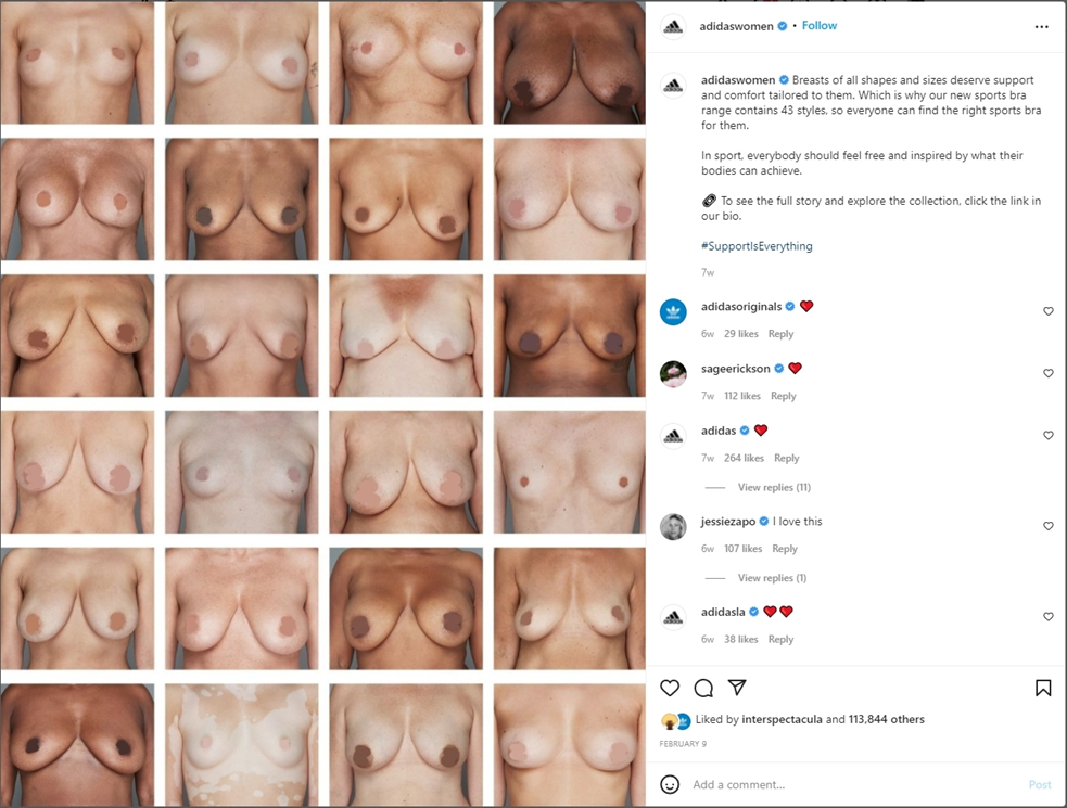
Adidas shows a variety of breast shapes and sizes without sexualizing the woman and without giving importance to physical appearance or race. With the premise, “All women deserve the best support” they want to normalize body diversity saying that Adidas has bras for all kinds of women.
I read the photobook “The Medium is the Massage: An Inventory of Effect” by McLuhan and Quentin Fiore in 1967. In there McLuhan considers the media as an extension of the human sense and life. At first, I thought media was just the way humans generally communicate, like radio, TV, the internet, etc. but after reading McLuhan I consider that the media is everything that the human being creates and uses to transfer and perceive the senses and human activities outside the body like his of the wheel as an extension of our feet, the clothes as an extension of our skin or the book as an extension of our eyes.
Also, the text says that the media are present in every aspect of our society and have been constantly changing and reshaping our society. McLuhan said, “It’s impossible to understand social and cultural changes without knowledge of the working of media”. One example of that is the internet that leads the subculture of the internet, like the gamers, geeks, trolls, fandoms, lurkers, memers, etc. And this whole subculture of the internet and social media will continue to change as new ideas and technologies arrive.
One thing that worried me a lot is that media is extremely influential. McLuhan said that “The wordpool of information fathered by electric media …. far surpasses any possible influence mom and dad can now bring to bear.” And this is true, the books, videos, internet tutorials, etc helps us to increase our knowledge faster and easier compared with past years. However, as easy and fast can change our interpretation of the world, for example, fake news or radical ideas. I think that designers have a huge and important moral responsibility for what we show to the world through media.
All the readings talk about the creation of universal design standards, which focus on the management of spaces and the clarity with which the message is visually transmitted. Müller-Brockmann with his text “Grid and Design Philosophy” focused on the idea of dividing, organizing, and arranging different elements of the design composition and the space using a grid system. He said that “This is the expression of a professional ethos: the designer’s work should have the clearly intelligible, objective, functional, and aesthetic quality of mathematical thinking”. And I think that this is the main goal of every designer, create something that everyone receives and clearly understands the message. Also, I want to focus my career path on designing websites and mobile applications so using the grid is very important to understand how to manage the space and arrange different elements (like text, pictures, icons, etc.) that go on the website or app.
Jan Tschichold’s text “The New Typography” and Karl Gerstner’s text “Designing Programmes” focus on typography and space. Gerstner wrote “The creative process is to be reduced to an act of selection. Designing means: to pick out determining elements and combine them.” And in one way, we combine images, fonts, colors, shapes, etc., in such a way that it has an aesthetic or visually attractive form both for us and for the public. And each element also has its own change selection, like his example of selecting a font (font-family, serif, sanserif, size, italic, oblique, thickness, color, flush left, flush right, justify, opacity, cursive, kerning, etc.). On the other hand, Tschichold talks about the clarity and the legibility of old and new fonts. He said that the new fonts are less ornamented compared with the old ones, so are clearer to read. He said that “The function of printed text is communication, emphasis (word value), and the logical sequence of the contents.” In other words, he focused on the hierarchy and the type of management of the words and lines, so the main information stands up from the other. These three readings are very important today because we massively consume visual images thanks to the internet and other mass media in such a short time that clarity and visual impact is very important to caught people’s attention.
According to the readings, Herbet Bayer’s text “On typography” talks about how important typography is for the Bauhaus, looking for universal typography that sought clarity, consistency, precision, and balance between the black of the ink and the white of the paper. He also talks about the adaptation of the artist and typography with technology, where it is used as a tool for mass production. He also criticizes the importance that society has on typography. Bayer says that typography “it has no adequate place of recognition in our institutions of culture. the graphic designer is designated with the minimizing term “commercial” and is generally ignored as compared to the prominence accorded by the press to architecture and the “fine arts.”. And it is true, many people do not take into account the power and usefulness of using different types of typography correctly. For example, I’ve seen a lot of “watch out” or “watch out for the dog” signs in the comic sans font, when it evokes a childlike tone. Also, very few people I know the importance of different fonts like Helvetica or Futura.
I also find the Typophoto that László Moholy-Nagy talks about very interesting. I like the combination of the shape of the letters with photography. I find it interesting and adds visual value and a unique aesthetic to the typeface. his mission was the inclusion of technology in art, in the case of Typophoto the mixture of the camera with the abstract forms of letters.


Recent Comments