These 4 photos were my choice throughout the Final project, which is why I printed them. The color cast here is probably due to the images still being in Prophoto RGB. I will explain each image and why I’ve taken them.
Topic: A day in a photographer’s life
 This first image, is of my main assistant Alex. I utilized the rule of thirds and framed him with the trees. The reason why I like this shot is because of the light and dark contrast between the tree on the left and tree on the right, also the light and dark contrast on the grass on the floor.
 This image, is more of a stark contrast between my work, and the reason why I included this shot in the series although it isn’t a portrait, is because it captures my nature as a traveling photographer- even though most of the time I pick up the camera to shoot only portraits, I found this scene interesting, especially since I had the 16-35 mounted and I could create a huge distortion of leading lines to the main subject, which is the acrobatics athlete, framed with the arch.
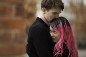
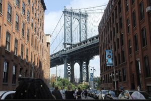
  This third image is an example of what I do most often. A lot of my shoots work around couples, and this shot and subsequently the whole shoot was quite interesting for me, because one of the subjects had such a strong pink hair color, and I was at Brooklyn Bridge Park and had to figure out how to use the light to my advantage. Surprisingly, there isn’t a whole lot of pink in that park, so I used the red from a brick wall instead. This was taken at 200mm, with the brick wall on the left side being near, and the subjects being actually very far away, more than 30 ft away. It gives off the illusion that the subject is nearby and I cut off the male subject’s head for a sense of intimacy; I have another shot where his head is not cut off and it feels a lot less intimate to me.
 This shot actually wasn’t printed, and I decided to write about it here because of the sheer expression on my assistant’s face. Alex had a long childhood and was a Boy Scout (now Eagle Scout) and instead of playing around at playgrounds like this one, he was busy volunteering and being at camp. This small, derelict park is under the Williamsburg bridge on the Manhattan side. I used the rule of thirds to frame the subject, Alex, but I also really wanted that whole slide in there, and in the foreground, I added a bit of a distraction to add to the dissonance of the scene- to connect with the facial expression of Alex, showing that he hasn’t been to a playground, derelict or not, in a while.
This project was actually great practice for me, and it reminded me what creativity really felt like no matter what my surroundings were.



 This first image, is of my main assistant Alex. I utilized the rule of thirds and framed him with the trees. The reason why I like this shot is because of the light and dark contrast between the tree on the left and tree on the right, also the light and dark contrast on the grass on the floor.
