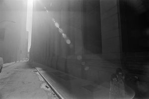
In the photograph called “Children near Ground Zero” by Eugene Richards is showing 2 children covering their mouth because of all the dust that cover throughout Manhattan. There’s also a sun glare that partially blocks the image of the two girls at the side of the photograph. Which kinda makes you not see the 2 girls at the corner in the first place. The streets look abandoned after all that happen at 9/11 and all you see is the 2 girls walking on the sidewalks alone holding probably a piece of paper on their mouth to prevent future health problems and avoid inhaling dust. The black and white filter makes the photograph look more of a sad look to the situation and brings sympathy to the viewers of the photograph.
In the photograph “Children near Ground Zero” it shows leading lines, diagonals and patterns and repetition. Leading lines is shown with the sidewalk.The lines make you look all the way down the block, almost making you ignore the two girls in the front of the picture.With diagonals one example would be the sidewalks I mentioned before, but another example would be the windows on the building on the right.The diagonal with the windows almost connect with the diagonal with the sidewalks creating this illusion of a vanishing point that further draws the viewer to look down the street.Another “coincidental” diagonal is the suns glare in the middle of the photo, it almost disrupts the parallel diagonal lines with the windows and the sidewalk on the right. Patterns and repetition can also be shown in the windows and the Columns on the right. It’s the same space between each window and the same exact window. This repeats all the way until our eyes reach the vanishing point where we can’t see it anymore.


Leading lines should lead to something-generally the most important thing in the picture. I would call the lines of the sidewalk and street perspective. As you say they are leading away from the girls (not towards them).