Due: 11:30, Monday, 3/28
Goal: Refine composition.
Objective: Create a structure that communicates.
To Do
-
- refine your alignment
1. alignment
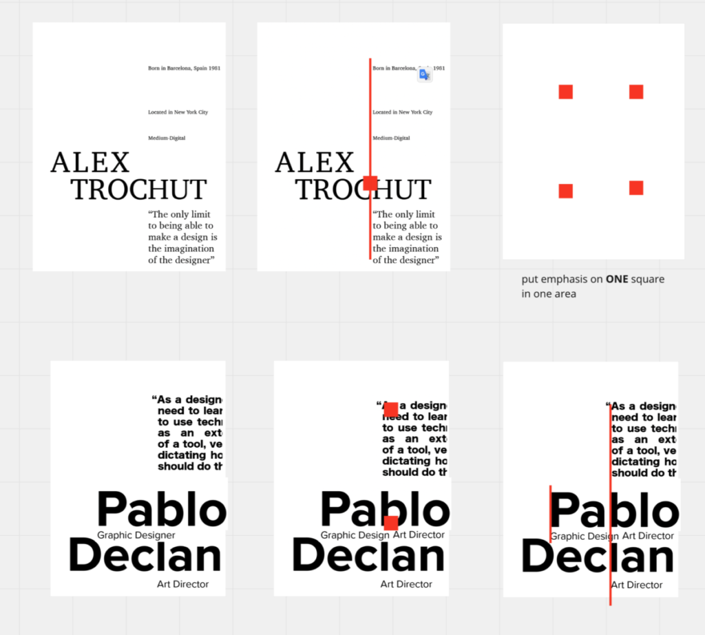
Revise your 11 x 17 document with the language of your influencer
1 Incorporate these elements
1. your influencer’s alignment
2. your influencer’s proportion
3 . your influencer’s typeface
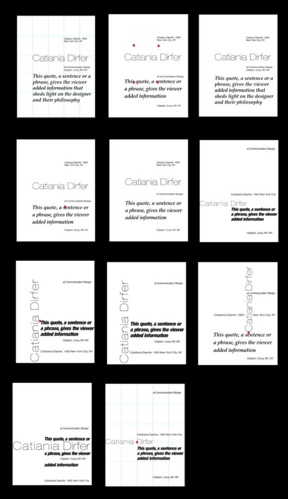
2 Present 3 version with and without grid
Remember use 3 different sizes and styles at most show a HUGE change of scale at this size align to the grid, not to the edge of the page group elements to allow for white space at the top or left side of your composition
3. Upload to Miro
Remember:
Define your grid on all compositions:
Make the grid structure obvious with the position of your elements.
• To define the grid, one of the edges of the type column MUST touch the grid line. Do not center the text column in the middle of your grid!!!
• Use scale, placement, alignment, typestyle, etc to create order.
• Asymmetrical compositions.
Have you defined your grid? When you turn off your guides you should be able to see exactly where the grid line is located
• show alignments • asymmetrical composition • align to the grid, not the edge • 5 column grid • no margins • black and white — no color
Reference
from class work:

change the emphasis to the quote


