Your designs are neat and look really nice, keep up the work but there one thing I noticed was that some of your designs had a bit too much white popping out then the black stands out. however, you can alter it but great work though.
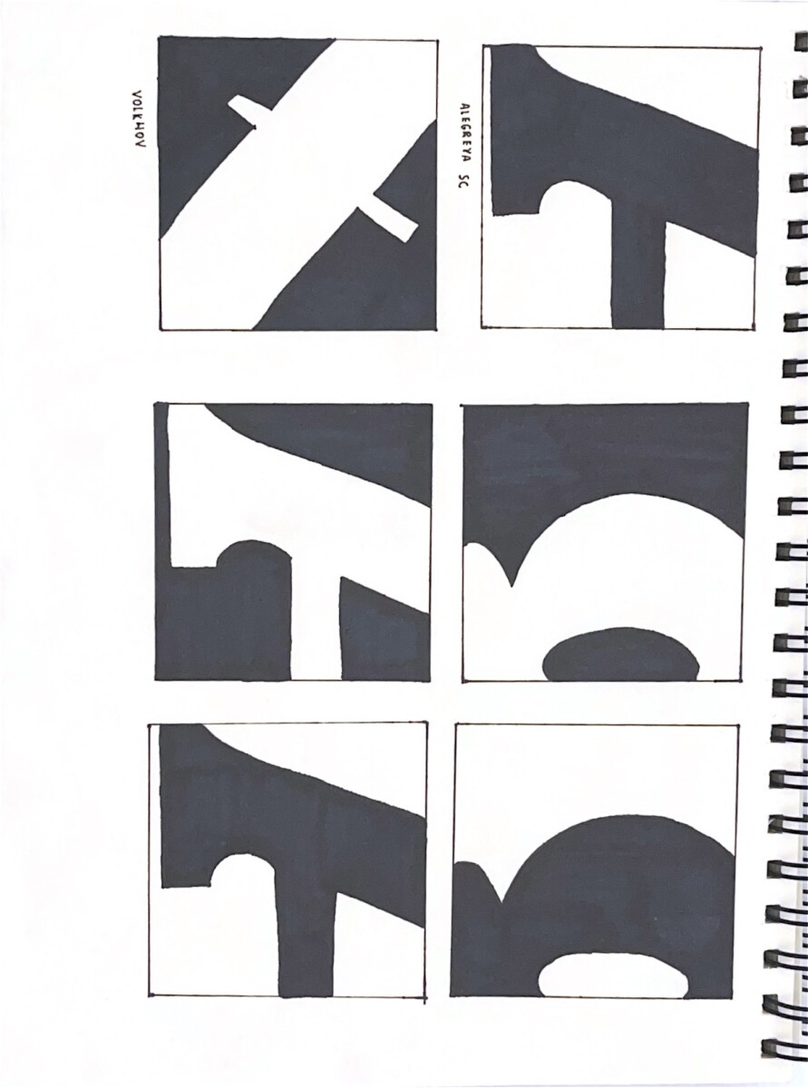
The entire second half are great examples of figure ground to my eye their equally white and black especially the As and Qs. I believe you grasped the concept very well
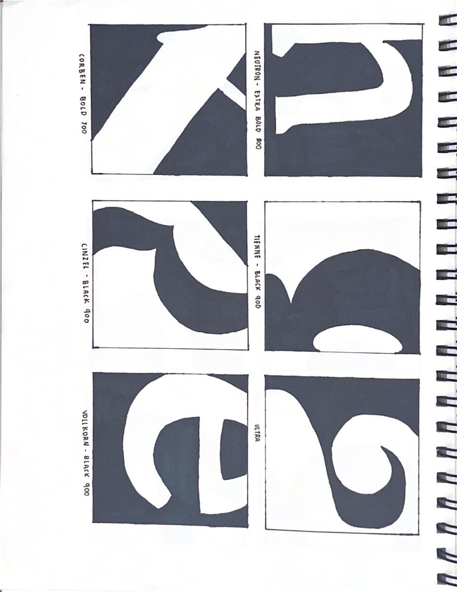


I think the shape of each drawing is very clean and sharp, and the proportion of black and white are well-balanced.
Your designs are neat and look really nice, keep up the work but there one thing I noticed was that some of your designs had a bit too much white popping out then the black stands out. however, you can alter it but great work though.
The entire second half are great examples of figure ground to my eye their equally white and black especially the As and Qs. I believe you grasped the concept very well