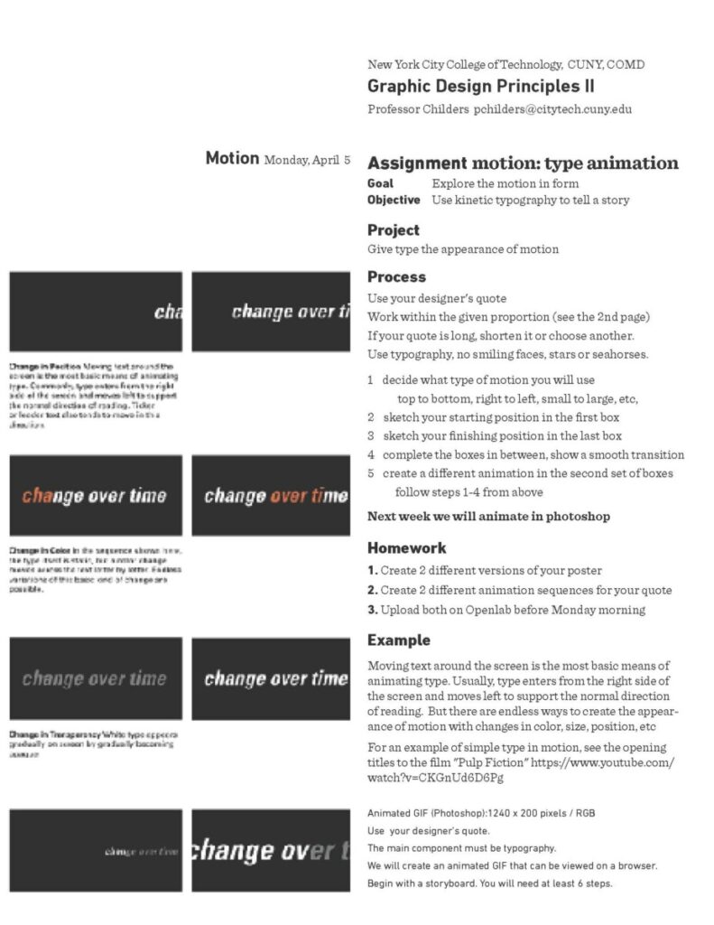
goal: sequencing
objective: imply motion with sequencing
theme: motion
to do
-
- watch and comment
- sketch
- refine
1. Watch and comment
-
- watch video
- Comment on Openlab: What type of transitions or specific actions make the animation feel like it had a “purpose.”
- Add a timestamp to your post
- category: Motion comment
- https://vimeo.com/69375692
2. sketch
motion
How can motion help to covey your influencer’s philosophy?
Use your final poster design
What aspect of your influencer will you emphasize?

Do it through motion
-
-
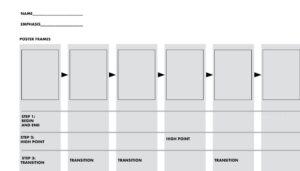
- download the template below
- sketch by hand to show 2 examples
- each animation has 5 steps 1 start with your first step 2. add your climax at the 4th step 3. your 5th step should lead to your first step 4. add your 2nd and 3rd steps to complete the transition to your climax
- Upload to Miro
-

need ideas? Hold your phone over this icon to see an animation
![]()
Example of animation sketch:

Want to try to create your own? Try Biteable. it’s free
3. poster
Fine-tune your poster
Finalize 2 versions
Upload to Miro
This will be graded based on criteria
Criteria, 10 points each for a total of 100:
-
-
- • Size: 11 x 17, with excellent craft. (no bitmapping unless it is part of the design)
- • Is ANYTHING centered?
- • Are you using a typeface that your designer uses?
- • Does your poster emphasize typography, not image?
- • Check all spelling and make sure you have NO hyphenations and No quote marks
- • Do you have clear hierarchy?
- • All type units relate to each other? (they do not all have to align)
- • No extraneous information? (birthdays or the town where they were born)
- • You didn’t place your type “around” the image, your typography is “in” the poster and not stuck to the edge.
- • You have 2 images that are clearly different
-


Motion Comment: What type of transitions or specific actions make the animation feel like it had a “purpose.”
00:54
I really like how the transaction shows the process of the animation. Showing the process as animation makes it feel like it had a purpose. They also used the right amount of negative and positive space. On movie screens it seems like it has a storyboard and leads you to the next part.
What type of transitions or specific actions make the animation feel like it had a “purpose.”
What made the video feel like a proper animation was the switching of different posters/movie posters to specifically convey a message to the audience. You were able to see that in each transition it formed the sentence “Every single movie got one. From simple to the more substantial”
Time Stamp 1:56