Topic: First impression
Goals: Communicate meaning using structure and hierarchy Objectives: Clarify meaning with visual excitement Dynamically represent your influence
HOMEWORK: Increase communication of your message.Do not proceed to the next steps until you have completed previous criteria
Check that you have fulfilled all the previous criteria see “previous criteria” below
Process
Create 3 compositions that:Uses minimal color to emphasize hierarchy and reinforce meaning.,
Upload to Miro
Add 1 sentence under each composition that describes:
-
-
- your meaning
- what your color reinforces
-
Previous criteria
-
-
- every element must feel intentional
- do not fill the entire page with your text or image, BUT–make sure that all the space in the poster is relevant — “mass” of white space
- align text on one main access—if you include a secondary access, make sure that it does not take away from the hierarchy of the main access
- do not center any text or image
- group similar items
- no extraneous items and punctuation, take out quote marks and dashes break your lines logically resolve spacing
- position your graphic element to reinforce your structure and hierarchy
- do NOT position your graphic element randomly in your white space
- do NOT use your image to create a shape around your entire text block It isolates your text from the other areas of the page
- Convey a message, Use scale, emphasis, and position, to communicate the meaning
-

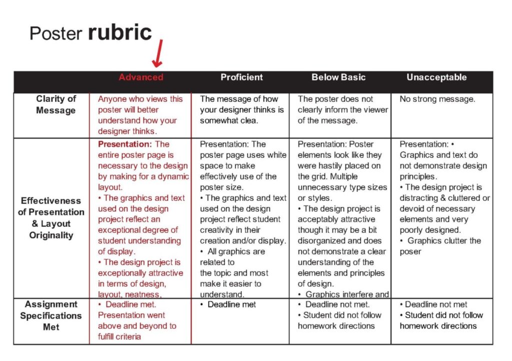
poster rubric


The usage of the color should be minimal and all details should be intentional. Do not center your text or the image . What people will think after seeing my poster.
This video tells about the importance of the text and how since text started to be used in movies. “On movie screens screen’s it opens and ends them”