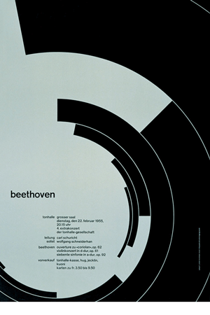
You can use repeating visual elements to form a unifying structure in your page. One of the primary purposes of the principle of repetition is to tie together otherwise separate visual components of the design. Repeating visual elements (such as lines, shapes, images, etc.) form a visual rhythm that strengthens the overall structure, making the design seem more unified and cohesive.
 Repetition can be used on any design, whether it is a single page or multiple pages. When you use it, your pages will look stronger and be more interesting. It is a principle that, when used well, can add a level of visual sophistication that your viewer will find engaging.
Repetition requires that the designer seek out and apply visual components to a page. Repeating visual elements does not necessarily mean that the elements have to be identical. You can use similar or related elements to great effect.
Repetition can also mean that in a multiple-page document such as a newsletter, you might use the same typeface, size, and color for all the headlines. Or you can keep consistent margins on each page throughout the newsletter. The possibilities are endless–the overall effect is that your pages will appear to be unified, organized, and visually interesting.
You may already use repetition in your designs a little: you may use bullets, lines, etc. WHat a beginning designer may miss is to really stress repetition in his designs. His designs designs are often weaker that they need be: not because of a total lack of repetition, but because he has not used the principle to greatest effect. You need to seek out visual elements to repeat to add to the meaning of your designs.
Unity
 When a designer repeats some visual aspect of a design, the overall composition reaps the benefit of seeming more unified. Unity is achieved when all the elements on a page look as if they belong together. The human eye seeks unity, so when we don’t find any in a page, we lose interest in that page quickly. Unity is really important for multi-page publications such as a magazine or newspaper where the designer much achieve a consistent look across several pages holding different content.
The principle of repetition draws on the ability of the human mind to see patterns and to draw conclusions from those patterns. When we see things that are exactly the same or similar, we naturally group them; we see visual connections between elements. These visual connections help us derive meaning form a design as we form associations between the forms on the page and the ideas we are coming to.


