Flow simply refers to the visual and verbal paths of movement in which the reader’s eye tracks through a design. A page with good flow will visually lead the reader from one element to another, carefully presenting information to the reader. A great design will lead the reader through the information in a relevant and informative way. Planning flow into your design allows you to better control the order in which your reader reads the point in your message.
Just remember: people are individuals and often unpredictable. It is highly unlikely that you’ll ever be able to control your reader 100 percent, but by understanding the principle of flow you have a better chance of influencing how people read your message.
To develop strong flow in your message, first you have to understand the message. READ THE TEXT. Let me repeat that: read the text, and read it thoroughly. Also, analyze how any graphics you have may support the message. Once you are clear on the meaning and intent of your message, then you can visually establish the order in which the text or images should be read–you can work out the flow of the message.
There are two halves to the principle of flow: verbal and visual flow. Verbal flow is the order in which reads the text on the page. Visual flow is the order in which the reader looks at the images and graphics on the page. The best designs draw on both of these types of flow and seamlessly integrate them together. All of the type and graphics and lines and color work together in a harmonious whole to present an ordered message to the viewer.
Verbal Flow
In western culture, people read text from left to right and top to bottom. In other cultures, the established flow runs left to right (Hebrew) or top to bottom (Japanese).
Establishing and maintaining good verbal flow through a document is critical to communication. How is good verbal flow achieved? In general, good verbal flow is achieved primarily through consistency in typographic treatment and establishing a logical reading path through the document. A document with good verbal flow has consistent logic to it, and as such is much easier to read than a badly flowing one.
The fastest way to achieve good flow in a document is to set up a typographic master plan and to stick to it. Include such details as typefaces, body copy, picture captions, pull quotes, etc. By planning ahead, you can consciously set up the flow in your documents and your designs will seem more consistent and unified, especially in multi-page publications. your readers will also benefit: a consistent typographic style helps them clue in to the plan and know what to expect. It will also be easier for them to follow the text through the document.
Techniques to Enhance Verbal Flow
- Place headlines near their articles
- Choose an easy-to-read typeface and use it consistently through an article
- When articles flow onto other pages, keep text treatment consistent
- Use columns that are neither too wide or too narrow
- Avoid extra-wide leading
- Keep listed items together
- Place quotes on the page with the text they reinforce
- Place linked columns of text next to each other, instead of intermixing the columns of text from two or more different articles


Visual Flow
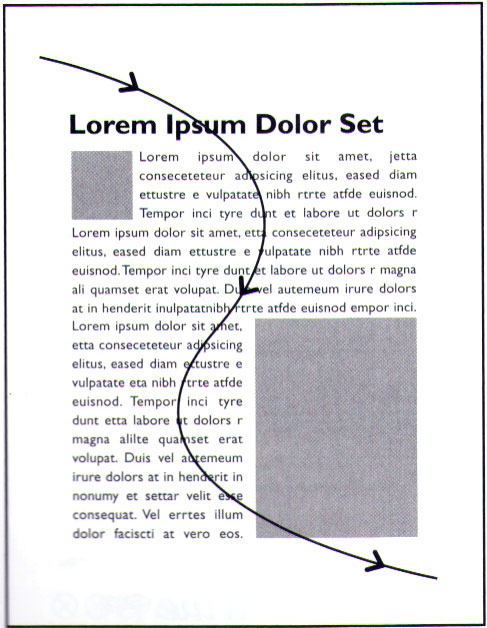
The other half of the principle of flow is visual flow. Visual flow is the order in which the viewer looks at the images on the page. On pages with both text and images, the viewer’s eye tracks in a backward “S” pattern. This is useful to know because you can pick images to control or enhance the visual flow through the page.