7 thoughts on “FINAL POSTER DESIGNS IN COLOR_CARL CABRALL”
Leave a Reply
You must be logged in to post a comment.

You must be logged in to post a comment.
Our goal is to make the OpenLab accessible for all users.
Our goal is to make the OpenLab accessible for all users.


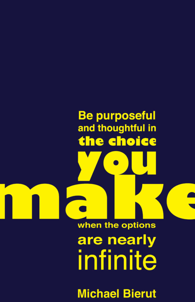
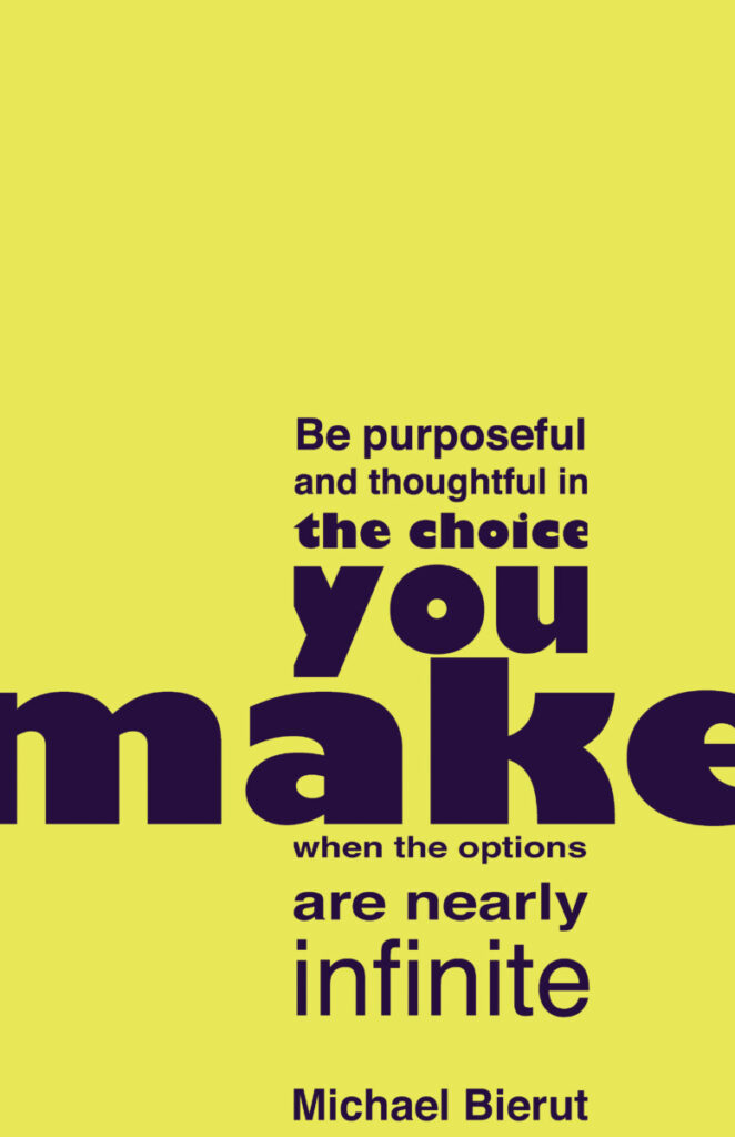
Wow! Carl, you’ve done an excellent job on this project. I really love the color scheme you’ve picked for your poster; it makes it stand out a lot more.
Thank you!
Christopher, do you prefer one over the other? Do they create different meanings?
Great structure and alignment on this poster, I can see a lower case t being formed, and loved how the MAKE is going off the page.
Thank you!
interesting observation Harry, thanks for sharing!!
Yes, good comment. Make is emphasize and appears to be going off the page