
Due: 11:30, Wednesday, October 27
Objective: Explore the diversity of alignment to a grid structure.
Goal: Examine proportions.
category: type poster digital
To Do
-
- design
- comment
1. design: Influence
Create 6 typographic compositions in InDesign
-
-
-
- 8.5×11″
- 5 columns horizontal and 5 rows vertical NO margin or gutter
- Choose an area of the page for your viewer to focus on
- Create alignments
Use the grid to define the placement of your elements.
Do NOT center! - Break text into smaller units to emphasize it’s meaning
Text:
one quote
designer’s name
designer’s medium (print, web, furniture, etc.) - Create 3-4 levels of hierarchy.
- Save as jpg and upload to OpenLab category: type poster digital
-
-
process
-
-
- grid
- asymmetry
- alignment
- hierarchy
-
example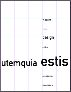
Need inspiration: https://www.typographicposters.com/
2 comment: on two different posters
suggestions:
Have they defined the grid? You should be able to see exactly where the grid lines are located
Have they created hierarchy?
What are they communicating?

