Letter A Black 
Letter A White


Letter G White 
Letter G Black

The OpenLab is an open-source, digital platform designed to support teaching and learning at City Tech (New York City College of Technology), and to promote student and faculty engagement in the intellectual and social life of the college community.


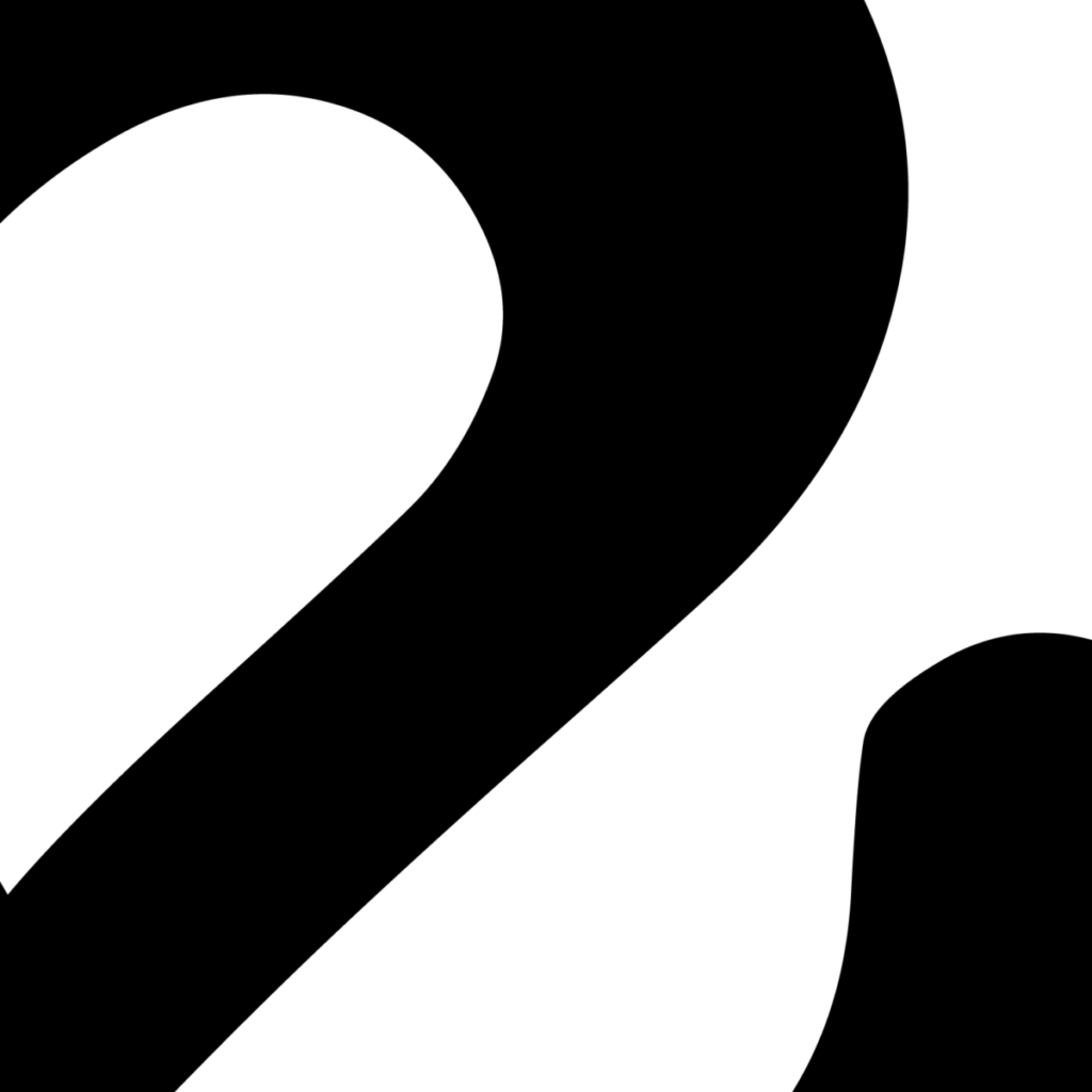
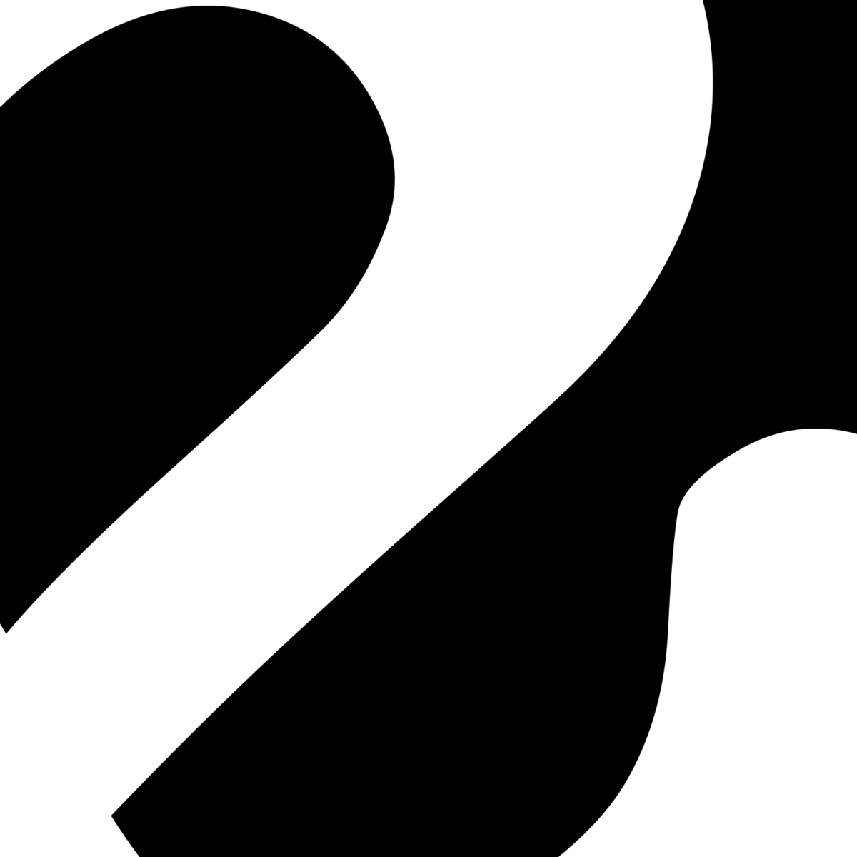
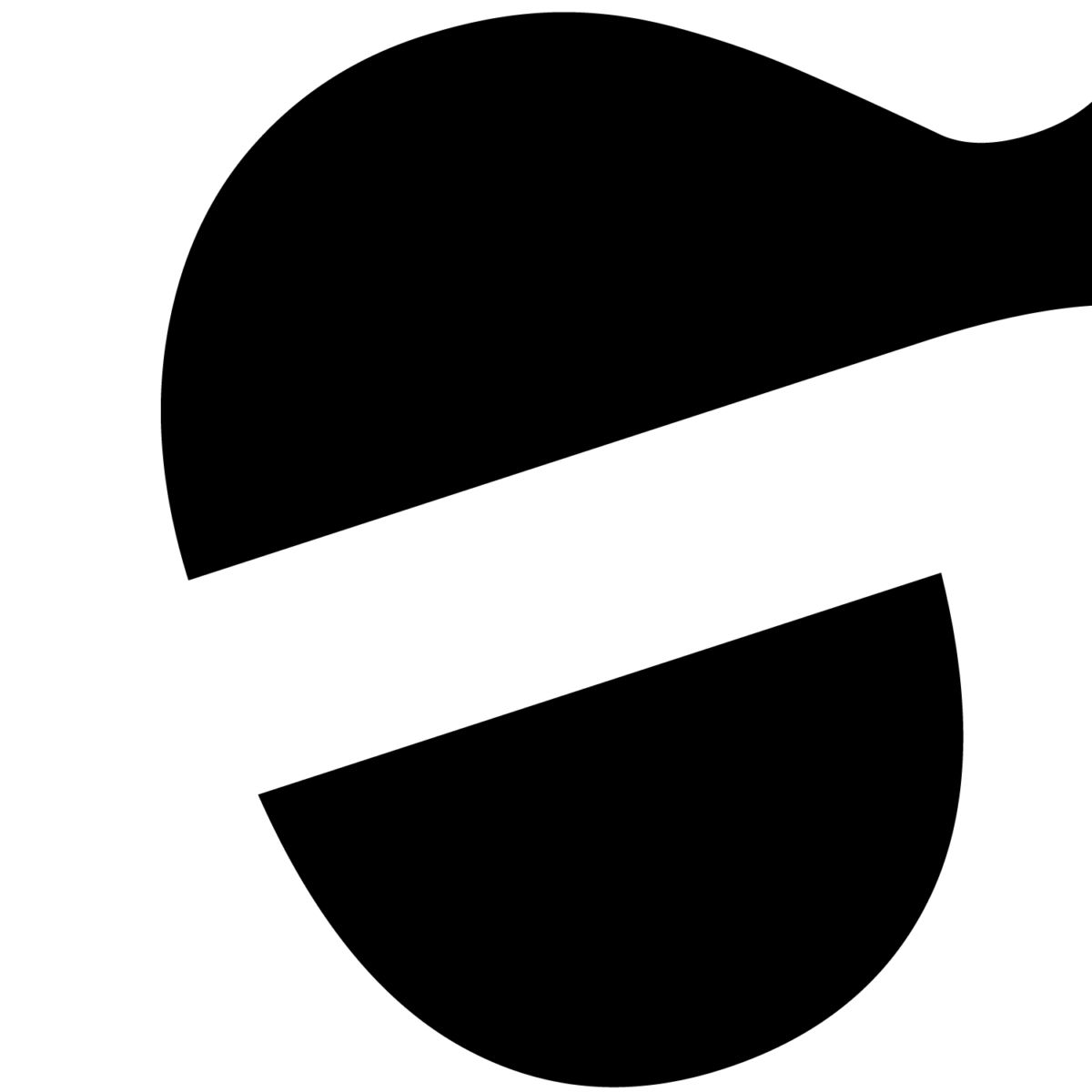
Christopher these are pleasing to look at because they cause the eyes to naturally flow across the designs. Also the eyes naturally bounce back and forth giving split-second appearances of spoons and lemons (letter G), the neck of a swan and a dipping spoon (letter A). You achieved a good balance between the white and black by cropping in just enough. This is reflected in both your positive and negative iterations.
The balance between the usage of black and white in the image are great. Moreover, due to the form used, it just adds to achieving the balance between the positive and negative space.
Hey Christopher, your project looks amazing. For me, I feel like your play on the positive and negative space is satisfying to look at. I can see the different shapes, such as in the G, it looks like a spoon just dumped something into a bowl. There is enough white and black balance to give off the letter form as well as the shapes.