Design Journal #24

Podcast: Great speaker. Humorous. Easy to listen to. Reminds me of an activity book I used to have showing grey squares, and I was sure the squares were different. The more I see different examples, I feel like my eyes are becoming more trained to spot  V,H,S.

vhs same-colors value saturation hue-and-stuff

Design Journal #22

Josef Albers: was instrumental in bringing the tenets of European modernism, particularly those associated with the Bauhaus, to America. His legacy as a teacher of artists, as well as his extensive theoretical work proposing that color, rather than form, is the primary medium of pictorial language, profoundly influenced the development of modern art in the United States during the 1950s and 1960s.

Key Ideas

Albers’s 1963 book Interaction of Color provided the most comprehensive analysis of the function and perception of color to date and profoundly influenced art education and artistic practice, especially Color Field painting and Minimalism, in the twentieth century.
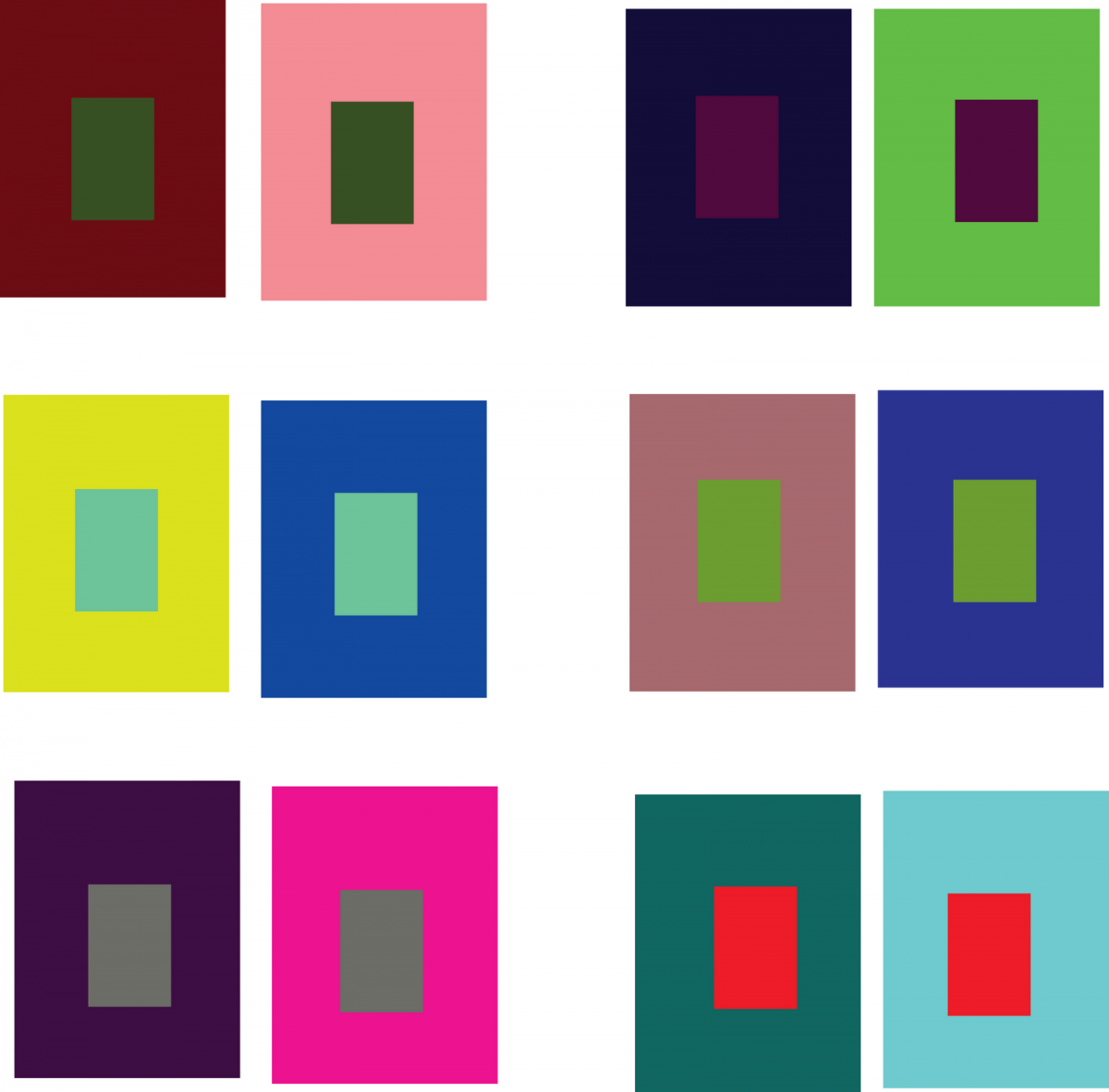
His series Homage to the Square, produced from 1949 until his death, used a single geometric shape to systematically explore the vast range of visual effects that could be achieved through color and spatial relationships alone.
Albers’s art and theories were widely disseminated to generations of artists and art-school faculty through his teachings at the Bauhaus, Black Mountain College, and Yale University, and they provided the theoretical basis for the development of non-objective art during and after the age of Abstract Expressionism.

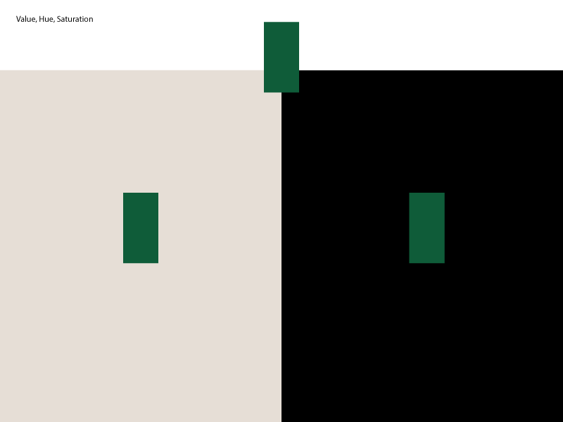
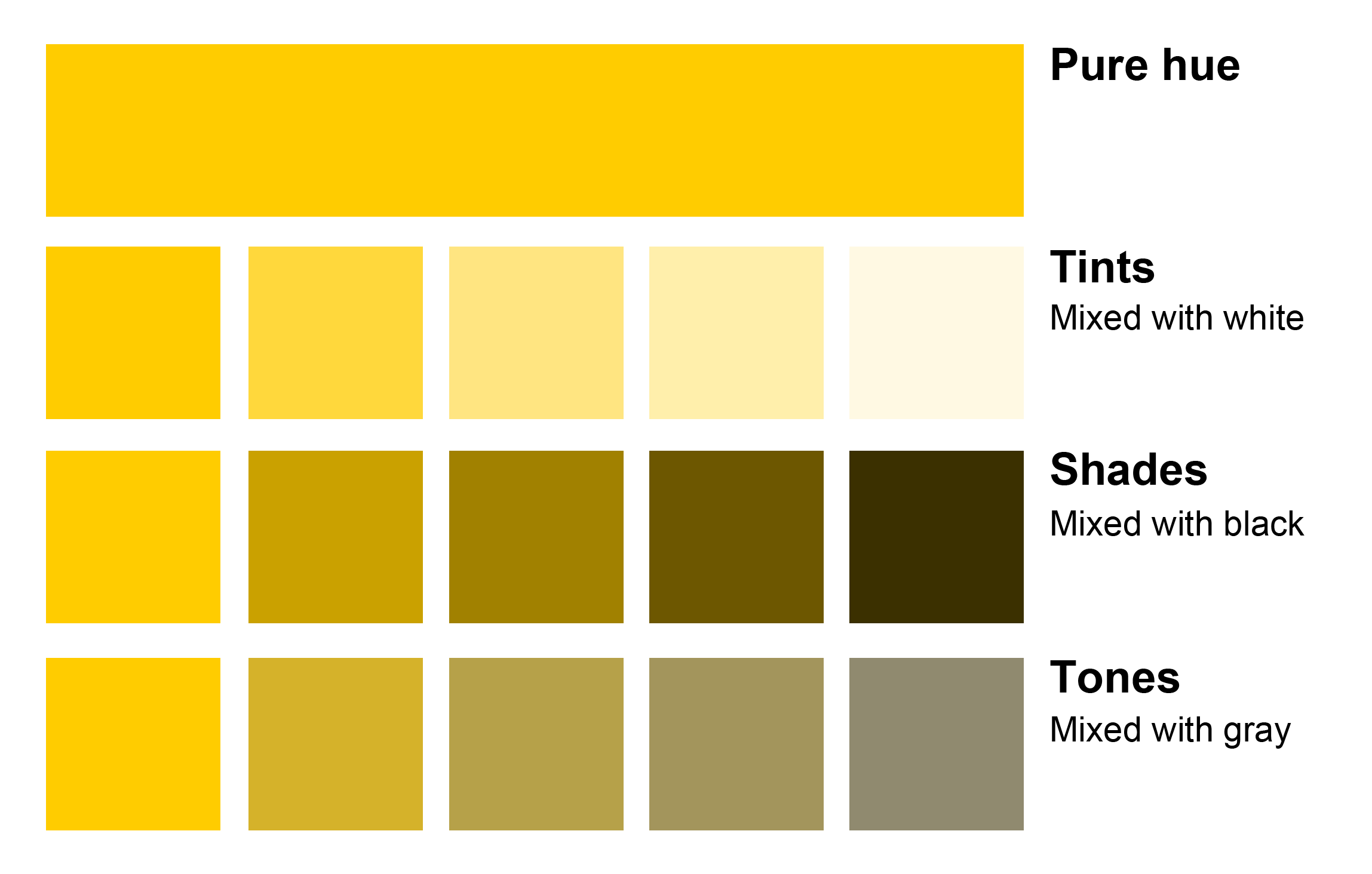
Johannes Itten developed the innovative “preliminary course”[3] which was to teach students the basics of material characteristics, composition, and color. “Itten theorized seven types of color contrast and devised exercises to teach them. His color contrasts include[d] (1) contrast by hue, (2) contrast by value, (3) contrast by temperature, (4) contrast by complements (neutralization), (5) simultaneous contrast (from Chevreuil), (6) contrast by saturation (mixtures with gray), and (7) contrast by extension (from Goethe).”[4](de) In 1920 Itten invited Paul Klee and Georg Muche to join him at the Bauhaus.[5] He also published a book, The Art of Color, which describes these ideas as a furthering of Adolf Hölzel’s color wheel. Itten’s so called “color sphere” went on to include 12 colors. In 1924, Itten established the “Ontos Weaving Workshops” near Zurich, with the help of Bauhaus weaver Gunta Stölzl.

 Albert Munsell


During his study of color, Munsell realized the need for an organized way of defining colors. He wanted to create a system that had a meaningful notation of color, rather than just color names that he found were “foolish” and “misleading”.[3] He set out to create his color space in 1898. To do this, he used his unique inventions to help make measurements to organize his system. One of these inventions was the Photometer.[4] This device measured the luminance of an object, and Munsell used this to make measurements of different colors and to help define how color changes. This information would later become his three dimensions of color. He also patented an invention called the “Spinning Top”.[4] This device was similar to the rotating color wheel developed by James Maxwell, where several colors were placed on the top and the top was spun, mixing the colors together. Munsell used this device to measure the relationship between chroma and value, which helped him create templates for each step in chroma and value for every hue. With these tools, Munsell was able to define three dimensions that define color. He also paid close attention to the sensitivity of the human visual system, and considered this when creating the steps between colors in his system, particularly his value scale. He called these dimensions Hue, Value, and Chroma.[3][5]

This wheel shows the principal hues of Munsell Hue. Inside the wheel, the notation for Munsell Hue can also be seen.

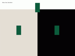
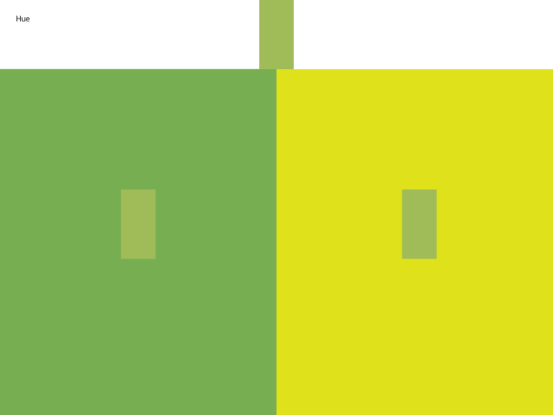
Munsell Hue is the attribute of color by which we distinguish red from green, blue from yellow, and other colors. Munsell chose several colors to be the principal hues. These are Red, Yellow, Green, Blue, and Purple. These hues were arranged in a circle. Each hue can be mixed with the same amount of the neighboring hues to create intermediate hues: yellow-red, green-yellow, blue-green, purple-blue, and red-purple. Each color can be defined by how much of each principal hue it contains. A color that is composed of just a principal hue would be given a number 5. So, the red primary would be given the number 5R. If you move to the left of the red hue, the number increases, with the color exactly in between red and yellow-red defined as 10R. Continuing around the circle, the number of the color goes back down to 1YR right after 10 red, until the color is composed of just the yellow-red primary, in which case the color would be 10YR. So, the number represents how much of the primary hue the color contains.[3][5]

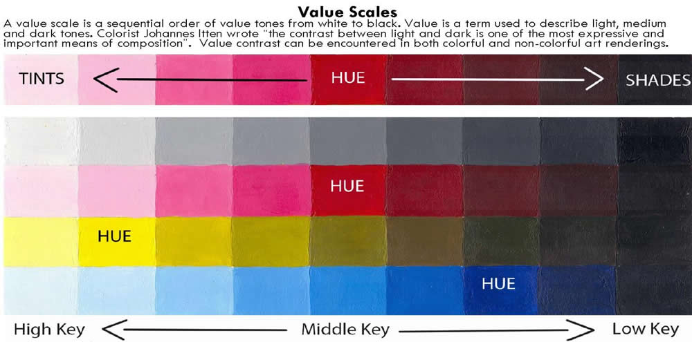
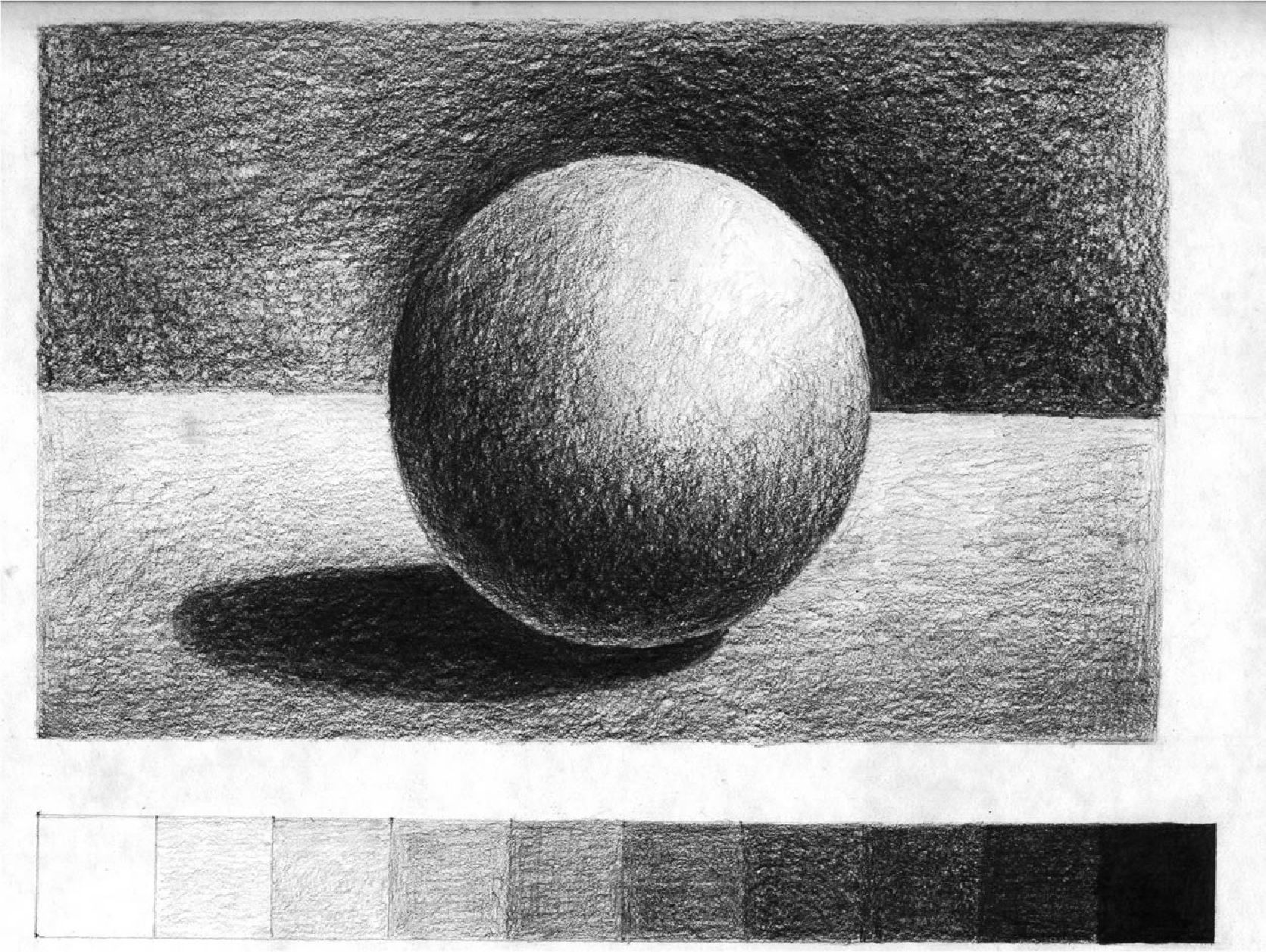
Munsell Value defines the lightness of a color, or how much black or white the color contains. The neutral color scale, from black to white with neutral greys in between, all have a hue of 0, which means they do not contain any hue. Instead these colors only change in value. Black would have a value of 0N, with N designating value. White would have a value of 10N, and middle grey would have a value of 5N. A grey in between middle grey and black would have a value of 2.5N. This value scale is based upon visual experiments. The middle grey is visual perceived to have equal amounts of black and white, and so on for other greys. It was very important for Munsell to create a system that was based on the human visual response to color.[3][5]

The final dimension created was chroma. Before the Munsell Color Theory, chroma was not a term used in the art or scientific community. Instead, the intensity of color was defined as saturation. However, Munsell felt it appropriate to break up saturation into two different dimensions, namely value and chroma. Chroma defines the difference between a pure hue and a pure grey. So, a color with a chroma of 1 would be very close to a grey. It is important to note that the maximum chroma of a color is defined by the hue of the color. For example, a color with a yellow hue will have less chroma values than a color with purple hue. This is because of the human visual sensitivity to different hues. Again, this shows how the human visual system is modeled through the Munsell Color Theory.[3][5]


Design Journal # 19

F: Proportion:Merriam-Webster

  • an amount that is a part of a whole

  • : the relationship that exists between the size, number, or amount of two things

  • : the correct or appropriate relationship between the size, shape, and position of the different parts of something

I: Relationship between part and whole of composition

VE: screen-shot-2016-11-11-at-1-11-24-pm

F: Rule of thirds: is applied by aligning a subject with the guide lines and their intersection points, placing the horizon on the top or bottom line, or allowing linear features in the image to flow from section to section. -Wikipedia

I: Creating a flow in a composition by having an equal alignment. Showcasing balance.

VE: screen-shot-2016-11-11-at-1-42-16-pm

F: Golden Rule (Ratio) designschool.canva.com 
What do the Pyramids of Giza and Da Vinci’s Mona Lisa have in common with Twitter and Pepsi?

Quick answer? They are all designed using the Golden Ratio.

The Golden Ratio is a mathematical ratio. It is commonly found in nature, and when used in design, it fosters organic and natural looking compositions that are aesthetically pleasing to the eye. But what exactly is the Golden Ratio and how can you use it to improve your own designs?

What is the Golden Ratio?

Putting it as simply as we can (eek!), the Golden Ratio (also known as the Golden Section, Golden Mean, Divine Proportion or Greek letter Phi) exists when a line is divided into two parts and the longer part (a) divided by the smaller part (b) is equal to the sum of (a) + (b) divided by (a), which both equal 1.618.

I- Creating an equally balanced composition using a mathematical equation.

VE screen-shot-2016-11-11-at-1-24-07-pm screen-shot-2016-11-11-at-1-25-57-pm

Design Journal #18

F-Venn diagram– shows all possible logical relations between a finite collection of different sets.  -Wikipedia
I- Diagram that takes unlike topics, putting them together to find a common factor.
VE: Below

trump-venn

F-Simultaneous contrast refers to the way in which two different adjacent colors affect each other. One color can change how we perceive the tone and hue of another when placed side by side. -painting.about.com

I-When two colors that are located next two each other alter how we view it.

VE:untitled-2

  F: Texture density: In order to maintain its wonderful illusion of direct and complete perception, the visual system must find ways to efficiently and accurately encode information. This problem seems of particular importance in the perception of visual details, such as textures, which seem to exist in such astonishing variety that their representation appears to have endless dimensionality. Casual introspection suggests that we seem to perceive textures in full detail, but this ‘seeming’ is suspicious. That this seemingly direct perception of texture is an illusion is made starkly evident by the aftereffects of texture density   swarthmore.edu/

I: An illusion that creates dimension

VE fig2

Design Journal entry #17

3 successful examples of transparency and layering in design. All three show layering and transparency. Being able to see what mediums have been layered and also seeing colors underneath the medium.

Example 1
Example 2
Example 3

F) Low Key: Spans the range from mid-tone to black –sensationalcolor.com
I) Colors ranging from mid-tone to black.

Visual Example

F) High Key: Describes the set of colors that range from mid-tone hues to white -sensationalcolor.com
I) Colors ranging from the middle tone to white.

Visual Example

High and Low Key V.E.

F) Narrow Range: Restricted in incidence or scope – OxfordLivingDictionaries.com
I) An area that is smaller.

Visual Example

F) Broad range: Wide area –Macmilliandictionary.com
I) An area that is wider

Visual Example

Design Journal #16

3 Companies I would work for are creative and tech integrated companies. All promoting social networking, connecting with cilents, and promoting ideas.
Etsy
Facebook
Buzzfeed

F) Tonal progression: is a succession of color mixtures proceeding from dark to light. -theryderstudio.com

In) Progression of a color from light to dark.

Visual Example

F) Shade: a darkened area in a drawing, painting, etc. -merriamwebster

In) A darkened area in a composition

Visual Example

F) Tint: a color or a variety of a color; hue. -dictionary.com

In) Another shade of color. Mixed with white to create a lighter hue.

Visual Example

F) Tone: refers to the light and dark values used to render a realistic object, or to create an abstract composition. When using pastel, an artist may often use a colored paper support, using areas of pigment to define lights and darks, while leaving the bare support to show through as the mid-tone.

In) Are the light and dark values of a composition

Visual Example

Song book

A few things I learned during this process:

-Exact measurements are essential. Even if you are off by a bit…it will ruin the design concept. Bending papers which lead to redoing it again.

-Exacto Knife vs Paper Cutter: Both risks being uneven. Exact measurements, correct hand holds, and patience required.

-“Never fall in love with an idea. They’re whores: if the one you’re with isn’t doing the job, there’s always, always, always another.”  Chip Kidd

Mock-ups are essential.

20161026_134204

I went through 6 before I was able to finalize my design. And even then I created the pieces and played around to make sure that the idea was actually doable.

Check out a side of my songbook below.

My songbook 

Inked Pattern Progress

20161024_221434
Introducing my failed attempted at creating a flawless inked pattern. I started using the wrong pens and markers. Followed by poor tracing and smudges. When I finally complete the composition I’m hoping to avoid cutting it out. From what I’ve seen in terms of progress, I can envision this pattern being used on stationary and as decorative border for websites (if colors were added.)
20161024_221440

20161024_221448

Student Perk

One of my favorite perks as a student is Amazon Prime. Annual charge is $99 but the price is reduced to $49 for students. It’s a great way to order almost anything you need and receive it in a short amount of time. You can even stream movies as an additional perk.