
During this internship with Professor Taradash we have had frequent meetings at her apartment with her other intern Daniel. During this time we have spent meeting up with each other we have been working on building the architecture for the new website for Professor Taradash. I would have to say that I look at both of them as people to look up to since they both have quite an amount of experience in the field and seem to have many connections with people. They are also great people to work with in a team and collaborative effort.
Another update to the website, since the Professor, Daniel and I met up this past weekend we created a brand new mock-up together and then on my own time I would polish the mock-up. I went and over the course of the week I designed a new mock-up based on the one we all created together this past weekend. I had another meeting with the Professor this week to talk about the new mock-up that I made on my own and to give me some critiques. The biggest and most meaningful critique I received was regarding her name on the homepage. I had her name in a serif font with lowercase letters. Taradash was explaining to me that she wants her name big and bold on the front page. There was a time where she wrote her name small and scripted and until someone put her name in big bold letters she realized that doing that she would appear to be more confident in her work. Going through that transition of having small scripted letters that doesn’t really pronounce or show that you are making a statement of confidence or wanting to be noticed. But having your name in big bold letters is something I learned is important to become noticed and to show that you are proud and confident in yourself and your work and this lesson is definitely something I will take with me throughout my career.
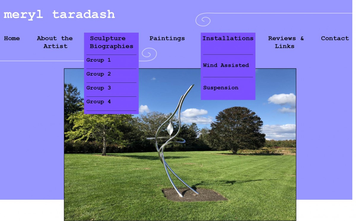
Polished mock up that I created
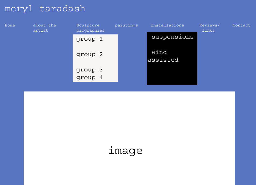
First original mock up that was made

