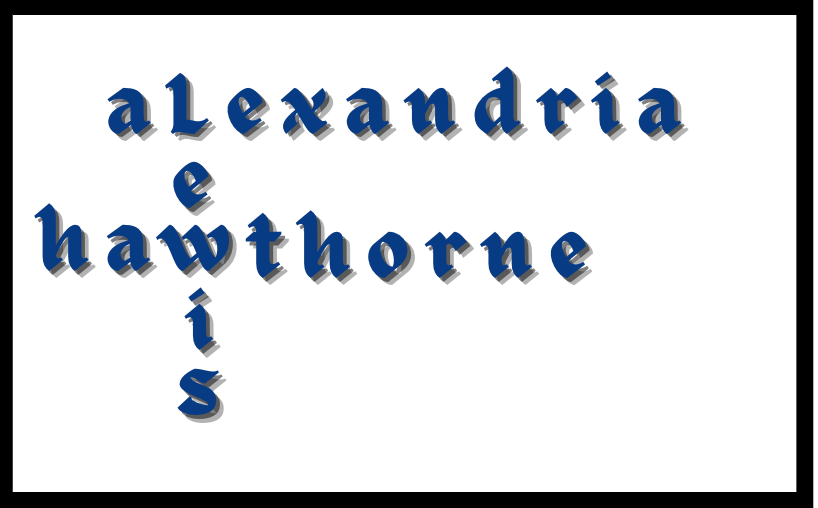
Alexandria L-Hawthorne’s logo consists of the colors white, navy, and black. Dark blue shades are serious, professional and none attention seeking, which also represents trust and stability (Royal & Navy Blue, 2020). She is trustworthy and honest as she would hope the same in return. Black is usually associated with power, elegance, and formality. It can be either conservative or modern, traditional or unconventional, depending on the colors it’s combined with (Chapman, 2010). Alexandria L-Hawthorne loves minimalism as white conveys cleanliness and simplicity and is popular in minimalist designs (Chapman, 2010). The font she chose for her brand logo is Celandine as the font that is designed in a modern style, minimalist and looks elegant but doesn’t lose its classic look (Setiawan, 2020). These colors and font were chosen because they represent Alexandria in different ways.
Brand Logo


