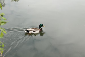
For my final I decided to photograph in a park that I have never been. This was a daunting challenge at first, I didn’t know where the interesting spots were, I didn’t know what routes to. But the shots came out interesting, My idea behind all 3 shoots were to express how beautiful the park on Staten island are. I know the 3-day shoot was a success all of the photos came out bright and had vibrant colors. I did receive a small injury whilst photographing, a thin but long cut in my left thumb, I did however use this to my advantage and captured the wound in vibrant colors.
Category Archives: Homework
Portraits
Portraits were difficult for me to complete. I am sort of self-conscience about my physical appearance so even though I didn’t take any of me most of the shoots were of the objects that symbolized me or that could relate to my personality. I mainly shoot outside because the light was very diffused and was not too hard or soft, plus it was a nice day.
MidTerm Happy
The Happy photos came out so nice. I took my setup out side in on a bright sunny day, so I had the intense sun to assist me in a happy look. Ikept my fstop medium I either shot 7.1 or below. The Sun also gave the chain a nice bling or shine which only enhanced the look of being happy.
Buy Me!
The Buy me shoot was a unique one. I choose to shoot a cologne bottle Calvin Klein Shock. And the reason it was unique was because there is one shot that looks very promising as an actual ad. I really want to re-shoot that one and get it perfect, angle clean bottle, the perfect reflection, and lighting so I can send it to CK because I think It Is worthy enough to.
Shoe
For the shoe shoot I decided to use my leather wingtip boot. I placed it on a few pieces of wooden floor tiles with a painted finish. i only moved the shoe five times, the light I moved much more. The most interesting shots were the few where the light was placed behind the shoe and the boot was in a back lite environment. It was so much of an ominous feel. The second best shots were when I had the light placed below the front of the shoe, the feel of that was mysterious.
DIY Studio
My DIY home studio was in my opinion the most makeshift a home studio could get. The only material is used were a stool that was roughly 3 feet tall, four pieces of foam core, two black and two white, rectangular hardwood floor tiles which I had applied a finish to them, and a tube fluorescent light, tape and push pins. I would put a white or black piece of foam core on the stool depending on the projects look; then I would put another piece at the back of the first at a perpendicular angle soi could clean the background, they stood perfectly because I used push pins. Following that I would hang the fluorescent light in certain places around the object to get the lighting effect I needed.
This was a good setup because it was sort of portable, in a few shots I moved into my living room at night where I had no light except the fluorescent, which I consider my key light. In other shoots I placed the setup near my couch where I had a window and could use a little bit of natural light. The wooden floor tiles came in pretty handy when I did the shoe photo project. I placed a few tiles on the foam core then put the shoe on the tiles and I used a leather wingtip so the combination was perfect.
MoMa
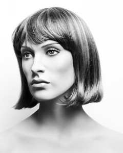
The trip to MoMa I would say it was okay. I don’t like going to museums that much, because every time I go and see the “Art” that hangs in there…Oh man, I get a bit mad. But back to the topic. I did find something that got my attention. The portrait (grisaille) of a mannequin by a French artist, Valerie Belin. I thought it was really cool to see that from far away it looked like a model, but once you got closer to the frame… you would see the details in the eyes; the eyes were painted well done. So that really got me because it looked alive, realizing it was a mannequin and not a photo-shopped model. It was my favorite piece at the museum. When women are photographed they put makeup to look like beautiful mannequins, so why not take portraits of the mannequins instead (that’s what i think) since they are perfect and don’t complain… or charge. The other pieces in the gallery were also very interesting and odd or just straight weird. For example (Richard Avedon’s American, 1923-2004 Gelatin Silver Prints 1975 (The Photography Council Fund)) was odd/weird to me. I didn’t get why a bunch of staff members were naked. I try getting an idea at least from it and I thought that “maybe, they want to show how they really are and be free and not be judge”, because in the image there’s a “girl” that has a male organ. After looking at several Images in the gallery, I thought that photography is very flexible, is not just about the colors but also about the texture, details and feeling(s) of that object or person that you capture at a certain moment in time on a frame. And it open my mind to other aspects of photography that i thought ( wow that’s possible with a camera).
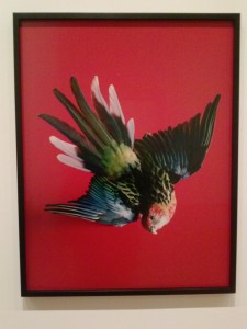
also I liked the red bird that was there. By Shirana Shahbazi (German, born Iran 1974)
(Bird-08-2009) Chromogenic color print. When i saw the bird, the vivid colors got my attention and everybody in the gallery. The red color background and the odd position of the bird also got my attention. the bird was flying down but looking at you, Also liked the space that the bird had in the frame. The dark colors blended quite well in my opinion, they were dark but not to the point for you not to see details, but on this piece you did see details. And yes i do agree on certain parts of the the “New York Times” article ‘A World of its Own,’ Examining Photography, at MoMA by Roberta Smith. I do agree that Belin’s portrait of a beautiful mannequin was really good and Shahbazi’s taxidermic bird was also really good. They both got my attention and made me stare at them for a good time in the gallery.
shoe
Shoe
for this assignment, I chose to photograph a soccer. I like this shoe because of the colors and the overall the design. all black on top with blue and pink on the bottom, to make it more stand out. With the huge Nike swoosh in the middle. I had pretty fun with photo shoot. Playing around with the lights on different angles gave me great photos in the end. 
Central Park
Location Location Location FINAL
For the last part of the location assignment, I used depth of field, and different angles for my photographs. I portrayed shallow and large depth of fields. This way I captured large, descriptive views of Bethesda Fountain and other views that were even abstract looking. The above and below the eye level pictures provide different point of views of objects that you would think of differently. When I returned to Bethesda Fountain the weather was completely different from my first two times, it was raining on and off and misting slightly during the day. The sky was completely cloudy and it cast darkness over everything. This caused my pictures to look gloomy, maybe even a little eerie. The mood of my latest photographs greatly differed from part one and two of my location assignment, both of which were sunny, cheerier pictures.


