Use headings to organize information
Using headings to create a logical structure allows people using screen readers to navigate among different sections and helps sighted readers scan a page to better understand where to focus their attention.
The video below, How Headings Help Screen Reader Users, by North Carolina State University, demonstrates why headings are important for people using screen readers to access the web as well as for sighted users.
Summary
- Use specific Heading styles rather than bold or italics to indicate a heading on your OpenLab site, in Microsoft Word, or another word processing software.
- The Heading 1 style should only be used once per page. Don’t use Heading 2 styles too often. They should be reserved just for sub-section titles.
- Don’t skip heading levels. For example, heading 3 (not 4 or 5) should always follow after heading 2. This is important for screen reader accessibility because it will sound like something is missing.
- Activate the Easy Table of Contents plugin to automatically generate a table of contents for longer pages, using the headings in your page. This can be useful for scanning the information in lengthy pages, and easily navigating through the page.
- Find out more about how to choose heading styles in the OpenLab Help resource Making your Work Accessible and the University of Minnesota’s accessibility resource page on Headings.
Break text and media in to smaller sections
Breaking text and media in smaller sections (or “chunks”) makes scanning easier for users and can improve their ability to comprehend and remember information. Using headings can help you achieve smaller, digestible sections.
A classic example of parsing things into smaller sections is phone numbers. It is much easier to remember 718-260-5550 than 7182605550. Similarly, it is easier to read and comprehend information on a website or document that is broken into sections with paragraphs, line breaks, and bullet points than a single large block of text.
Summary
- Keep related items close together and aligned.
- Use bullet points and numbered lists where appropriate for organization and ease of scanning.
- White space and line breaks separates paragraphs and sections from each other.
- A horizontal line helps break up long sections of text.
- Avoid text lines that are wide; they are more difficult to read. Try for a width around 50-75 characters.
Tables
It’s best to avoid using tables to display information if they’re not necessary. Tables may not display well on mobile, especially if the cells contain a lot of text. While tables in WordPress have some accessibility options, such as defining a header row, there are some table accessibility functions that aren’t possible without editing the HTML, such as tables with two headers.
In many cases where tables are used–such as to display a course schedule–headings and bullet points can work as an alternative way of presenting the information. For example, a schedule could be presented as follows:
Week 1: Sept 3
- Topic: OER Fundamentals
- Readings: An Introduction to Copyright
- Assignments: Take the low stakes quiz to test your knowledge
Week 2: Sept 10
- Topic: OER Fundamentals
- Readings: Embracing Radical Inclusivity: Practical Steps for Creating an Intersectional, Interventionist Syllabus,
- Assignments: Select 3-5 course materials for your OER. Share a minimum of two resources with the group, which we’ll use for our in-session activity.
If it is necessary to use a table, be sure to indicate which row is a header row, if applicable. This is required for screen readers to navigate the table correctly. You can add this in the settings for the table block in the post or page editor. Find out more about how to enable a header section in OpenLab Help.
Example
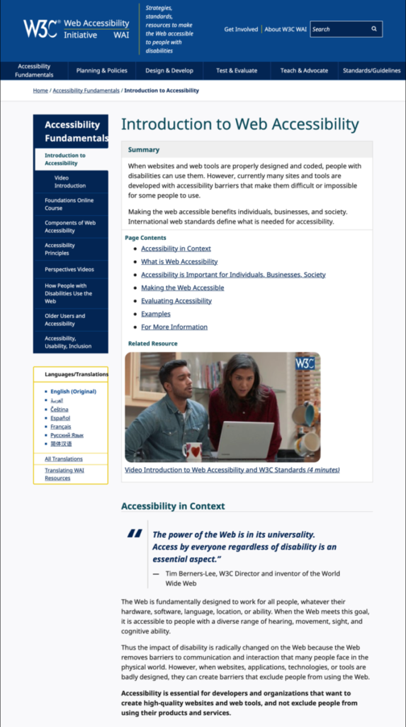
The example below, from Introduction to Web Accessibility, illustrates good use of headings, breaking up text into shorter “chunks” and bulleted lists, and effective use of legible fonts and colors.
The video below, by Normandale Community College, illustrates examples of how a screen reader reads inaccessible vs. accessible web content. It is an illuminating example of why some of the best practices you’ve learned about in this module are important for screen reader accessibility.
Additional Resources
- Headings (University of Minnesota, Accessible U)
- How Chunking Helps Content Processing (Nielsen Norman Group)
- Color & Contrast (University of Minnesota, Accessible U)
Sources
Information on this page is adapted from:
- Making your Work Accessible (OpenLab Help)
- Reading Ease and Accessibility (OpenLab Help)

