Improve Readability and Legibility
Readability refers to how easy it is for people to read text. Legibility is a measure of how the fonts, styles, and colors you use affect people’s ease of reading. If readers can’t understand or remember the information you are presenting, your material is not accessible.
Use clear, plain language
Plain language is text that the reader can understand the first time they read it. It improves comprehension for all users and allows for easy adaptation to other formats.
Guidelines for readability using plain language:
Use short sentences. Avoid complicated sentence structures, with many subordinate clauses and conjunctions that strain readers’ short-term memory.
Write in the active voice. “Publish your blog post by Wednesday” is more direct than “Blog posts must be published by Wednesday.”
Use familiar words and avoid jargon. While each academic discipline has its own specific vocabulary, students and other potential readers are not (yet) members of your discipline, and may not be familiar with discipline-specific vocabulary.
Test the readability of your text using the Hemingway app.
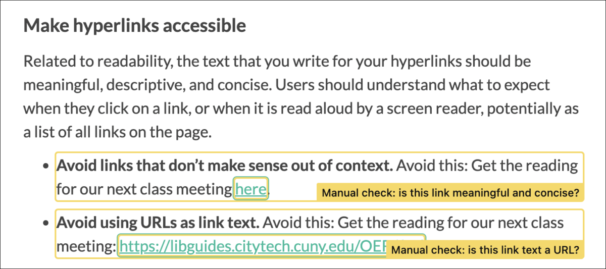
Make hyperlinks accessible
Related to readability, the text that you write for your hyperlinks should be meaningful, descriptive, and concise. Users should understand what to expect when they click on a link, or when it is read aloud by a screen reader, potentially as a list of all links on the page.
- Avoid links that don’t make sense out of context. Avoid this: Get the reading for our next class meeting here.
- Avoid using URLs as link text. Avoid this: Get the reading for our next class meeting: https://libguides.citytech.cuny.edu/OER/find
- Embed the link in a sentence, with text that could stand alone. Do this: Please read the City Tech Library’s OER Resource Guide for our next class meeting.
- Avoid using images as links; use text instead. Images used as links are difficult for screen readers and can be unclear for anyone using your site.
- Links should open in the same tab. Having links open in a new tab or window takes control away from the people using your site, and means the browser’s “back” button will not work. It is confusing for someone using a screen reader, and can be confusing or disorienting to many people who rely on the browser’s “back” button for navigation. If it is necessary to use new tabs, it is best to warn users first.
Use legible fonts and colors
Use common, recognizable fonts that provide a strong contrast with the background color of the page.
- Avoid italics and script fonts. These can be more difficult to read for everyone, especially people with visual impairments.
- Avoid using colors that create a low contrast. Light color fonts on a white background will make the text illegible.
- Use bold for emphasis.
- Avoid red or green, which can be difficult to read and may not be seen by people with color blindness.
- Avoid underlining, except for hyperlinks. Underlining can interfere with perceiving lower case letters and can be confused with links.
- Avoid all caps, which connotes yelling on the web, can be difficult to read, and can sometimes cause screen readers to read text as an acronym.
Support multiple languages
You can use the GTranslate plugin to allow your site visitors to automatically translate your site into other languages using Google Translate. This won’t provide a perfectly accurate translation, but it will be understandable in the translated language.
Documents
Microsoft Word, Adobe Acrobat, and other applications have different functionality for making documents or various types of media accessible. There are a number of helpful resources on making your syllabus accessible, including Tulane’s Accessible Syllabus project, CAST’s Universal Design for Learning Syllabus, and Accessible Syllabus from University of Minnesota. CUNY’s guide to Making Content Accessible covers PDFs, Microsoft Word docs, email, video, social media and websites. The rest of this section will focus on your OpenLab site.
It is important that documents like PDF and Microsoft Word docs are accessible. These include documents you prepare for your class, or post on an OpenLab Site. CUNY’s guide to creating accessible PDF and Microsoft Office documents provides detailed instructions for how to do this, but a few key points are emphasized below.
Microsoft Word
The videos below by the CUNY SPS Office of Faculty Development and Instructional Technology discuss Word Document accessibility in two parts.
Creating Accessible Word Documents, Part 1 covers the basics: general principles, styles and headings, tables of contents, and bulleted and numbered lists.
Creating Accessible Word Documents, Part 2 covers more advanced features: including images, charts and graphs, tables, hyperlinks, using the Accessibility Checker, and converting Word documents to PDF.
PDFs
PDF files are the most difficult file format to make accessible, and properly-structured HTML tends to be the most accessible.
Tips
- Use a PDF only when you cannot use HTML or Microsoft Office files.
- Ensuring searchable text and tagging a PDF with hidden labels (tags) that describe the structure of the document are the minimum requirements for PDF document accessibility, in order to be correctly read by a screen reader.
- If it is necessary to use a PDF, please follow CUNY’s guidelines for:
The video below by the CUNY SPS Office of Faculty Development and Instructional Technology covers the basics of Creating Accessible PDF Documents.
Microsoft PowerPoint
The video below by the CUNY SPS Office of Faculty Development and Instructional Technology covers the basics of Creating Accessible PowerPoint Documents.
Use the Editoria11y plugin to check your site for accessibility
Like a spell check for accessibility, the Editoria11y Accessibility Checker plugin checks your site, displaying any existing issues with a thorough description of what they are and how you can address them.
The image below shows how it flagged the examples of inaccessible link text described above.
Additional Resources
- The Accessible Syllabus (City Tech Library; Google Slideshow)
- Making Content Accessible from CUNY
- Reading Ease and Accessibility (OpenLab Help)
- Plain Language Is for Everyone, Even Experts (Nielsen Norman Group)
- Hyperlinks (University of Minnesota, Accessible U)
Tools
- Accessibility Checker in Microsoft Word
- Check PDF Accessibility
- Hemingway App for testing readability
Sources
Information on this page is adapted from:
- Making your Work Accessible (OpenLab Help)
- Reading Ease and Accessibility (OpenLab Help)
- Legibility, Readability, and Comprehension: Making Users Read Your Words (Nielsen Norman Group)

