Making your Site Accessible
Accessibility means ensuring that people with disabilities can use, interact with, and contribute to websites, web tools, and the materials they contain. Making websites and materials accessible also often makes them easier for everyone to use and understand.
The information below outlines what you should do to improve accessibility on your own Course, Project, Club, and Portfolio sites and those you’re contributing to. You can find out more information about OpenLab accessibility features in Accessibility of the OpenLab. The City Tech Library’s Accessibility Module focuses on course materials and OER. CUNY’s site on accessibility standards also has helpful information on making digital content accessible.
Editoria11y Accessibility Checker
Like a spell check for accessibility, you can use the Editoria11y Accessibility Checker plugin to check your whole site. The plugin will display any existing issues with a thorough description of what they are and how you can address them. It can be helpful to activate on your site so that you have its guidance as you’re going through any of the steps below to provide additional information and suggestions.
Posts and Pages
Headings and Fonts
- Organize content in a Post or Page using Headings to structure the information you present to create a clear visual hierarchy.
- Rationale: using a logical structure will benefit everyone who visits your site. The information is easier to scan for sighted users. People using screen readers can use headings to navigate among the different sections.
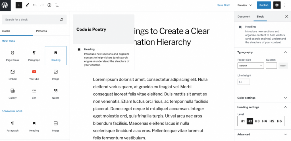
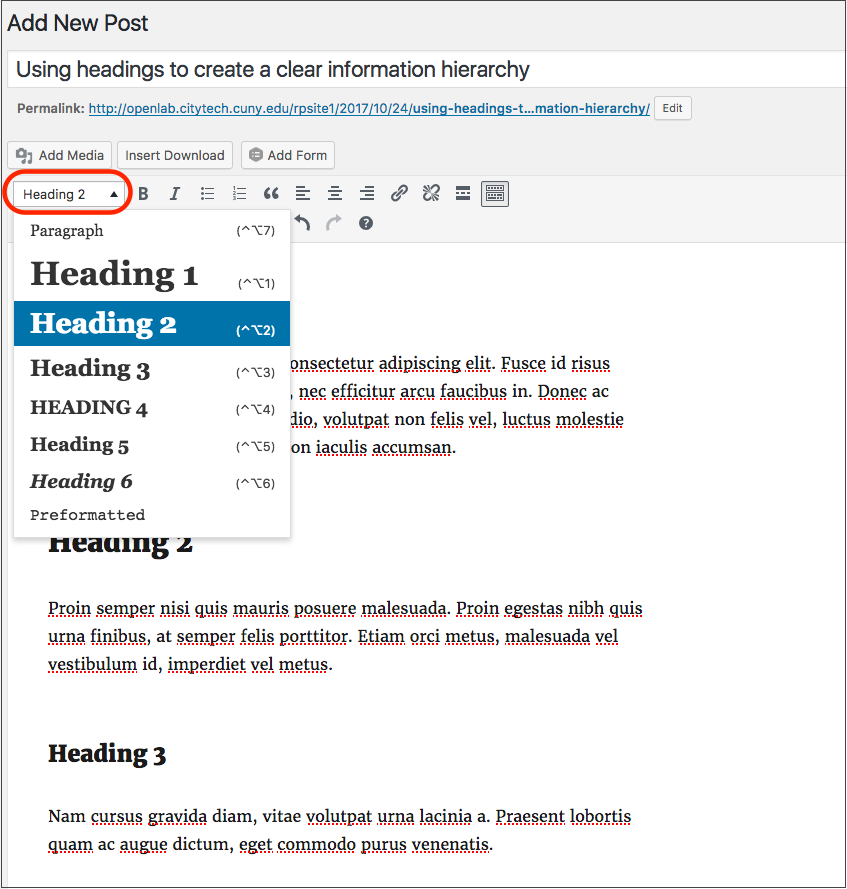
- In the Classic editor, use the Heading styles in the Post or Page editor dropdown, rather than bold or italics to indicate a heading. In the Block editor, use the Heading block, rather than bold or italics in a Paragraph block to indicate a heading. (See screenshots below.)
- The Heading 1 style should only be used once per page. Don’t use Heading 2 styles too often; they should be reserved just for sub-section titles.
- Use common, recognizable fonts that provide a strong contrast with the background color of the page. This will not be an issue for most OpenLab members if you stick to the default fonts and colors for your theme. However, if you’re using one of our font plugins, such as Easy Google Fonts, or changing the text or background colors, you can find more information about contrast in WebAim: Visual Disabilities: High Contrast.
- Avoid using colors that create a low contrast; for example, light color fonts on a white background.
- Avoid script fonts, which can be difficult to read for everyone; and especially people with visual impairments.
- Try viewing your site while zoomed in, which is a common practice to increase readability. You can do this by pressing the ctrl and + keys together, or command + on a Mac.
Links
- Use informative and specific wording for the text that the user will click on, to describe where the link will take them. For example, if you are linking to an accessibility article, use descriptive text such as “Article on Accessibility.”
- Avoid vague phrases like “Click here.”
- Avoid using the word “link” because screen readers will already alert the user that the text is a link.
- Avoid using URLs in the link text, because they are cumbersome when read aloud. E.g. Use “W3C Tutorial on Functional Images” rather than “https://www.w3.org/WAI/tutorials/images/functional”.
- Rationale: If someone is using a screen reader, which will read the links out loud, the user will be able to know where a link will take them before clicking.
Tables
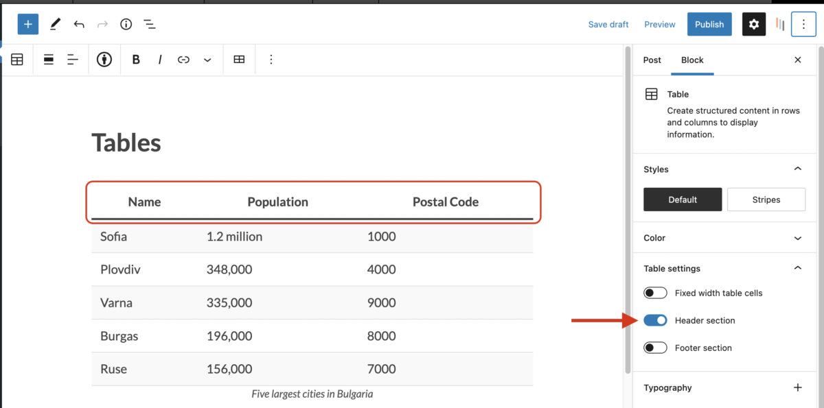
It’s best to avoid using tables to display information if they’re not necessary. Tables may not display well on mobile, especially if the cells contain a lot of text. While tables in WordPress have some accessibility options, such as defining a header row, there are some table accessibility functions that aren’t possible without editing the HTML, such as tables with two headers.
If it is necessary to use a table, be sure to indicate which row is a header row, if applicable. This is required for screen readers to navigate the table correctly.
You can add this in the settings for the table block in the post or page editor. You can also add a caption for the table.
Images
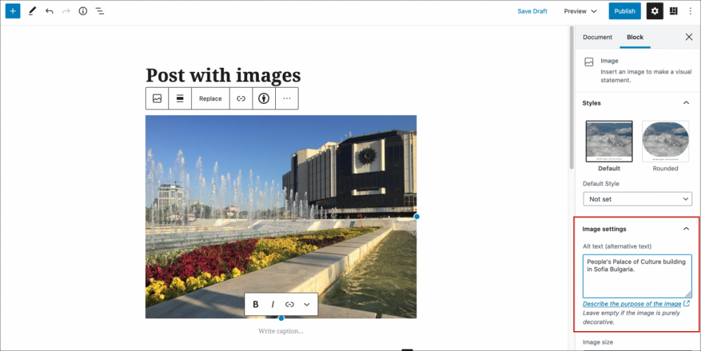
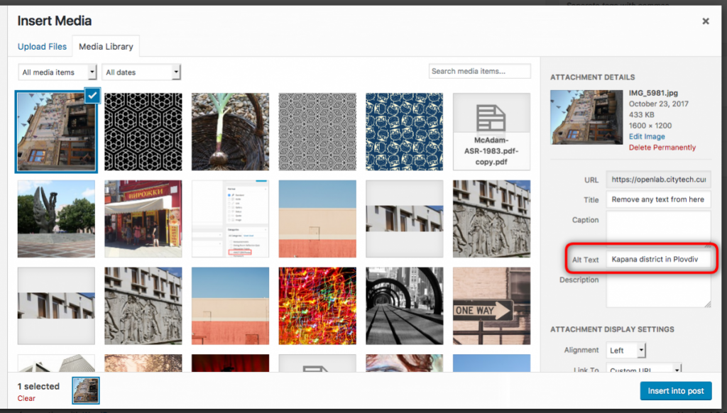
- Include alternative text for all images. Whenever you add a new image to a Post or Page using the Classic editor, include short text in the Alt Text field in the Insert Media pop-up box (shown in the screenshot below). In the Block editor, when you add a new image or select an image block, include short text in the Alt Text field in the block settings sidebar panel. (Both editors shown in screenshots below.)
- Do not include the words “photo of” or “image of” because the screen reader will already signal that it is an image file. Keep the description short and informative.
- For images that represent concepts and information, such as photos and illustrations, include alt text that briefly conveys the essential information presented by the image. For more on alt text for different types of images, see CUNY’s guide to image accessibility.
- Rationale: Alternative text, or “alt text” for short, refers to a short description for images that will be read aloud by screen readers, and is required for accessibility.
- Remove any text in the Title field.
- Rationale: WordPress automatically creates an image title that is the same as the image file name. Usually this results in a meaningless title, such as “IMG_5981.” Titles are optional and some browsers or devices may not support them, so it is better to include only alt text and avoid the screen reader either missing the title or reading the same information twice.
- Prevent images from opening in their own tab after being clicked, by selecting none in the Link To dropdown menu.
- Rationale: Images will not have any alt text or other accessibility controls when they open in the new window.
Video and Animation
- Do not autoplay video and animated gifs with flashing visual content.
- Rationale: People using screen readers may have difficulty hearing the reader’s output if other audio is playing at the same time.
- Rationale: Quickly blinking or flashing images can trigger seizures in people with certain types of seizure disorders.
- Rationale: Animations can be disorienting to many people, especially those with certain types of cognitive disorders.
- Include captions for video. Captions provide text versions of the words spoken in a video. It is essential for people who cannot hear the audio, and can be helpful for all users of your site, including people not fluent in the language used in the video/audio, or people who are working in a quiet space.
- YouTube is one of the two suggested video platform for the OpenLab, and provides instructions for adding subtitles and closed captions on your own videos. If you’re using a video someone else uploaded, you can check whether captions are provided before embedding it on your site.
- The OpenLab supports embedding from Yuja, a video platform for educational institutions. You can embed anything from the City Tech’s video library, or upload your own video to Yuja and include captions.
- You can find information on additional tools in CUNY’s guide to video captioning tools.
Additional Resources
Below are some more helpful resources on how to make your site more accessible:
- W3C Images Tutorial
- CUNY Guide to accessible uses of Technology in the Classroom and for Online Courses
- WebAIM Color Contrast Checker – can be used to verify color contrasts match accessibility standards
- Web Accessibility Evaluation Tool (WAVE) – can be used to find any accessibility errors on your Site
- ADA Compliance for Online Course Design