Tag Archives: ADv1100

Illustrated Harmonious Moment research and final preparatory drawings. Final Version

12345 1234

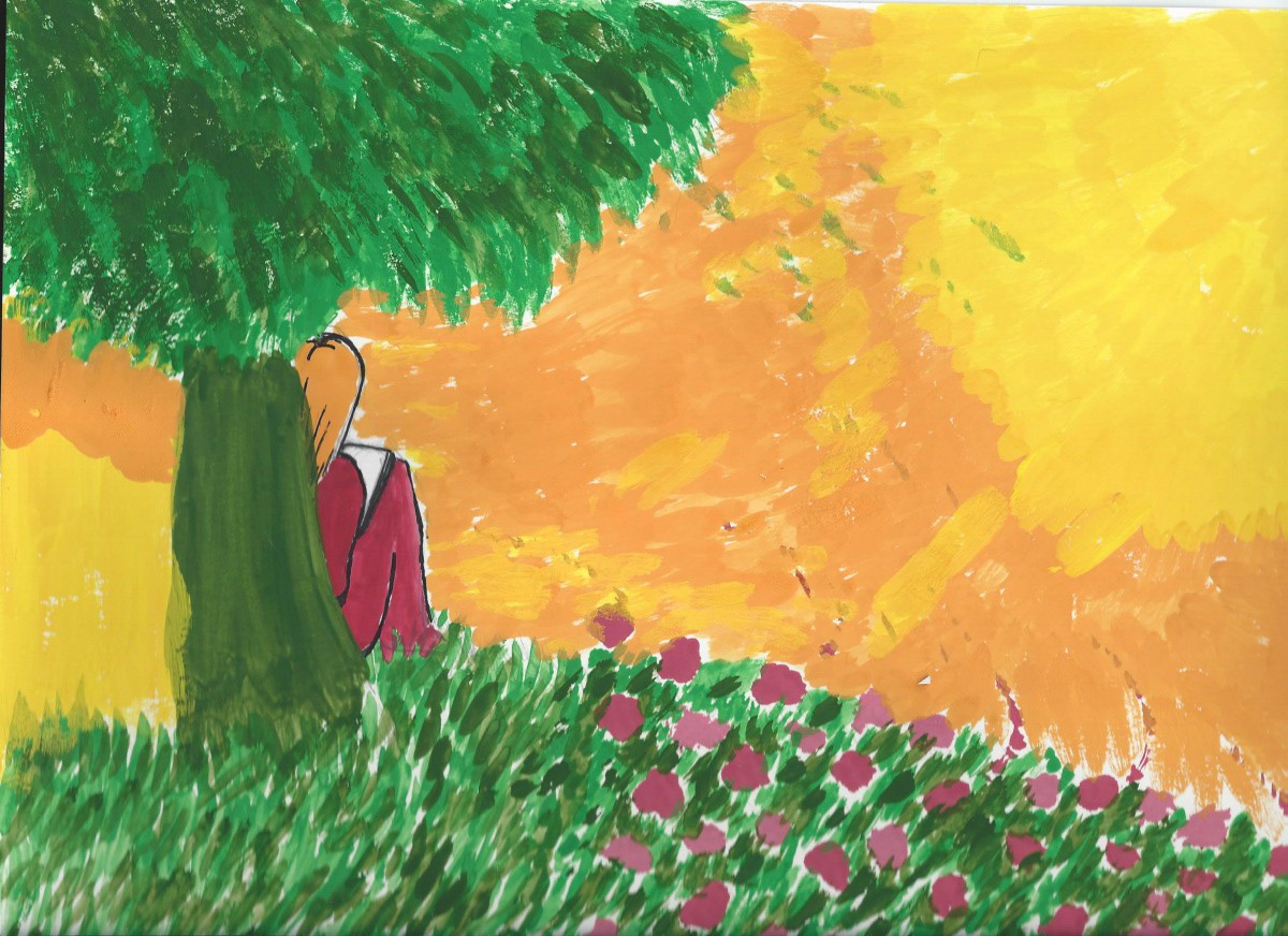
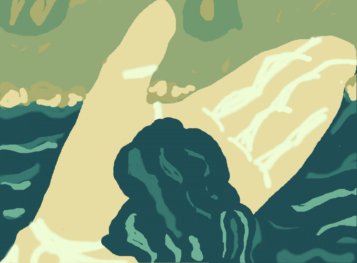
This is my harmonious moment dedicated to my aunt in Ecuador. One moment, I was in Archidona, Ecuador and it was really nice and relaxing then my eyes caught my aunt reading a book in the plain grass filled with roses in the sunset. It was a harmonious moment for me because that moment opened my eyes to such a beautiful event with nature and its surroundings. It was all dedicated to the proportion colors in the right with the garden that made me recapture the moment I saw my aunt in Archidona. I will never forget that event.


Illustrated Harmonious Moment research and final preparatory drawings.

Final Preparatory Image Proportional


The preparatory drawing displays the colors of the sky and the heavens. These colors show the moment I had when I was in Archidona, Ecuador when I first laid hands on the clean waters of the river and swam on it for the first time. The first time I felt the water on my hands was like the sky filled with shining light of the sun. I will not forget that moment I had and it was like a sensational feeling I had that made me open my eyes to the world beyond my imagination.

Final Free-Study – Paired Color Identities with Simultaneous Contrast

20131203_210434[1]

The color identity in the purple square is ASHLEY that represents her favorite color that I saw in her was indigo or purple. The red shoes symbolizes her interest in fashion and clothing. While mines is the blue square which she saw in me was blue because I was calm and relaxed and the power button symbolizes my interests in technology and what a best way to interpret my interest by demonstrating the power button. But not just any power button, the design at the bottom shows data and storage on the technology that is advancing throughout our lives. The red symbolizes our interests in the color and the objects such as the heart and the blood and the first color of the rainbow. It demonstrates the feelings inner self that everyone has.


Achromatic grays

achromatic grays

The Achromatic gray I have painted was very difficult to draw on layout because I was very confused on the colors for the way the darker chromatic gray looks similar at the bottom. However I have managed to draw as light as possible by adding white to black to create a chromatic gray. In addition, I manage to look closer and look at there differences now. Feel free to comment on my art. Joseph Albers really captures the eyes of the audience literally by display the square colors and really makes us think that the colors combined really makes us think that the colors are being erased and makes it feel the colors are being changed as you examine it closely.


Free-Study #2 Final version

Reb_Tech_Wallpaper_by_FahrenheitWilt


The final version of my painting drawn first and re-edited to form a techno style version of my logo and my company. I first edited my logo then I pasted my logo to another version from the internet in a techno style to represent the background and its unity in the form of a symmetrical painting. Feel free to comment.