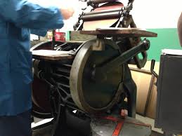
 The trip to the Letterpress was an astonishing experience because there was an old printing press that displayed a style of crafting ink on paper. In history class, my professor mentioned that older technologies determine newer technologies and that theory contributes to the print press. In the letterpress, I was able to use the printing press and print ink on paper. I was nervous that the printing press may clobber may hand, but I got over my fear and the experience was proved astonishing. Without the invention of the printing press, society would have a hard time writing books and it would take months or years to complete a book.
Category Archives: Coursework
My Biography
 People are curious about knowing the other person’s life whether they lived astonishingly or horribly. As for myself, I had encountered certain events in my life that are both astonishing and horrible that defined my personality today. As a kid, I was incredibly shy, and felt down most of the time. In KIPP Star, I was afraid to speak up for myself which led to my insecurity to my surroundings and being always negative to myself. I could not make friends because of my shyness which later I got picked on for it. But, besides the darkness that surrounds my environment, I had my light of hope that helped me get to where I am. My parents loved me because I was doing school work, and was focused on what will I be when I grow up. I was able to see the beauty of Ecuador, and the jungle really set my mind at peace. In high school called St. Agnes, I was picked on because of the way I look. But despite all the harsh scolding that I had to encounter, I really had a good time going on trips like going to the retreat in Connecticut where there is nature and wildlife. Even though, there was darkness in my life that I had to remember everyday for the rest of my life, that darkness I had, I took it with me and it made me stronger. I converted that negativity into a positive energy by remembering all the beauty of my family and the good experiences I had with my friends at the beach. I love them and could not have done it without them. I thank them for the good experiences that they gave me and I am proud to be in this world still studying to become someone more than just a regular person. To those who scold me and berate who I am and what I am not, I am receiving a college education and becoming a great professional engineer and designer.
Painted Progressions: Tinted and Shades
Final Free-Study – Paired Color Identities with Simultaneous Contrast
The color identity in the purple square is ASHLEY that represents her favorite color that I saw in her was indigo or purple. The red shoes symbolizes her interest in fashion and clothing. While mines is the blue square which she saw in me was blue because I was calm and relaxed and the power button symbolizes my interests in technology and what a best way to interpret my interest by demonstrating the power button. But not just any power button, the design at the bottom shows data and storage on the technology that is advancing throughout our lives. The red symbolizes our interests in the color and the objects such as the heart and the blood and the first color of the rainbow. It demonstrates the feelings inner self that everyone has.
Free-Study – Paired Color interactions
Achromatic grays
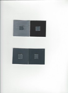
The Achromatic gray I have painted was very difficult to draw on layout because I was very confused on the colors for the way the darker chromatic gray looks similar at the bottom. However I have managed to draw as light as possible by adding white to black to create a chromatic gray. In addition, I manage to look closer and look at there differences now. Feel free to comment on my art. Joseph Albers really captures the eyes of the audience literally by display the square colors and really makes us think that the colors combined really makes us think that the colors are being erased and makes it feel the colors are being changed as you examine it closely.
Free-Study #2 Final version
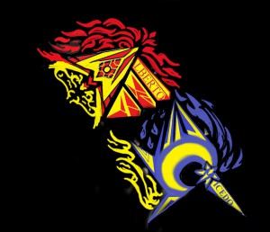
The final version of my painting drawn first and re-edited to form a techno style version of my logo and my company. I first edited my logo then I pasted my logo to another version from the internet in a techno style to represent the background and its unity in the form of a symmetrical painting. Feel free to comment.
Free-Study #2 Thumbnails sketch
Collaborative Free Study: Combined Saturation
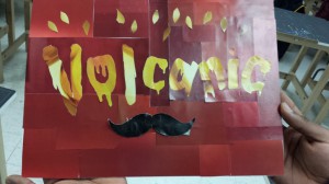
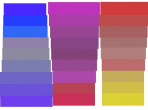
For this project, my group decided to create warm colors based on the word Volcanic. The colors display a high darker to lighter reds and the word volcanic shows its saturation of yellow color. From light yellow to darker yellow, the picture displays a use of the word meaning is hot and fire. P.S. do not mind the peddle-stash it is just there to caught people off guard.


![20131203_210434[1]](https://openlab.citytech.cuny.edu/acaicedo-eportfolio/files/2013/12/20131203_2104341-300x168.jpg)
![20131129_160044[1]](https://openlab.citytech.cuny.edu/acaicedo-eportfolio/files/2013/11/20131129_1600441-300x168.jpg)
![20131129_160051[1]](https://openlab.citytech.cuny.edu/acaicedo-eportfolio/files/2013/11/20131129_1600511-300x168.jpg)
![20131129_160101[1]](https://openlab.citytech.cuny.edu/acaicedo-eportfolio/files/2013/11/20131129_1601011-300x168.jpg)

![20131117_164925[1]](https://openlab.citytech.cuny.edu/acaicedo-eportfolio/files/2013/11/20131117_1649251-e1384725021105-168x300.jpg)
