First and foremost, I would like to announce that I am not an artist, I am not good at math (graphs, charts, and those sorts of things), I am not versed in photo manipulation, and I find difficulty in coming up with new ideas. With that being said, I hope that my attempt at this response is understood. I did the best I could.
Part 1:
Infographic Draft
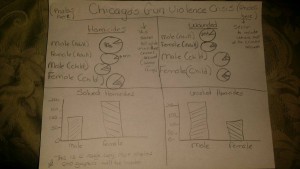
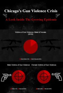
I’ve decided to focus on Chicago, Illinois for my infograhic. In my exploratory paper I mentioned violence in urban communities, which was inspired by the gun and gang violence crisis in Chicago. I also became interested in this topic when I started reading the Chicago Tribune and would see numerous articles about shootings all across the city. In my issue paper, I even paid special attention to this area and researched it thoroughly. This is a very rough layout, but my main objective here was to provide as much information as possible. This is a very serious problem and I figured that getting statistics out should be the primary goal. I decided to create various sections so not to confuse the reader, but enable them to focus all of their attention on one area at a time. I did not want to create a “busy” look. This draft does not display authentic information that will be displayed in the actual infographic. For my background, I will go with a dark color, prerferably black as the background, and I will use red and white for my texts and graphs. I think these colors flow well together, and the black background will allow the red and white to jump at the reader, not to mention the bloodshed all across the windy city, and the somber air that surrounds it (black background). For my data, I prefer to use pie charts because I feel they accurately depict percentages and numbers, and one does not have to look at two different axes to get a quantifiable value. The text will be used to direct readers to a specific area and what that area will be presenting.
Culture Jam Draft
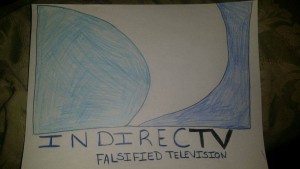
For this draft, I was inspired by an article I read in regards to DirecTV. This company was sued by the Federal Trade Commission (FTC) because according to the article, “The Company Advertises Discounted Monthly Prices, Fails to Tell Consumers about Two-Year Contract Obligation, Significant Price Increase in the Second Year, and Need to Cancel “Free” Premium Movie Channels.” Therefore, I took this idea and ran with it. Their slogan is DIRECTV: Satellite Television, so I decided to manipulate their logo based on the lawsuit they were hit with by the FTC. They failed to tell their customers about the two-year contact obligation that allowed them access to the lower monthly prices. They falsely advertised their intentions, and they also were indirect about their intentions. This is also a play on the fact that satellite television is horrible. During bad weather (rain, snow, strong gusts of wind, etc.), I’ve often experienced my satellite dish losing signal and disconnecting from the satellite, so that also makes it “indirect.” I’ve decide to keep their logo colors (white, black, light blue, and dark blue) and copied everything the best I could. I manipulated the company’s name and slogan to give it an authentic look while displaying a message about their fraudulent activities.
Inspirational Draft
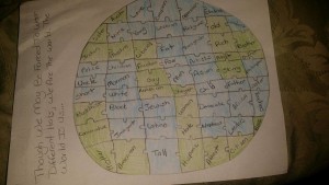
This is a jigsaw puzzle representation of our planet or a globe. I’ve decided to use the traditional green and blue colors because to me, they represent life. Water and plants are two of the main sources of life for all beings on earth. It may be a cheesy attempt, but I am one of those people that pray for world peace. I am inspired by that. I hope for togetherness and unity. I do dream of a world where no one person or a group is in control, and the rest are left suffering. I am not above thinking that those things are possible. There are all types of people that make this world revolve, and though we may wear different hats, we are all the same. We are all fragile frames of ingenuity. We all have different destinies and purposes, but we are still all here. We don’t know how long we have to spend here, so why not just get along? Why not be more accepting? Many of the labels included on my draft are all social constructs that definitely have nothing to do with content of character. All of the trials, tribulations, successes, atrocities, victories, losses, wars, reconstruction, and more are all due to the fact that many of us are authors of our own destiny. Every man is out for himself. When you really think about it, every person is not writing their own destiny or philosophy because it almost always affects some of us or all of us. Each individual fits exactly where he or she needs to be in this world, and that is a part of the human race, regardless of the labels society has forced us to use for ourselves and others.
Part 2:
*Infographic is not complete, and I will be adding more images and statistical data to it.
