For the first project in type 3, we are having to create a logotype brand for ourselves. I wanted to find a way to properly describe who I am as a person, a passionate yet dedicated person who still can be professional in the time of need. These were my solutions.
Author: Zezzily
Name Contrast
For my first assignment in type 3, I was asked of to create a contrast between my first and last name. Using only type and the option of changing the opacity of the color black. Through this assignment, I was able to have some fun results, whereas other results led to a more classic look.
Icons on a Eco-Friendly Society
One of my favorite projects this semester was the chance to create my own logos for a society I had no prior information about. This was a group assignment that created an eco-friendly activist society. I was able to learn and create logos that would reflect certain aspects that a society would encounter.
Through the project I learned the importance of simplicity and the scaling of an object. In realizing that certain objects did not remain the same, logos showed me a new outlook on design.
CLICK HERE to see a PDF of the final presentation;
Educational Banner on ISTD
This was my final project for my type 2 class this semester. We were all given our own topics and were required to do research and create a flyer with hierarchy and the required specs.
Here was my final result on the project; CLICK HERE!
Zezzily Altamirano ITSD
Romeo & Juliet Book Sleeve
This project was to recreate the classic written by William Shakespeare; Romeo and Juliet. We were given the ability to choose our own theme and re-create it to our ability. I had chose to follow the dark secrets that are within the story itself to inspire my idea.
Click here to see a PDF of the sleeve;
Book Sleeve
Dance Newsletter
Click here to see the project;
Dance Newsletter
This project was created for my type two class.
Classmates EPortfolios’
To start off I do like certain aspects of each and every one of my classmates portfolios. Yet there are certain things I do not like as well. Every person has their own perspective on things and what they like and dislike. This was a difficult process for me to decide which two classmates profile I would write about.
One of my favorites was Jessica Hernandez’s EPortfolio
https://openlab.citytech.cuny.edu/jhernandez24-eportfolio/
Jessica’s portfolio is very professional, simple and direct. Her work features not only what she has done in class but her personal work as well. Her page does offer a whole different approach than the “About Me” kind of approach.
Another one of my favorites was from Diana Young
https://openlab.citytech.cuny.edu/dyoung-eportfolio/
Again like Jessica, Diana’s EPortfolio is very simple yet offers who she is as a person. Her main photo is of hands reaching upwards with different colors. It gives me the idea that Diana is a woman who reaches for her goals through many different approaches with a very unique result everytime.
Music Inspiration
Every person has their own way inspiration hits them. Most of the time I get my inspiration from nature, yet there are times I do get my inspiration from music. Music gives me this feeling of flowing, lose, relaxed and a constant rhythm to write. Yet there are some songs that do allow my creativity to run wild and allow me to expand my design thoughts.
A couple of my favorite songs are listed below with the link!
Bruno Mars- Just the Way You Are
Coldplay- Clocks
Cascada- Everytime We Touch
Zedd- Clarity
Usher ft Romeo- Promise
Aventura- Solo Por Un Beso
Lifehouse- You and Me
My Texture
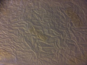
Hey guys! So this assignment we were supposed to create 10 textures in our design journal. I felt that this one was my favorite one because of the way it is an actual texture not something that was implied. However, now it is after taking the photo. I feel that this texture would be most useful in a history type of website. It could be tinted and used as a background of their website. The added texture creates a feeling of something vintage (with age that is old). With added color I feel that this texture could translate into other backgrounds.
Negative/Positive Spacing
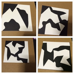
The purpose of the exercise that was given us on Friday was to understand the use of negative and positive space. However, it was not only that single concept; it was also for us to learn the geometric and organic shapes in the spacing. One of the things I’ve learnt from this exercise is that not only it is hard to keep craftsmanship in mind at all times but also to always be able to see the bigger picture. During the exercise I was able to detect which of the papers I was cutting was negative or positive. There are some points where it could be hard to distinguish the two, however it allows the mind to explore and develop new ideas.
I learnt to keep an open mind mostly from this exercise and that it will take time and a lot of practice for my work to improve. Yet, I know as time goes on and I keep updating here on openlab. I will see the progress I’ve made.


