Category: Uncategorized
Re:Arch 1121/ Vocabulary List
Homework Assignment
I got all the definitions and images from google.
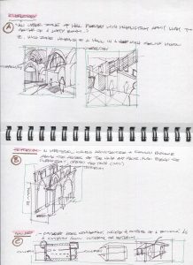
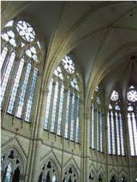
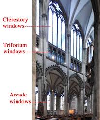
1.Clerestory- “a high section of wall that contains windows above eye level.The purpose is to admit light”
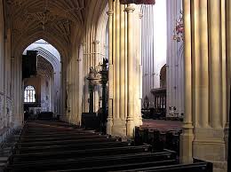
2.Triforium- “an arcaded gallery above the arches of the nave and below the clerestory in a church”
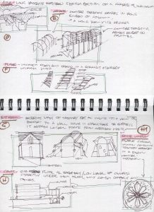
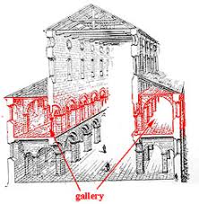
3.Gallery- “any covered passage that is open at one side”
4.Aisle- “is more specifically a passageway to either side of the navethat is separated from the naveby colonnades or arcades, a row of pillars or columns”
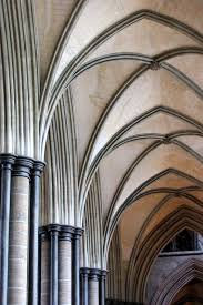
5.Arcade- “series of arches, with each arch supported by a colonnade of columns or piers.”
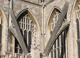
6.Flyer- “ An arch that connects a flying buttress into the structure it supports. “
7.Buttress- “ structure built against or projecting from a wall which serves to support or reinforce the wall.”
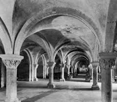
8.Crypt- “ is a stone chamber beneath the floor of a church or other building”
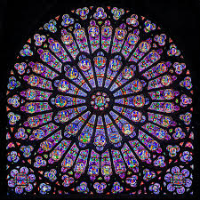
9.Rose Window-“are the large circular stained glass windowsfound in Gothic churches”
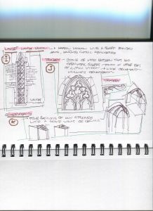
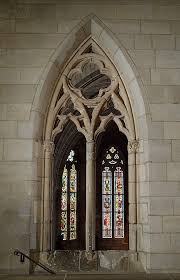
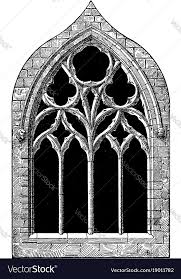
10.Lancet- “a tall, narrow window with a pointed arch at its top”
11.Tracery- “ is the stonework elements that support the glass in a Gothic window.”
12.Quadripartite –“as a vault, by the system of constructionemployed, into four compartments.”
Assignment 5
I had accidentally uploaded this under docs, so I am reuploading it here.
The Pantheon and Hagia Sophia are both such beautiful and magnificent structures. They both are not only stunning from the exterior, they also look so amazing from the interior that it makes them look ethereal. They both have similarities and differences in between them. The Hagia Sophia has many buildings and structures near it, which makes it look a little tighter and more cluttered. While the Pantheon is a little spaced out and isn’t interconnected with the other structures. This also effects the accessibility of the entrances for each of these structures. It is much easier to enter the Pantheon because it is more “spread” out. This is my opinion, but I believe that the Hagia Sophia is slightly more aesthetically pleasing and more visually satisfying in the interior, because of the use of colors. As for the exterior of the buildings, they both follow a similar color scheme. They are both whitish/ creamish color. Well the Hagia Sophia has a red colored portion in the structure but besides that it is the same. The roofs for both structures are high which helps create the illusion of “emptiness”. In other words, it makes them look a lot more spacious. If I were to walk inside either of those structures I would feel “free” because there is so much space and circulation. The lighting inside both of these structures is also very different. The Hagia Sophia has windows throughout the whole structure. While the Pantheon has a one circular skylight, which is in the center of the dome. Even though the Pantheon only has that light source, it seems more brighter inside because it has a lighter color scheme. Another similarity between them is that they both have some building and another building attached to it. In addition, they both have levels inside the structures. The Pantheon has two levels and then the dome. The first level has columns and the second level has these faux windows. Then in the Hagia Sophia, there are 3 levels and then the dome. The first level has arched doors, and then level 2 and 3 have arched windows. That also brings up another difference in between them. They use different shapes, the Pantheon has squarer like and geometric shapes, While the Hagia Sophia has a vast number of arched designs. The walls, doors and windows are all arched. They have their similarities and differences but overall both of these wonderful structures are beautiful and attractive.
Assignment #5
Franklin Bravo
ARCH 1112
Prof. Zigaroli
May 4, 2020
Assignment #5
The Hagia Sofia, also known as the Holy wisdom, is located in Istanbul, Turkey, while the Pantheon is located all the way in Rome, Italy. Both are coming from very different backgrounds, and being very far apart, they share very similar features, experiences, and some architectural concepts. Both the Pantheon and the Hagia Sofia share a structurally daring and visually satisfying feature, a dome. Your attention is captured by their ethereal beauty and majestic magnitudes. The dome in the Hagia Sofia measures 102 feet across in diameter, with the dome at the Pantheon measuring 142 feet in diameter. Although the Hagia Sofia being a bit smaller, it still holds its dignity. Its massive interior space flows effortlessly to interconnect and complement its billowing dome. Similar to the Pantheon, the Hagia Sofia holds corinthian columns, able to withstand the circumference and weight of a dome. The many columns do not only hold a principal function, but they also carry an aesthetically pleasing visual that captivates people to visit and enjoy the view. A key difference between the two is the 4 pointed pillars surrounding the Hagia Sofia, that adds and emphasizes to its outer grandeur. They also present its interior radiance differently in that the Pantheon focuses its dome on a single circular opening, letting in a beam of light that depicts a heavenly presence. The Hagia Sofia does the same thing, only that it appears to suspend its dome in space, light-reflecting through its center. Using different methods of architecture allows these buildings to highlight its surfaces enriched by its elegant light, to really give each of these monuments a sound significance and individuality. The Hagia Sofia and Pantheon do share common traits, they just present and transform them differently to give off almost the same feeling that really makes them feel special while still holding their own identity.
Assignment #5
Anamarie Perez
May 3, 2020
Spring 2020
Assignment #5
The Pantheon is a Roman temple that was built from 118-28CE. The Pantheon is most known for one of the most influential works in the Western architectural history. This temple was constructed in the reign of the emperor Hadrian. The entrance of the Pantheon consists of an enormous portico and twenty Corinthian columns. The portico is connected to the circular cella. The Pantheon was converted to Christian use. When standing in the middle of the cylindrical cella, the dome looks massive compared to the actual measurement. The interior part of the Pantheon is just a wide spatial area, where the dome outlines the exterior. There are many coffered squares on the interior part of the dome and there is a open circle in the middle of the dome so light can shine in the Pantheon. Overall, the Pantheon is structure that has influenced many other buildings.
The Hagia Sophia is one of the greatest masterpieces of the Byzantine architecture. The Hagia Sophia was built at Constantinople in Turkey from 532-537CE. The Hagia Sophia is a basilica with a central dome and semidomes at the front and rear of the building. In the interior of the Hagia Sophia, there is a linear space. There are two aisles on sides of the building and in the middle is a rectangular space. The central dome has a diameter of 107 feet, and it is supported on pendentives. The light shining in the Hagia Sophia comes from the many windows created at many levels. These windows created at many levels are set between the dome’s ribs and create an illusion of the dome being unsupported. The architects of this buildings designed the Hagia Sophia so it would rival the Pantheon. To conclude everything, the Hagia Sophia is similar to the Pantheon but they have their differences.
Assignment #4
Anamarie Perez
March 9, 2020
Spring 2020
Assignment #4
El Morro Castle was built in San Juan, Puerto Rico. This Castle is very durable. The construction of this castle started in 1539 and while the construction of this castle was going on, it was getting attacked by their enemies. El Morro still stands today and is completed. El Morro is now a museum for tourist to go visit. El Morro was very useful. This was used for battling against their enemies. In El Morro, they have the cannons and the tools that were used in the war when entering. In some peoples’ eyes, El Morro is considered a beautiful building with history behind it. There are over 2 million tourists that visit El Morro.
Looking at Ching’s organization system, El Morro is more like the Centralized Organization There is a outer shape and then the inner shape which looks like it centered in the middle. The inner shape of El Morro is a bit different than the outer shape.
re: pdf upload homework 4
Homework 4
Assignment #4
Franklin Bravo Assignment #4
ARCH 1121
Prof. Zagaroli
The Louvre is a museum of art and antiquities located in Paris, France. Although having gone through a lot of reconstruction and renovation, It is mostly comprised of cut stone. It is also a vast complex of pavilions and wings on four levels. With the Louvre pyramid made entirely out of glass and steel. The pyramid measures 116 feet wide and 70 feet high. With 95 tons of steel and 105 tons of aluminum used to support the structure. The circulation of the museum seems a little confusing since the entrance is not made clear. The Louvre pyramid is utilized as a statement piece to attract, and capture the beauty and grandeur of the surrounding buildings. It is properly used to signify an entrance in an elegant way. And since it is composed of glass, lights are used to illuminate the pyramid to make it stand out and really emphasizes importance. The form and shape of the entrance is familiar as it has the same proportions as the pyramids of Giza. Its shape is also used as a reminder of their egyption collection inside the museum. So its form and shape are not only beautiful but functional as well. Looking closer at the pyramid, the glass is made of up smaller triangles and diamonds, almost making it seem like the pyramid is made out of cut jewels. The pyramids prominent organizational system in this case is more of a grid organization as it uses its formation of glass as a grid to create a bigger three dimensional figure.
Assignment #4
Vanessa Gallego Assignment #4
ARCH 1121
Prof. Zagaroli
The Metropolitan Cathedral of Medellín is the largest church in South America, it’s a neo-Romanesque style church. The circulation throughout the church can be made on either side of the church and in the middle. The Cathedral was built in the site of Plaza de Villanueva which was renamed Parque Bolivar after the land was donated to the city by Moore. The materials that were used to construct this church was adobe bricks 1,120,000 to be exact.Throughout the whole church there’s paintings and sculptures devoted to the Catholic religion also it has a small religious museum consisting of four rooms it reportedly includes about 40 paintings. The church has a total of 76 stained-glass windows that lets adequate amount of light. The organization that is more prominent is the linear and the grid organization because of the walls and the seating system. The Lines of the walls going horizontal and vertical all meet up to make a grid and linear organization system.
