I used this quote because in a way it represented me. The way I made it was by placing a picture on Indesign and placing the text over on the top at the very center. The font of the text is Berlin San FB Demi Bold with a font size of 49. I made sure to enlarge the text because I wanted it to almost scream to be different. I loved this quote for the very reason everyone should be different. No one has to be the same. The red person in the center of the image is a red figure and as you notice, around him, every other figure is the same color, grey. Though this image is basic, it does speak the message and quote Oscar Wilde is trying to make. Why be everyone else as the same grey color when you could be different and shine the most?
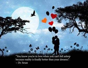
The next quote I used was one from my all time favorite childhood author, Dr. Seuss. The image used to represent the quote really seemed to fit by the way it looks like a fantasy yet reality at the same time. Dr. Seuss mentions how falling in love is now a reality than a dream, which I agree. Though I thought to myself why just reality? You could also dream about it and still have good memories even if it is a reality. Which is why I used this image to project how falling in love can be of both world. In reality, you could spend a lovely night with the one you love under the moonlight in a beautiful scenario but at the same time, the way the image looks, it could very well be a dream that you wish would never end. Creating this was fun for me because it made me think a lot of what love means for a lot of people. The text is placed below right by where the grass are for the very reason because there was no other place to place the text without the colors overlapping or coming out to strong. I decided to go with white to match the image and extend it width wise to blend with the grass. The font used is minion pro at a 24 font size.
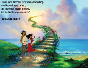
The next quote is a lovely one that maybe most who are in love can relate to. The way how this image was made was on Photoshop combining two picture together. One image is the background of the beautiful sea with the stairs going towards the sky almost as if it leads to heaven. The next image is of the beautiful couple who seem to be dancing with big smiles right by the stairs. I had to mask them in order to blend the couple into the background image and make it seem as if it were one in the same. The reason I chose this background because it represents what William W. Purkey quoted about love. When you’re in love, you just imagine it as you and your partner alone. You can sing and dance together without a care in the world because they will always share those memories with you. You have to live life at the fullest with the utmost joy no matter what comes your way. The font used was Arial and the size is 24. I placed the text using Indesign after merging the two photos on Photoshop. I decided to place it on the left side to make it seem as if it’s telling a story when you read it.


