Author Archives: Zio

Poster

This poster I created is basically a drawing representing me. I made multiple version of myself doing many different facial expression or activity to express who I am. I started them of first as sketches before transferring them onto Adobe illustrator where I outlined them and colored them. I have myself as waving Hi, while another is playing video games and the one on the right bottom in front of a desk drawing away on the computer with a drawing tablet. I wrote this text because art is based on creativity, effort, and practice. Not everyone is perfect in the beginning but they continue to practice in order to reveal how their skills changes over time. It all depends if you have what it takes to keep going forward or holding yourself back. Especially when you express yourself through your work. Not everything will come out perfect but you are placing a piece of yourself through every piece you make. It’s something to come to love which I do very much. I’ll continue to draw and see the changes as they go by. Art is creativity, passion, and beauty.

Field Trip Report

During our trip to the UFT (United Federation of Teachers), I found many interesting printing machine that had unique job which indicates how much technology has developed throughout the year. One machine I found interesting was the one which could creates seal labels for every envelop in such a short time such as 5 minutes for over 500 envelopes if not more. It made me see how much time has gone by because back then, in industry companies, you had over hundreds of people sitting down in rows doing such work by hand which would take up more time. Now it can be done with only one machine in such a short amount of time yet in big quantity. Another machine I found interesting was the print T-shirt where it printed designs online straight to a t-shirt in high quality. It was amazing to see because it took less than 5 minutes to have the shirt design printed in the center of the shirt along with having it compressed in another machine. It got my interest because anyone can create design using the proper program and print them on plain white or black t-shirt. Overall, the trip was fantastic because it’s amazing what one machine used for a certain task can do while back then it was harder that took time to develop. With technology this advance, I do wonder what machinery will come in the future for task such as these.


Logo/Banner

My logo/ banner represents me because it contains all the elements of who I am. To start off, the logo I created are my Initials of the first letter in my first and last name which is X,M. In the beginning I had a different logo which is where I combined both my initials to create one image, though it did not turn out well because I wasn’t able to have my first initial stand out first rather then my last name. So I began to start a while new idea where I wanted the X to stand out. The logo you see now has the X in the very center in white while my last name initials, M surrounding my first. The images you see are everything that I stand for. On the left side, I have two images which are what I drew. One is a drawing of my little brother I had drawn as a portrait for one of my class as I am majoring in the art field. The other drawing on top is a drawing I created during my free time on a sticky note pad since I did not have my sketch book at the time. On the right side, it represents what I love to do on a daily basis when I am not drawing. On the top, the image is what anyone loves to watch, which is anime. I love to watch anime because you can see great animation. I love to see how creators make such great plot line for story that no one would dream could actually happen. It’s a fantasy where anything and everything is possible. On the bottom, it’s a very popular game which was created in 2014, Overwatch. I chose this image too represent me because I love to play video games as well. It’s amazing to see how games can be developed when it starts of from the very beginning. I’ve watched countless videos of how games start off to the point where they are now and it’s amazing how much time and effort is placed. Overall, I wish to be someone who can create games and create story lines where it relates to everyone. I want to be the one to talk about certain topics others don’t wish to talk about. My goal is to become an animator/ game designer and with hard work and effort, I believe I will reach my goal someday.

Visual Enhanced Quotes

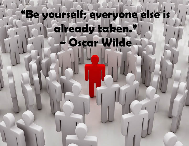
I used this quote because in a way it represented me. The way I made it was by placing a picture on Indesign and placing the text over on the top at the very center. The font of the text is Berlin San FB Demi Bold with a font size of  49. I made sure to enlarge the text because I wanted it to almost scream to be different. I loved this quote for the very reason everyone should be different. No one has to be the same.  The red person in the center of the image is a red figure and as you notice, around him, every other figure is the same color, grey. Though this image is basic, it does speak the message and quote Oscar Wilde is trying to make. Why be everyone else as the same grey color when you could be different and shine the most?


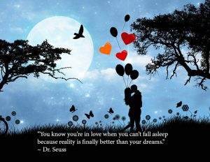
The next quote I used was one from my all time favorite childhood author, Dr. Seuss.  The image used to represent the quote really seemed to fit by the way it looks like a fantasy yet reality at the same time. Dr. Seuss mentions how falling in love is now a reality than a dream, which I agree. Though I thought to myself why just reality? You could also dream about it and still have good memories even if it is  a reality. Which is why I used this image to project how falling in love can be of both world. In reality, you could spend a lovely night with the one you love under the moonlight in a beautiful scenario but at the same time, the way the image looks, it could very well be a dream that  you wish would never end. Creating this was fun for me because it made me think a lot of what love means for a lot of people. The text is placed below right by where the grass are for the very reason because there was no other place to place the text without the colors overlapping or coming out to strong. I decided to go with white to match the image and extend it width wise to blend with the grass. The font used is minion pro at a 24 font size.

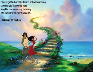
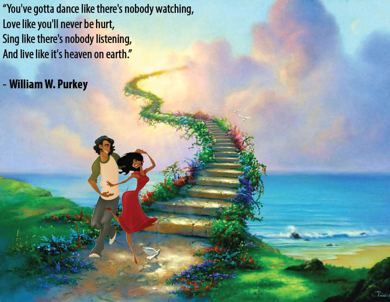
The next quote is a lovely one that maybe most who are in love can relate to. The way how this image was made was on Photoshop combining two picture together. One image is the background of the beautiful sea with the stairs going towards the sky almost as if it leads to heaven. The next image is of the beautiful couple who seem to be dancing with big smiles right by the stairs. I had to mask them in order to blend the couple into the background image and make it seem as if it were one in the same. The reason I chose this background because it represents what William W. Purkey quoted about love. When you’re in love, you just imagine it as you and your partner alone. You can sing and dance together without a care in the world because they will always share those memories with you. You have to live life at the fullest with the utmost joy no matter what comes your way. The font used was Arial and the size is 24. I placed the text using Indesign after merging the two photos on Photoshop. I decided to place it on the left side to make it seem as if it’s telling a story when you read it.