This field trip to the Society of Illustrator really opened my eye and mind. The way people illustrate and thought process is always amazed to me. This time I mainly focused on editorial illustration. I did one two semesters ago without getting any credit. Probably due to the article I chose wasn’t fit for me therefore I did not think of a good illustration to go with it. So, when inside the Society of Illustrator, I want to figure out the way they drew and what inspire them to drew their pieces.

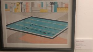
Until, I came upon one illustration which curious me, and made me want to dig deeper of their illustration process and that piece is Andrea Mongia’s The Depth of Swim. Andrea Mongia is an Italian illustrators who was grown up in Rome and work for clients such as The New York Times and Wall Street Journal. Most of his clients are newspapers,, which he did a lot of editorial illustrations. This piece was done for an Italian magazine, Rivista Undici.
As I look around, I found out most of the editorial illustrations appear in this kind of style. Not only that, I remember one of my friends who is starting her editorial illustration career has the similar style of this one as well. This style always has lighter colors and easy feeling when viewing. I wonder if this is the most popular style when comes to editorial illustration? I would love to try out their techniques on some of my future pieces. Also, I found out they don’t use a lot of colors, and most of them don’t even draw shadows! But the way they drew didn’t made their images look flat. That is amazing.


