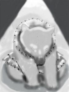
I know my value studies aren’t the best, but I think I used the multiply layer a bit too much. I took off the small party hat and the muzzle the bear had. I decided to show a headlight to showcase the bear like how it would in an actual circus. I think the light makes the illustration have more of an emotional aspect.
Author Archives: Lylianna Velazquez
Concept Sketches
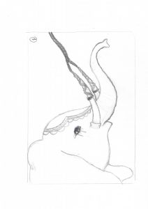
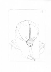
For my editorial illustration concept sketches it showcases circus animals abuse. The first one is of an elephant being tied up by its tusks. The second one is of a lion, its mane is supposed to be flames because in circuses lions are usually jumping a ring of fire. The third sketch is of a bear that has a mechanism on its face that closes its jaw.
Society of Illustrators
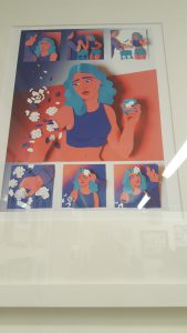
Entering the Society of Illustrators gallery, this illustration caught my attention. The art director is Nathan Huang, the illustration was for the New York Times. The illustrator is named Maelle Doliveux. Her illustrations shown in her website is mainly using cut outs. “Fractured” is a mix of cut paper and digital work. I felt the cut out paper gave the piece dimension.Doliveux choices of color made the illustration stand out as well. “Fractured” showed a story and it was very clear, not like many of the illustrations that were shown in the exhibit. “Fractured” is considered a comic and was posted in a blog for the New York Times. On Doliveux’s website she wrote the whole story in a sentence, “A young woman goes on an impromptu first date the begins in Brooklyn bar and ends in a hospital” (http://maelledoliveux.com/filter/comics/Fractured). I believe Doliveux could’ve gone in a whole another direction with the fractured arm making it into gore themed piece. Instead she went on the lighter side creating cut out pieces of paper shaped as flowers and leaves.


