Author Archives: Kelvin M
Editorial Illustration Concept Sketches
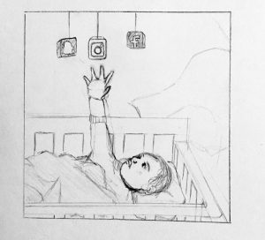
It’s Digital “heroin”: how screens turn kids into psychotic junkies
http://nypost.com/2016/08/27/its-digital-heroin-how-screens-turn-kids-into-psychotic-junkies/?utm_source=pocket&utm_medium=email&utm_campaign=pockethits
I liked this article because it addresses the changes of technology on the upcoming generation. In this article, it’s discussed how little kids who are being introduced to devices and technology happen to have symptom systems of narcotics use. They have found that children’s brain look like they just took cocaine when their brain scans were viewed. This topic is really interesting
The Future of Loneliness
https://www.theguardian.com/society/2015/apr/01/future-of-loneliness-internet-isolation
This article is on the effects of social media, technology and the internet on mental health and personality. The author uses the tri-annial show exhibition that exhibited a while back. The show itself was on how technology has driven many people into loneliness and have become alienated. The author believes that the internet has become this tool where we can design personality according to our desires and just build this false sense of personality. As well, social media has changed how people interact with each other. All in all, technology has changed how we go about life and perceive the world and that’s what the author wants to show in this articles. Give it a read.
Midterm re-edits
Value and Composition
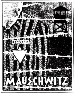
This illustration was done by Art Spiegelman. It was done for his graphic novel “Maus”. He uses value to demonstrate the dark and gruel times Jewish people went through during the Holocaust. The values range but they are consistent in that elements are divided into white, grey and black.The background and post guard are black to show the grittiness of the camps. The sky and the mouse are grey. The grey sky makes the mood sad and melancholic. The artist made the barb `wire white as the focus in front of the everything. The composition is strong because of the values and emphasizes the hierarchy from the barb wire to the background. I felt the values really depicted the mood of the illustration.
Trip to The Society of Illustrators
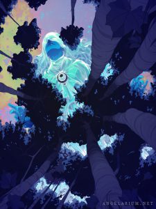
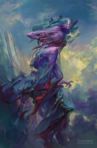
Among many great pieces from the editorial exhibition of the Society of Illustrators, I happened to be amazed by Goni Montes’ piece, Tamiel. This piece called my attention with its bright lucid colors. At first glance, you may notice a brightly colored woman but soon you notice that this is an enormous woman on top of a forest. The way perspective was used impressed me. Goni Montes digitally illustrated this piece for the book Angelarium: Book of Emanations. Angelarium was a project started by Peter Mohrbacher. worked in the gaming industry and was the one to start this project. It’s based on the various angels in mythologies and created. The goal of the book is to explore the various ways angels can be envisioned in surreal ways. The book is being funded through a kickstarter, and so far $50,000 have been pledged.
this was the version done by Peter Mohrbacher. I find both pieces amazing. However, Goni’s calls my attention more because of the bright palette and composition. Although, Mohrbacher’s looks more defined and finished, I happen to like works like Monte’s . All in all, I really enjoyed the trip and it helped me see great work and makes me want to put in more effort into my work.
Meet the Artist
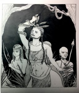
Meet the Artist
I liked doing this Meet the Artist because it made me think of how I would like to communicate to other people my personality and how I carry myself. I liked drawing some of the contents from my bag because some of the contents I grab subconsciously and they almost never come out of my bag. This is somewhat my style but not entirely. I do like making clean lines and keeping the drawing minimal. What do you guys think?


