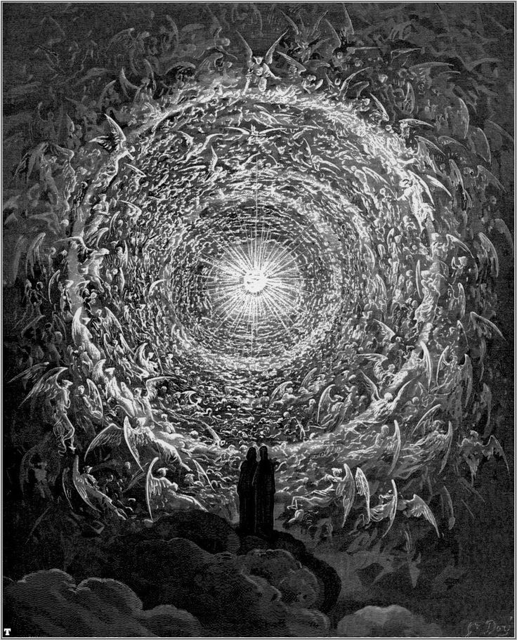
This illustration from Dante’s Inferno was illustrated by Gustave Dore. He uses value to make the center a big focal point. By getting progressively darker away from the middle of the page it leaves an empty space in the middle. Also I think it shows the gray-scale as it shows various levels of value. It’s like the middle is drawing you in the light with the edges of the page being in shadow.The way everything is moving towards the light can give of a sense of curiosity to see what’s so attracting about that light.

