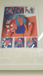
Entering the Society of Illustrators gallery, this illustration caught my attention. The art director is Nathan Huang, the illustration was for the New York Times. The illustrator is named Maelle Doliveux. Her illustrations shown in her website is mainly using cut outs. “Fractured” is a mix of cut paper and digital work. I felt the cut out paper gave the piece dimension.Doliveux choices of color made the illustration stand out as well. “Fractured” showed a story and it was very clear, not like many of the illustrations that were shown in the exhibit. “Fractured” is considered a comic and was posted in a blog for the New York Times. On Doliveux’s website she wrote the whole story in a sentence, “A young woman goes on an impromptu first date the begins in Brooklyn bar and ends in a hospital” (http://maelledoliveux.com/filter/comics/Fractured). I believe Doliveux could’ve gone in a whole another direction with the fractured arm making it into gore themed piece. Instead she went on the lighter side creating cut out pieces of paper shaped as flowers and leaves.
COMD 2313 Illustration 1, SP2017
Just another City Tech OpenLab site


