Product Illustration

These are  product illustrations of a kind of Chinese persimmon wine. The persimmon  tree is the antlers.  This idea is good,  and result is great, it looks like watercolor or ink printing. That makes the illustration is  hyperbolic, but it is beautiful and layered.

Response to the readings

Reading 1

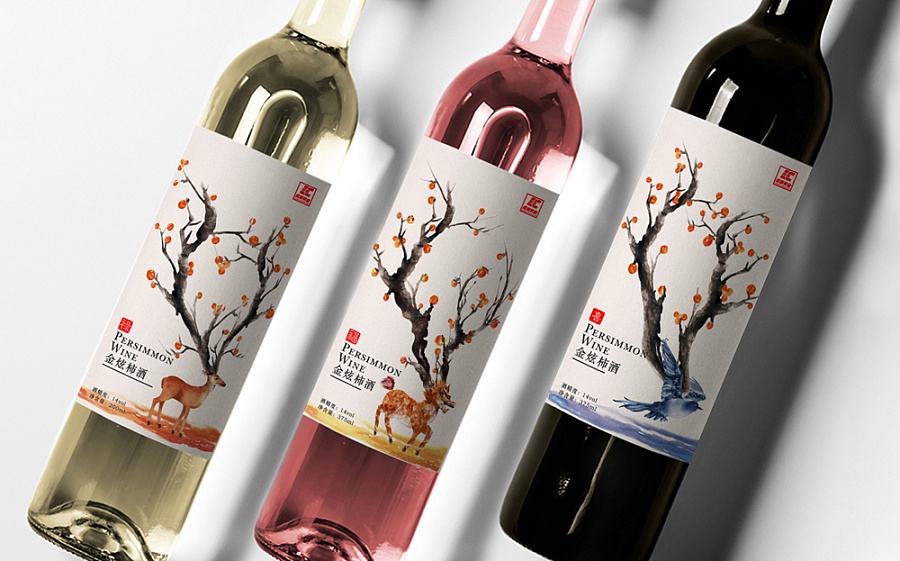
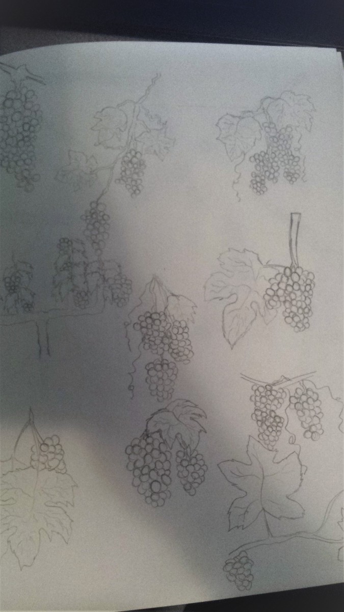
While I was reading this article, the first image came out of my mind was a wine bottle design named Empire. It gave me a very strong feeling, full of impacts and incredible amazing that caught my eyes at first from a page with different labels. So I completely think that eyes catching always plays an important role when it comes to product design. People might forgot the taste of the beer,the soda, or the wine…but there are always memory left behind the illustration from the design. The illustration tells a theme,a story or even a single word. When the color add into it, it’s not as 1+1=2. I still strongly remember the design of the Empire wine, with black or white background, golden or black dragons only, it’s very unforgettable,and I think this is the power of illustration when it comes to eyes catching design.

Reading  2

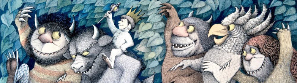
I like the design “Freedom to Read.” Jillian Tamaki mentioned two things I founded interested in her process. First, come up with different words and draw out thumbnails even though they might look funny. I think this is a good way to practice creativity and combination of ideas. Second, resources are important. We can fill our idea by looking around the resources. From the design “Freedom to Read,” I can see the influence from children books, both the style and the concept.

Collective Arts Brewing – Deadline to submit: September 30, 2017

Class-  Here is a chance to get some professional exposure for your work and earn some money from it!  And you thought this was JUST an assignment!


We are looking for the best new and emerging artists around the globe to be part of our Series 9 Call for Art. This year marks an important milestone for Collective Arts. Our beer can be found coast-to-coast in Canada, and in the USA we are available in New York, Massachusetts, Connecticut, Maine, New Hampshire and Vermont. Collective Arts will be launching in Chicago and Nashville this fall and our beers can be found in Australia! We want to show the world YOUR work as we continue to grow. 

Deadline: September 30, 11:59PM.


Reading # 1 Response

I do not drink beer, but, as far as I know, quality beer is a proven technology. Therefore, to date, most manufacturers do not participate in the competition for the quality of beer, because they already have it. They try to attract buyers by giving them a “circus” because they already have “bread”, that is, beer. An exquisite variety of tastes and quality of the beer is now complemented by works of art on labels. Because when we say that people have a taste, it’s not just about food or drinks, but also about the ability to perceive beauty. Thus, a simple walk in a supermarket past beer stands can be equated with visiting a museum of modern art, and you can choose one piece for yourself without paying a lot of money.

Response to Jillian Tamaki

I’d have to say the one strategy that she uses for concept generation that relates to me the most is Step 3: Taking the source content seriously. I have to say that this one immediately reminded me of myself because my working process is pretty much the same way as she describes this step. If I am trying to come up with an idea or concept I would look at an image or a reading or something for a while and try to observe the smaller details and just let everything sink in over the next few hours while trying to come up with something unique. I also if I have the opportunity to would like to research and dive into as much detail and know as much as possible about what I just observed so I can know all the who? what? when? where? and why? so I can have a better idea of what the creator of the source material was thinking but it can also help me create my own ideas or inspirations as well.